Classic jäätelö
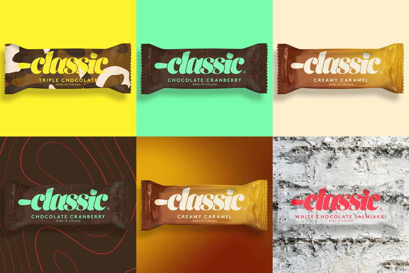
Made in Finland since 1993, Classic ice cream needed a new identity and a new attitude to take on the competition and gain traction again. I created the concept and designed the identity and packaging for Froneri.
How I gave a classic ice cream a new attitude?
In a crowded freezer, a good product is not enough. Froneri wanted Classic, an ice cream stick made for Finnish tastes with a thick milk chocolate coating, to stand apart from its competitors with a voice of its own. I developed the creative concept and was art director and lead designer on the identity and the packaging. The concept fits in one line: life is sticky, messy, cool and vibrant.
How the identity found its attitude?
Classic is for the curious ones, who eat their ice cream with eyes wide open and go looking for experiences of their own. It talks like a no-nonsense friend, down-to-earth but never boring.
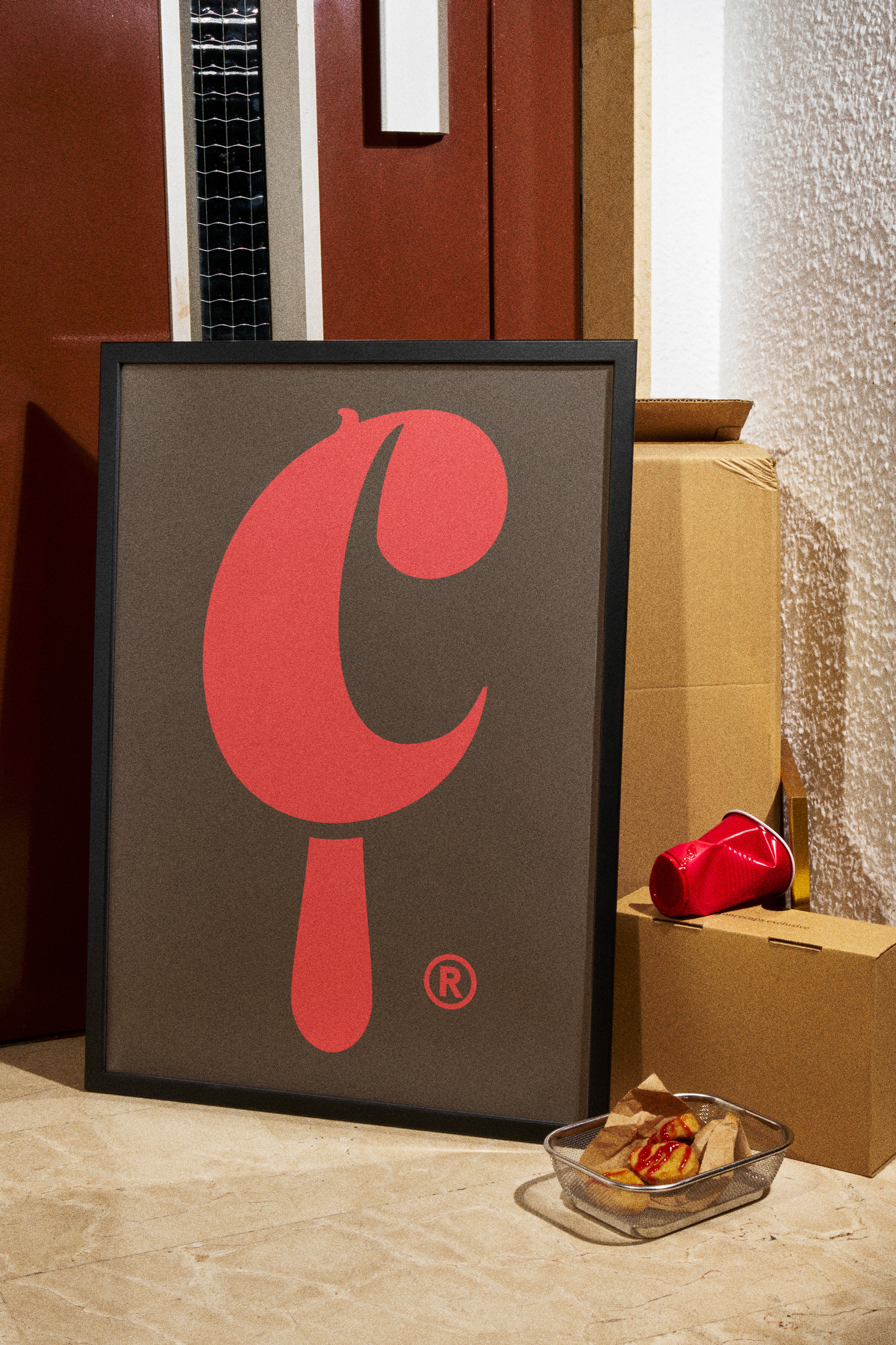
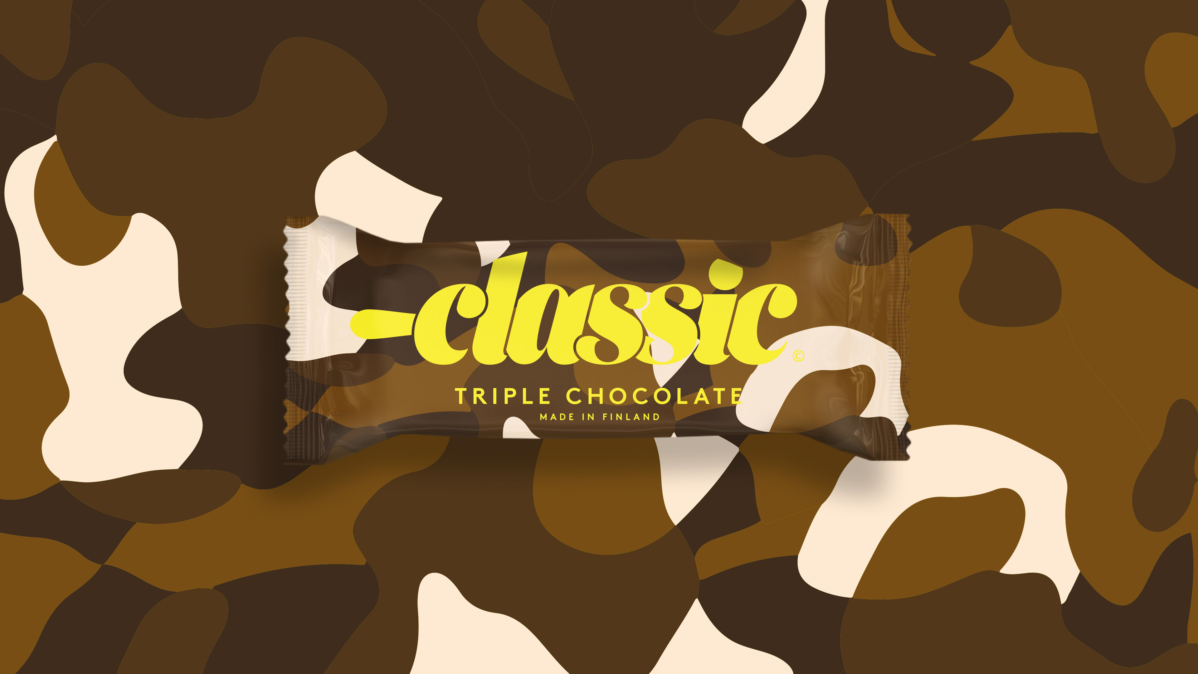
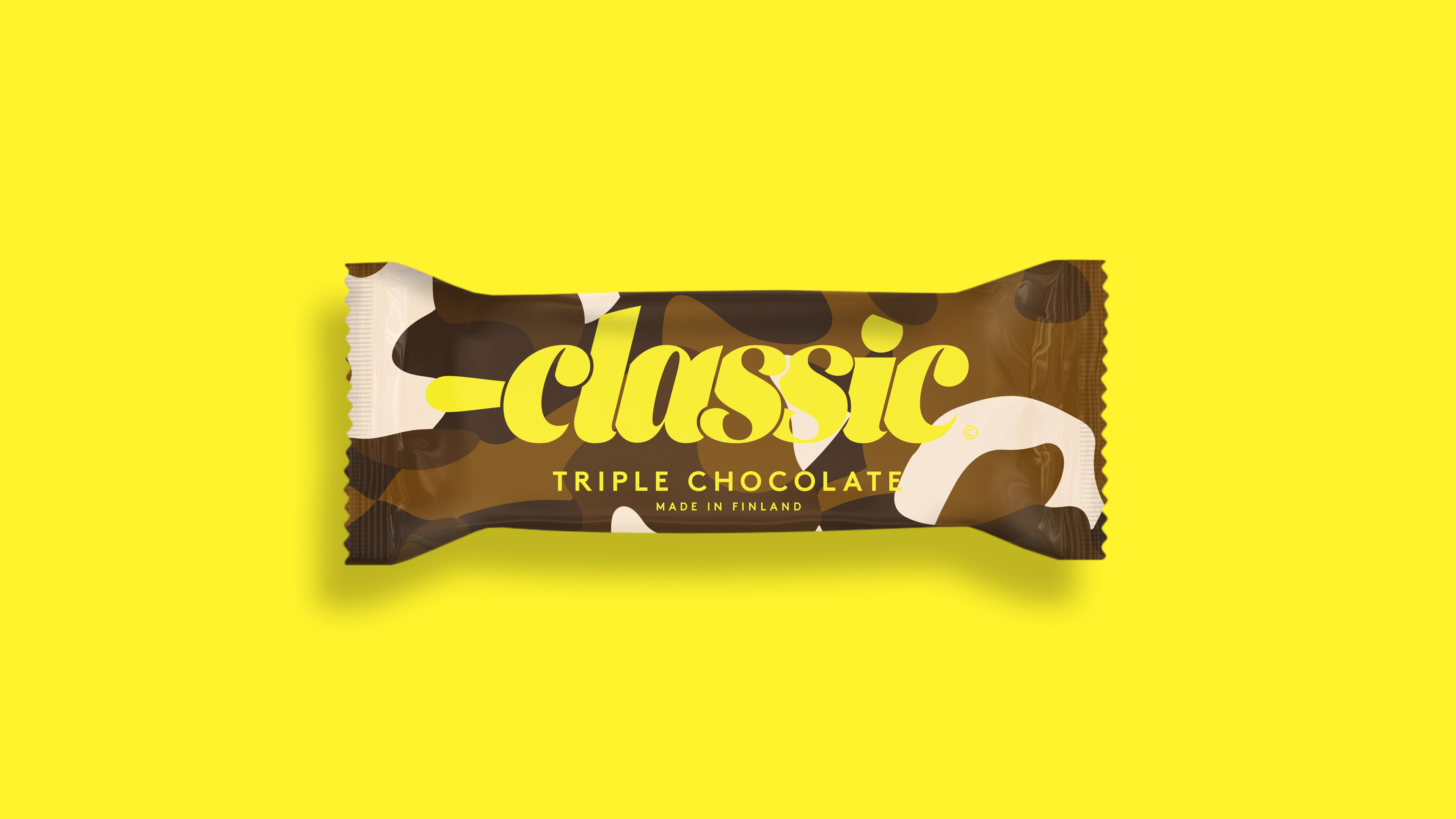
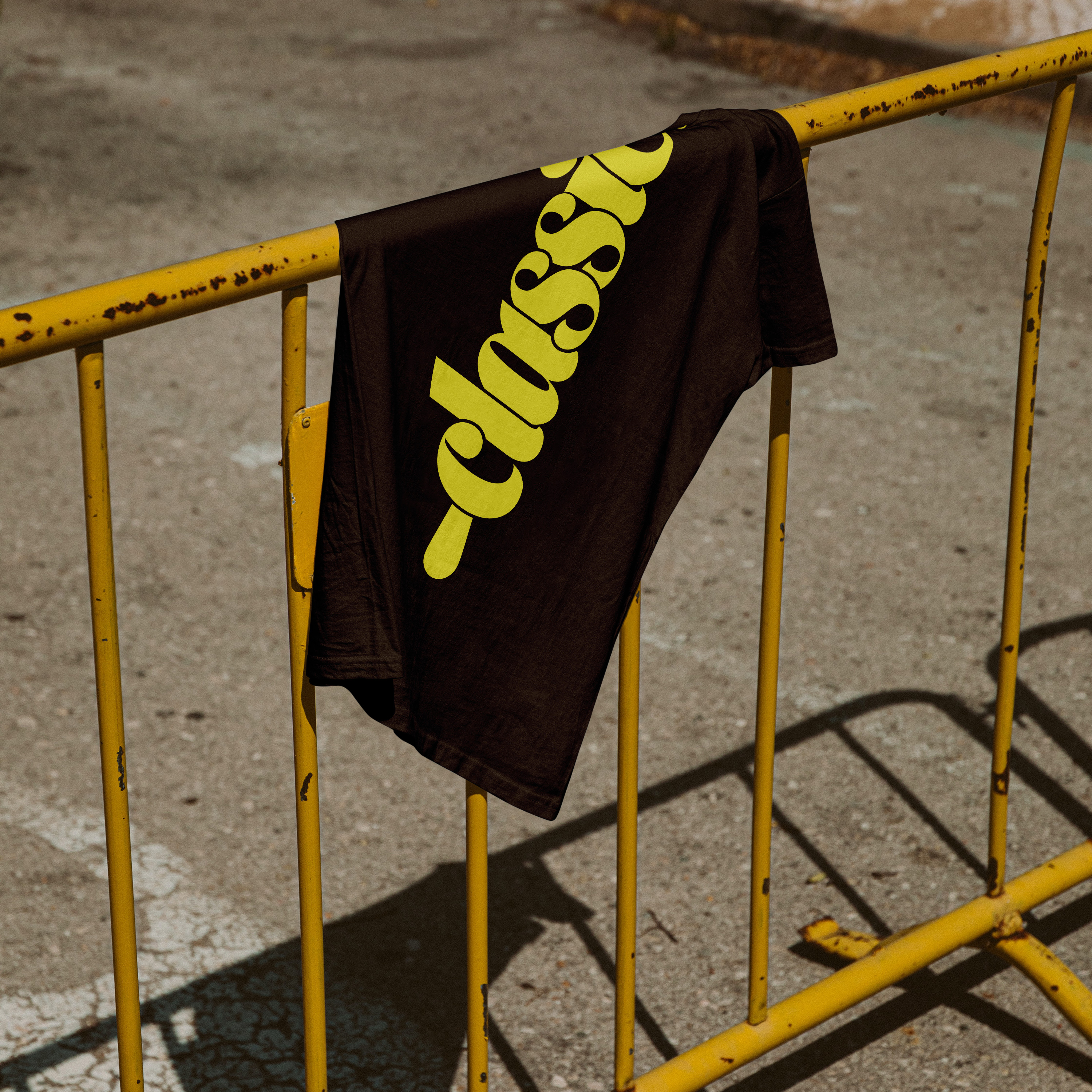
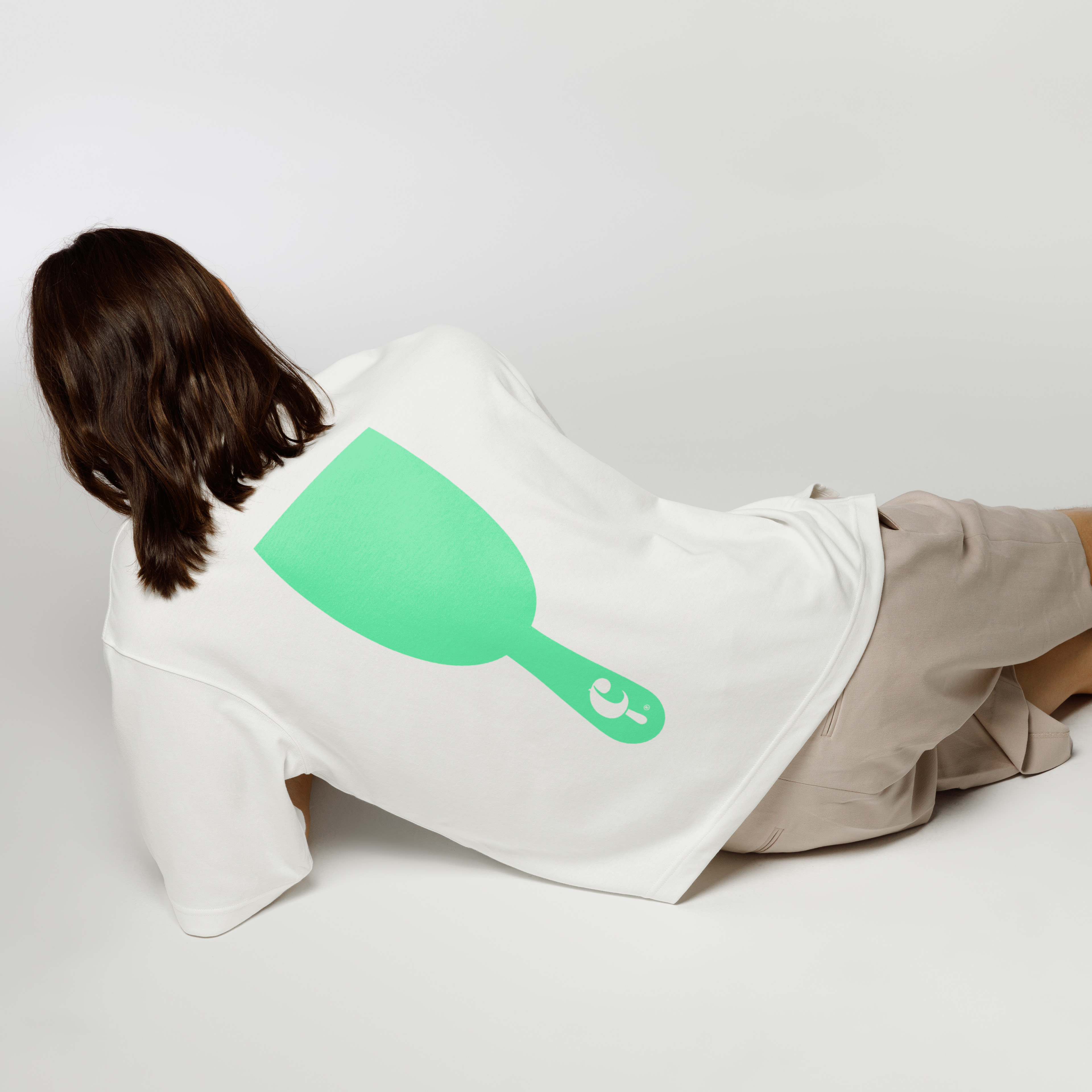
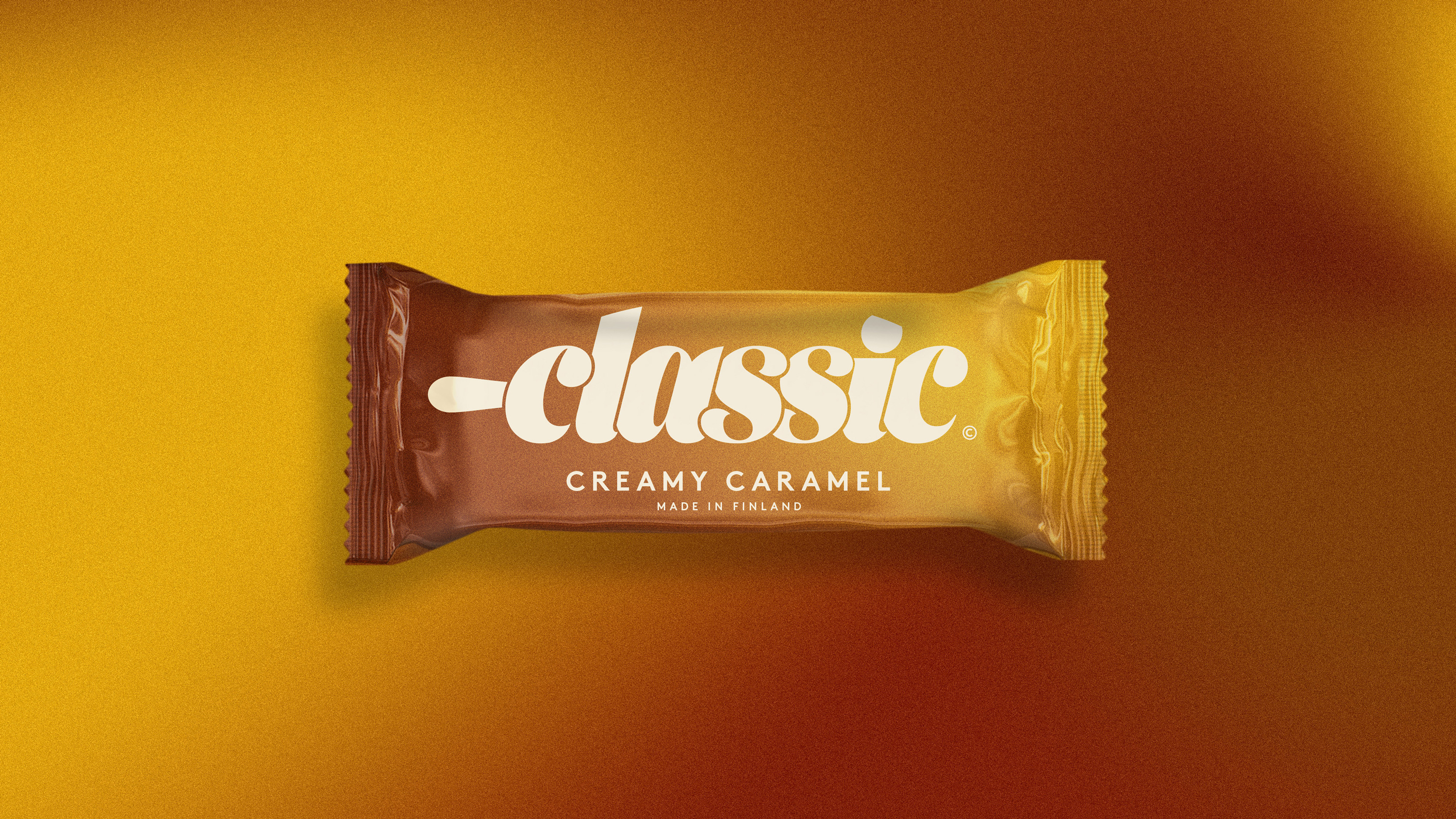
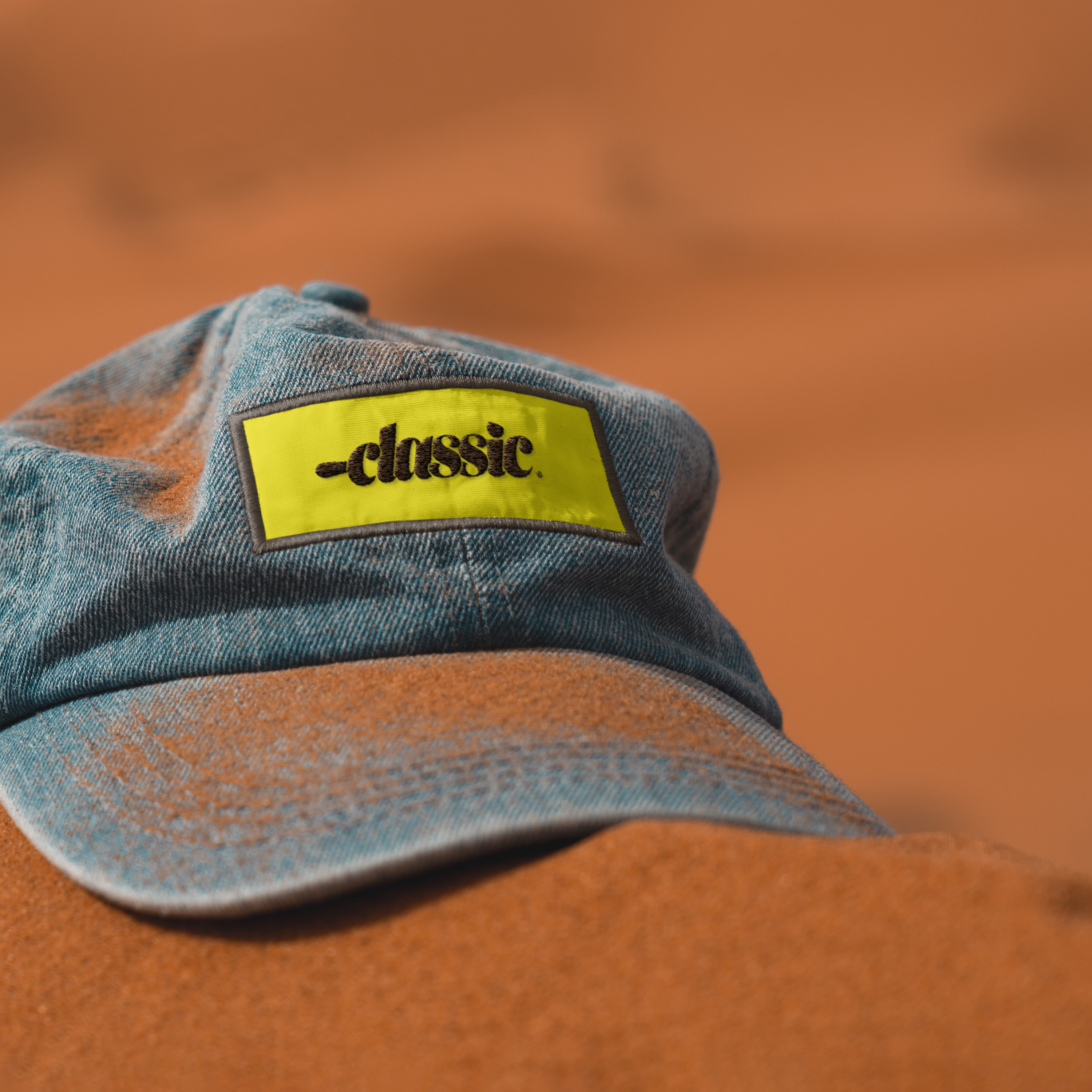
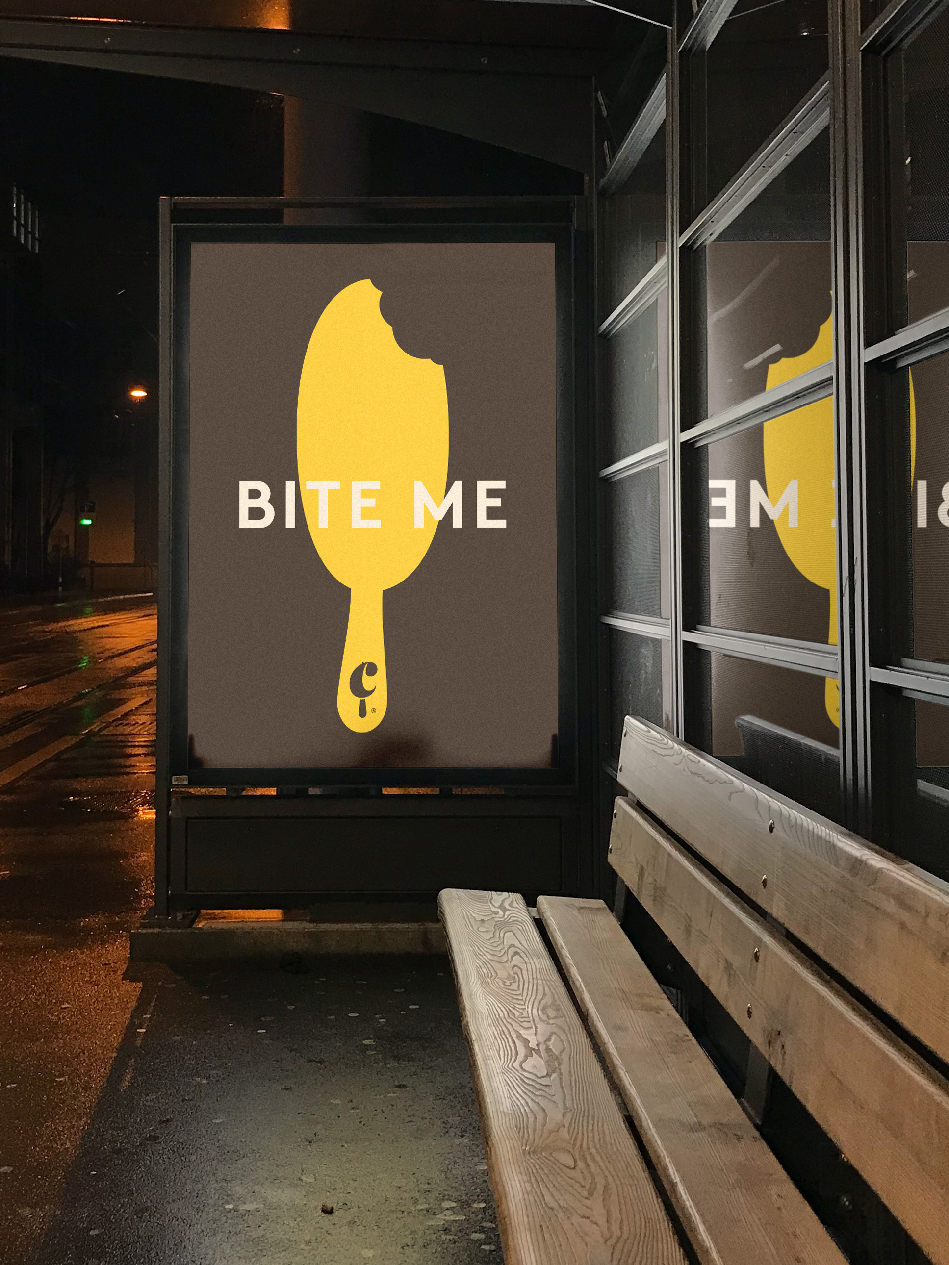
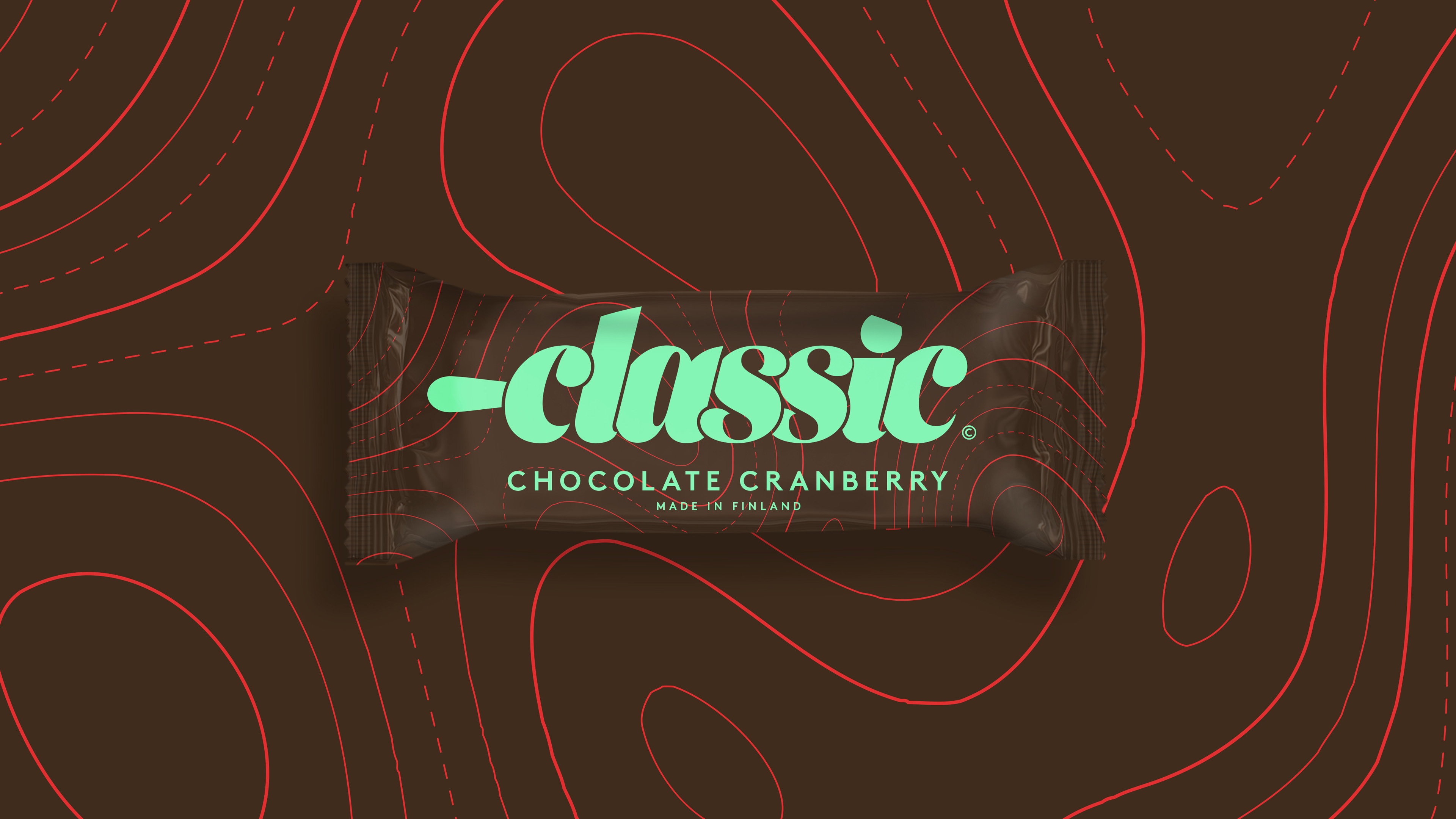
The ice cream bar, cast in Classic's own mould, sits at the heart of the brand, so it shaped the identity. The logotype takes the codes of classic luxury lettering and gives them a young, delicious attitude. Its stick and the cuts of the real mould are drawn into the letters. A monogram carries the same bar in a smaller, quirkier form.
Chocolate is the foundation, with cream as its indulgent contrast. Together they work like black and white, only warmer. The logotype stays in these two colours as the premium side of Classic. The monogram and any bright colour bring out the wild side, which keeps the brand open and playful. The new identity reached the shelves in autumn 2018.
Classic jäätelö key facts
- Client
- Froneri
- Expertise
- Brand building
- Disciplines
- Creative concept, visual identity, packaging design
- My role
- Creative concept, art director, lead designer
- Timeline
- 2017–2019
- Agency
- Mirum (now part of VML)