CurifyLabs
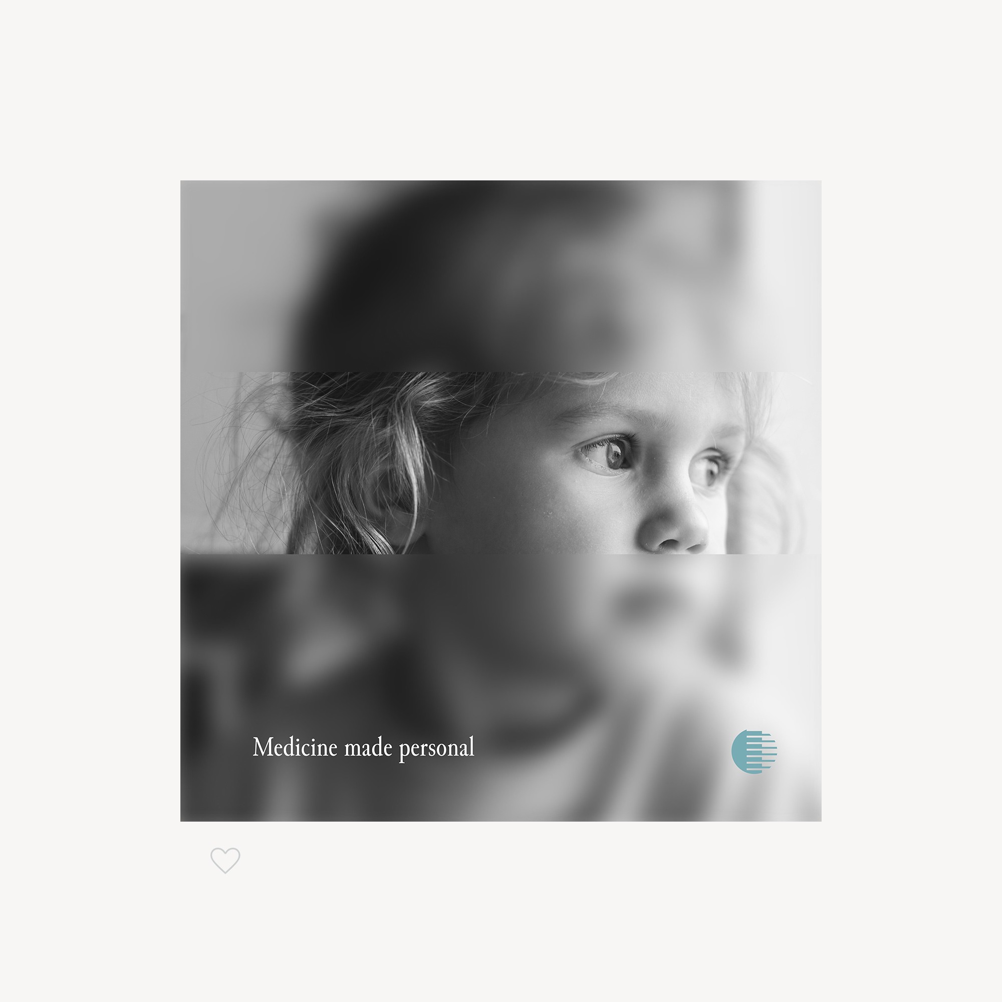
A funding round was coming, and the brand still spoke mostly about pets. CurifyLabs lets pharmacists make personalised medicine by 3D printing it, so the old message confused the customers and investors it needed. I gave it a focused brand upgrade and a new website, on a startup budget.
How I refocused a pharma startup from pets to pharmacies?
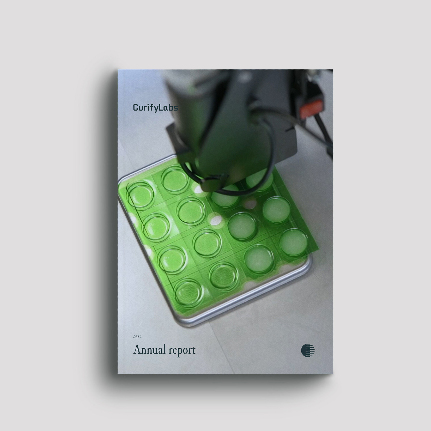
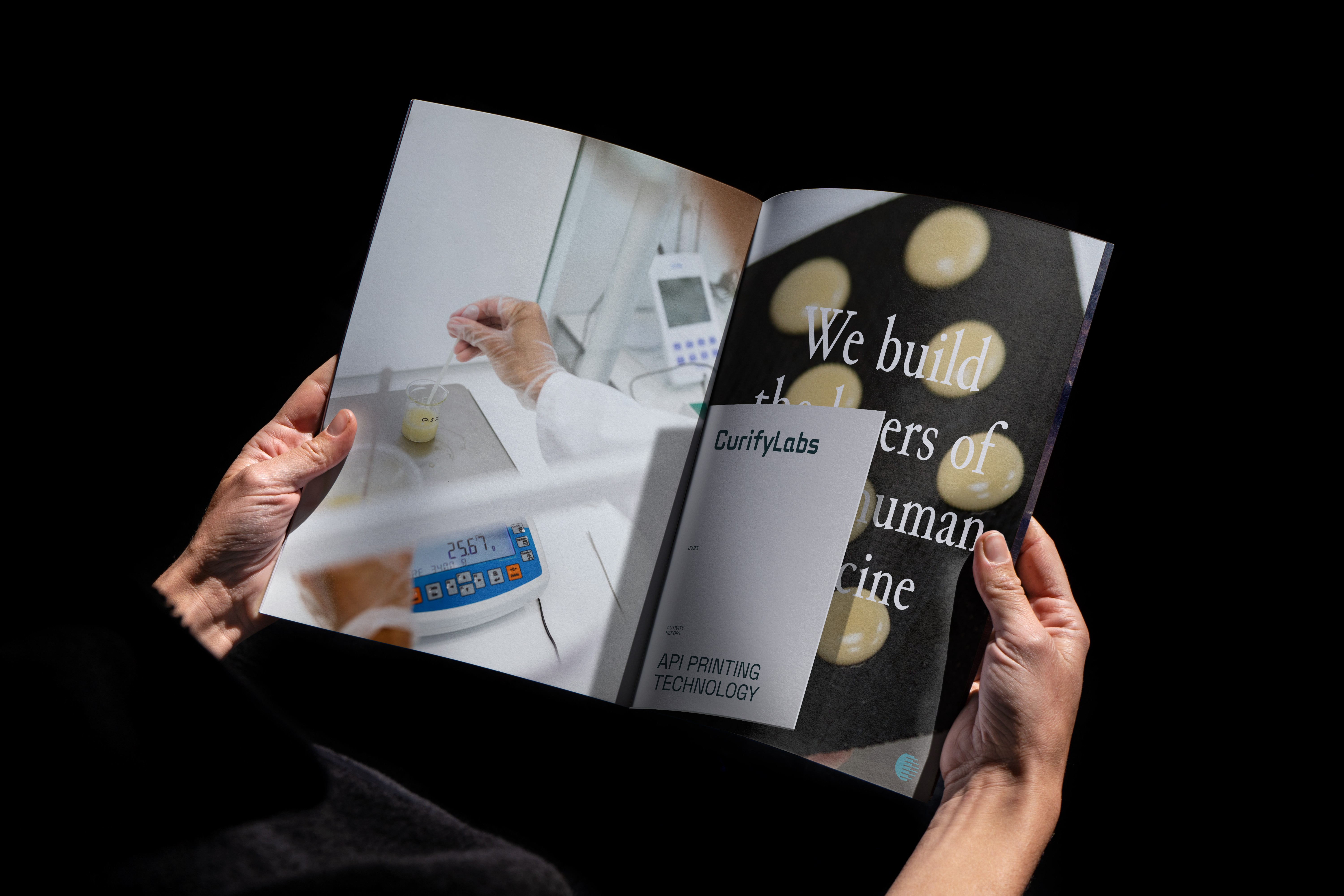
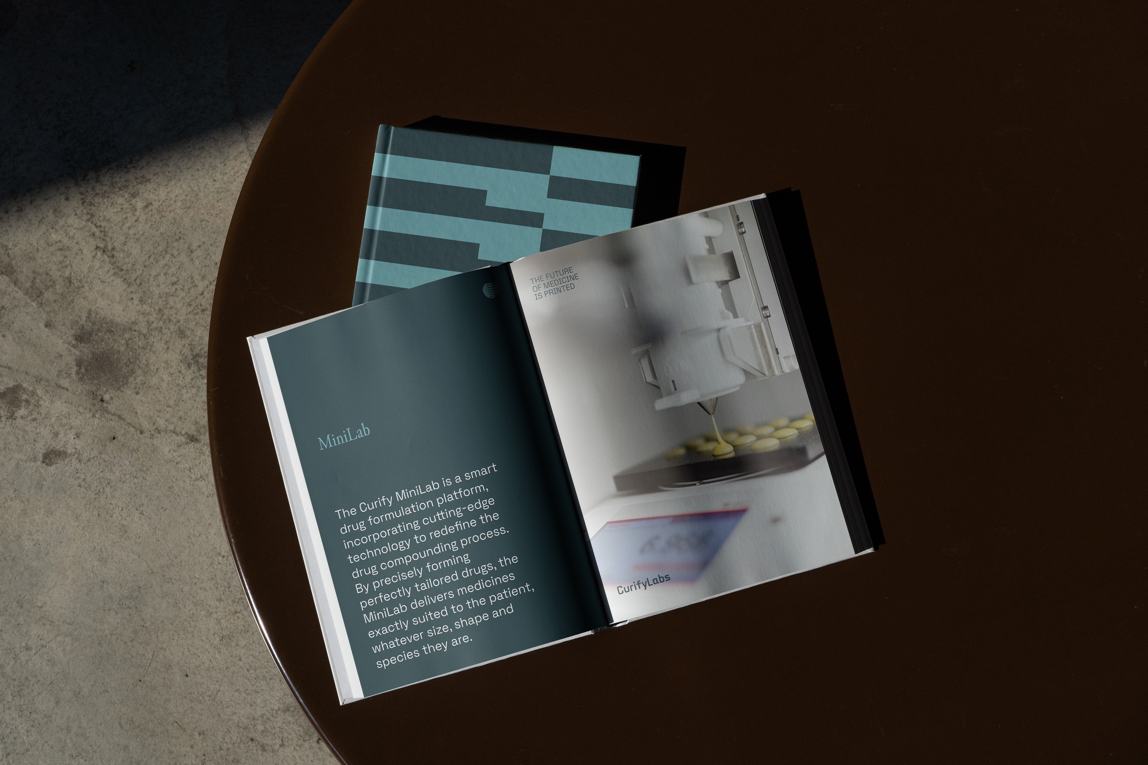
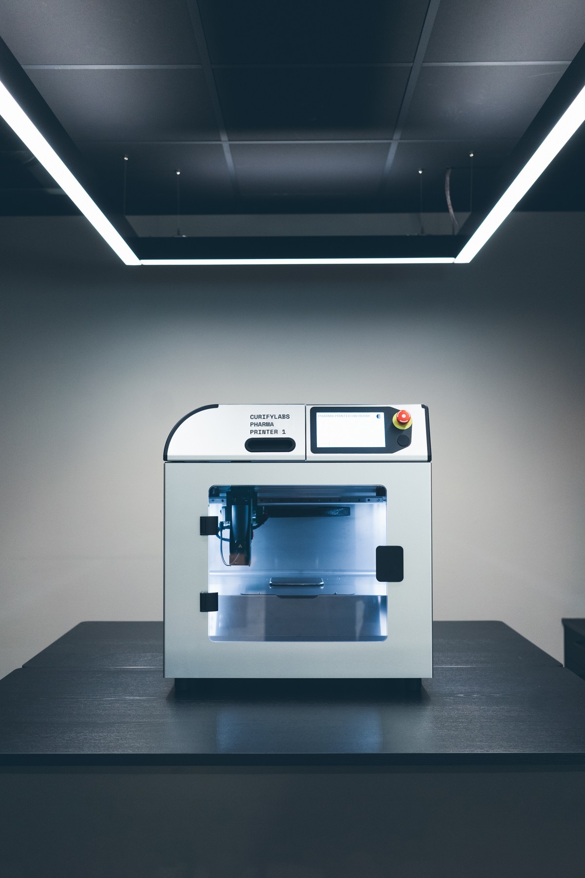
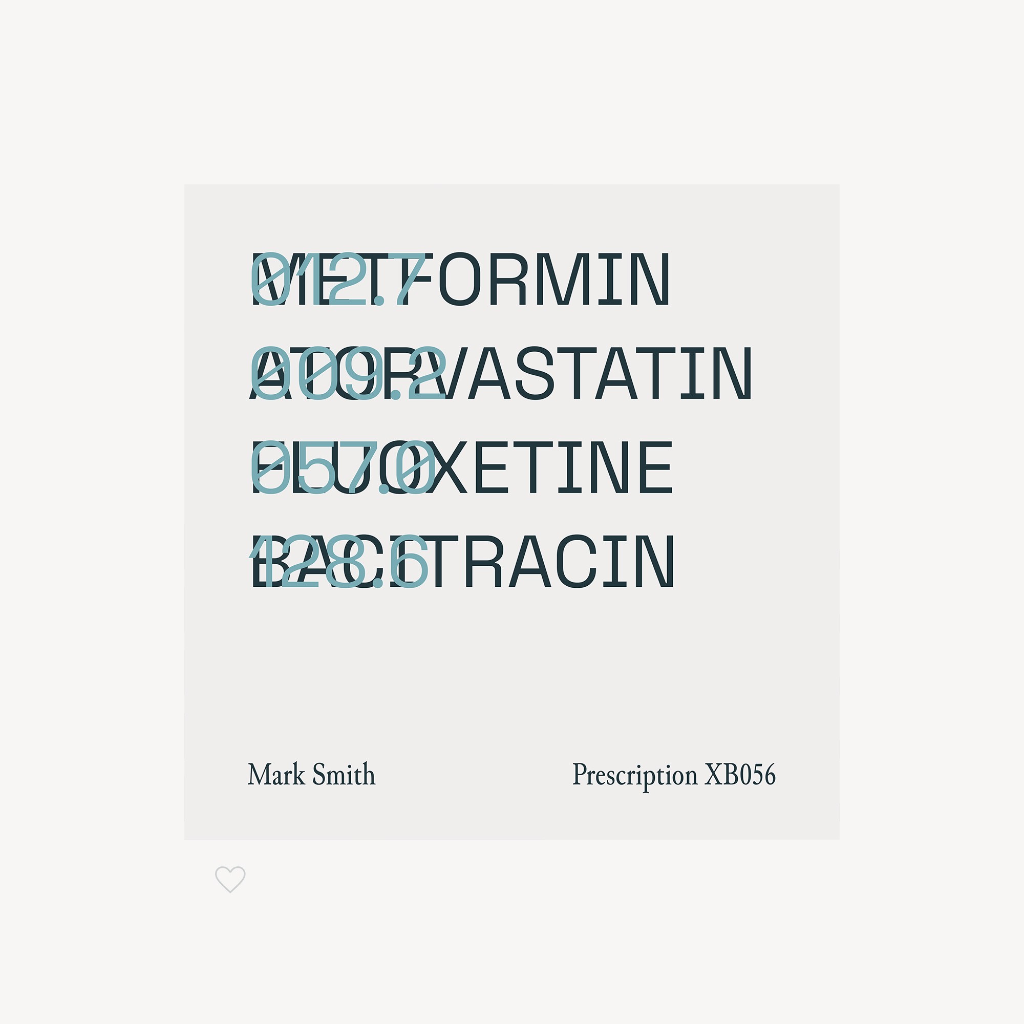
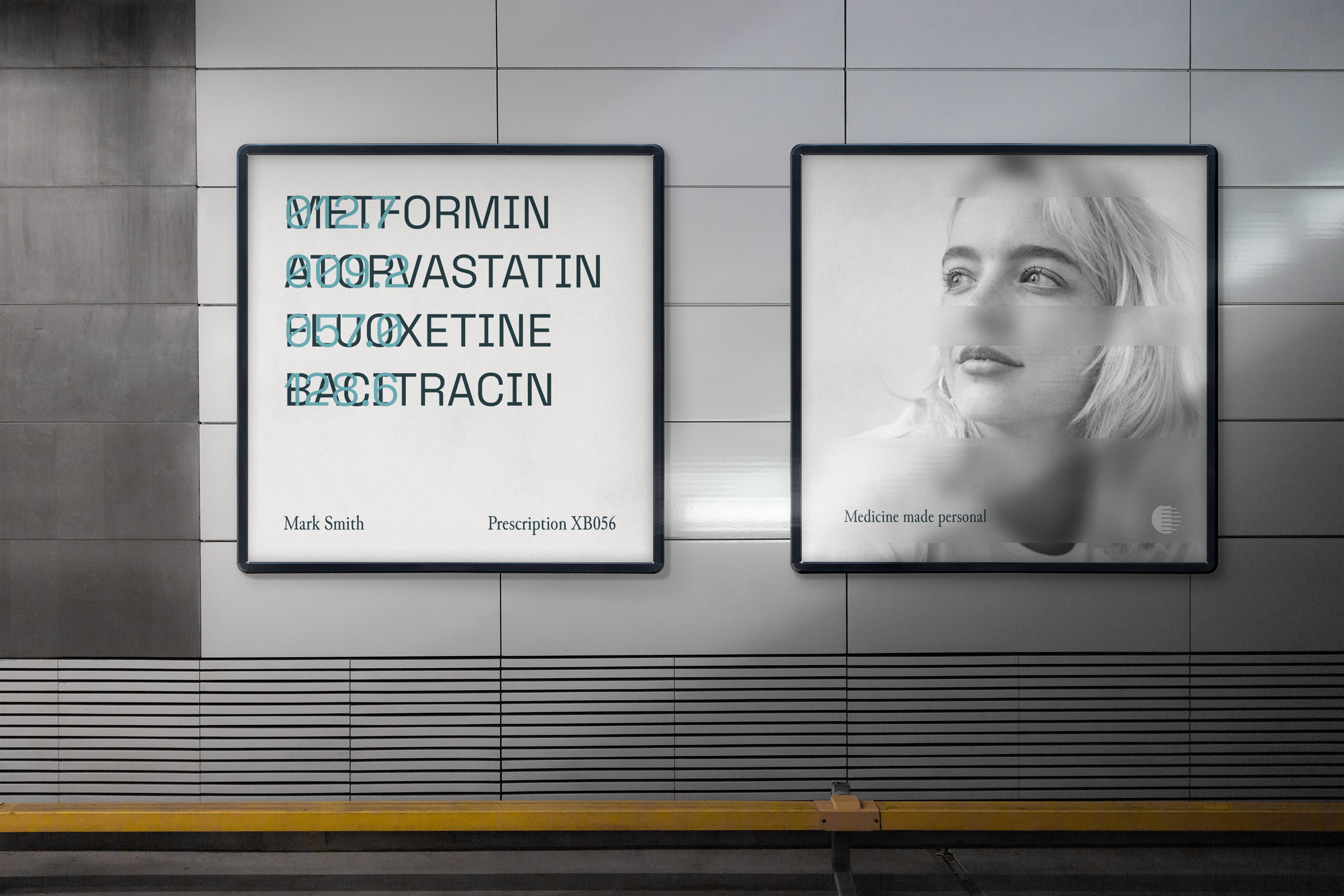
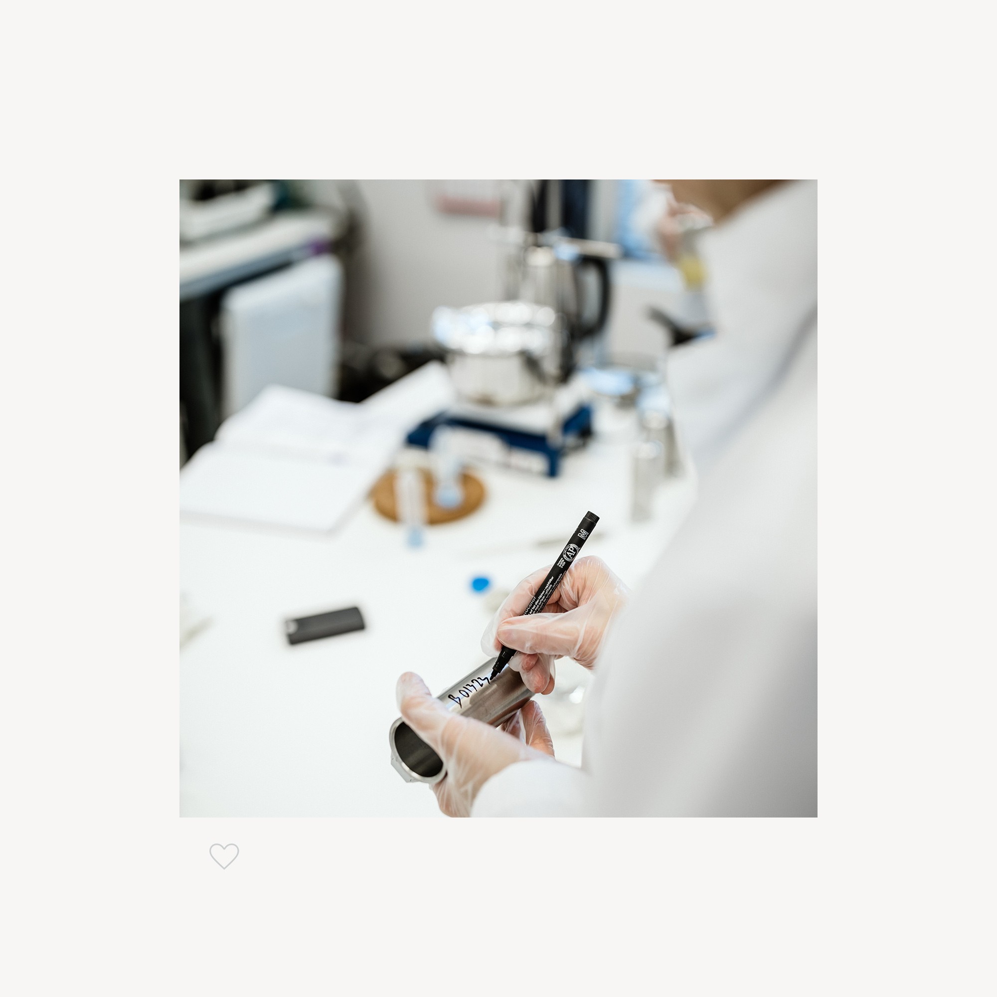
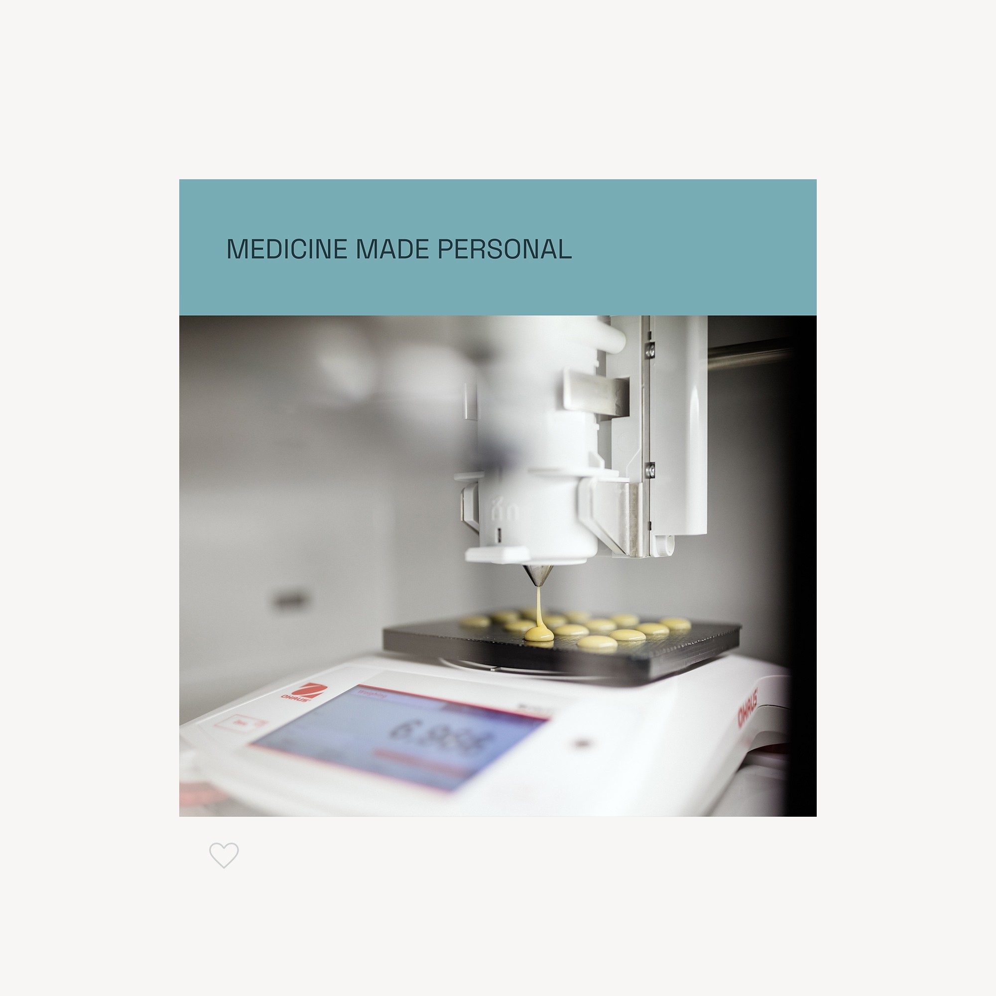
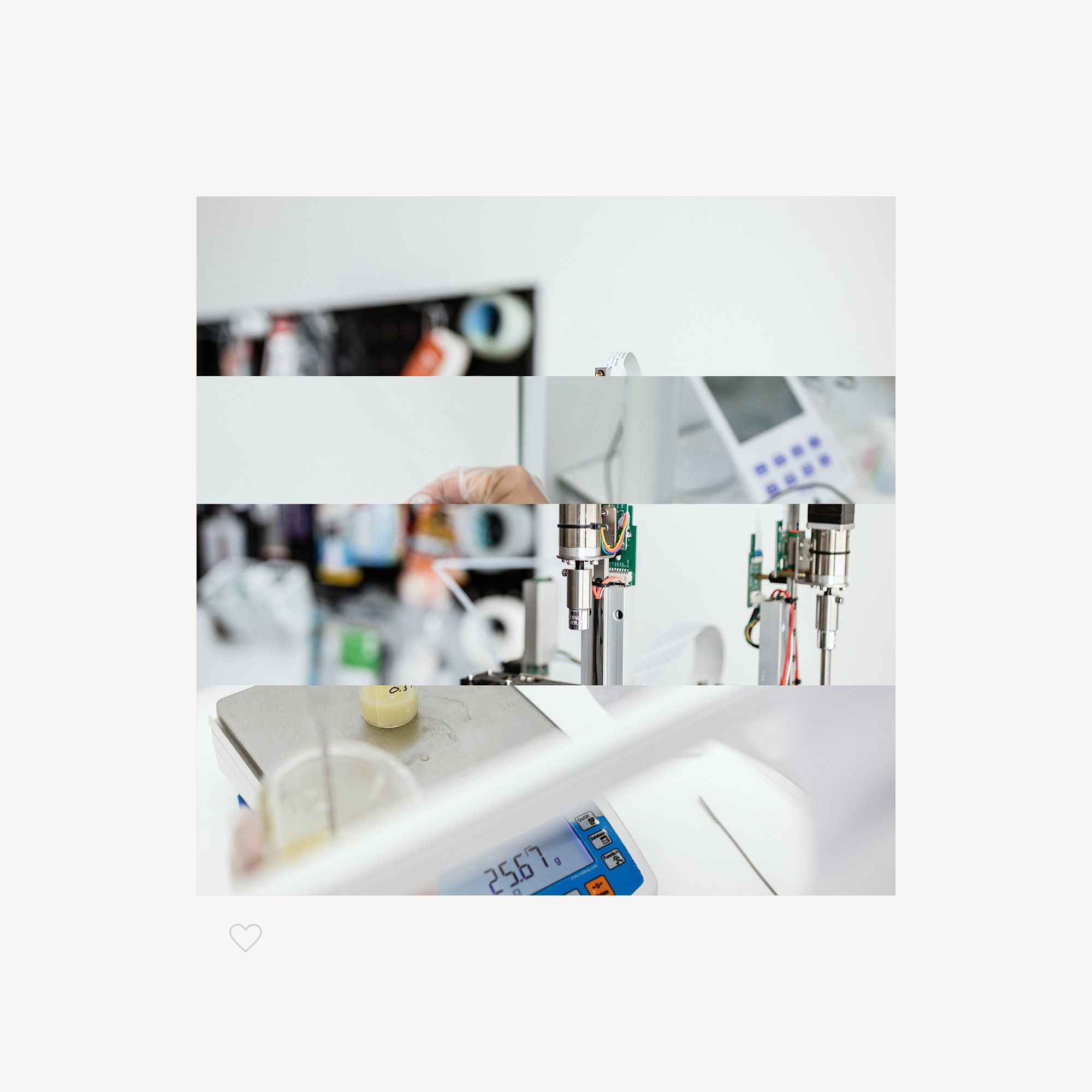
There was no budget for a full rebrand, so the work on CurifyLabs, a platform for compounding personalised medicine in the pharmacy, was surgical. It covered the tone of voice, the website content design and an upgrade of the visual identity. It also covered the art direction of a photo shoot and a new website. I was the sole designer on the project.
How printing layers shaped the identity?
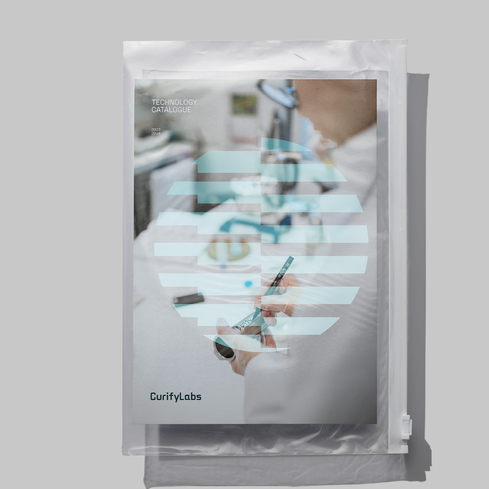
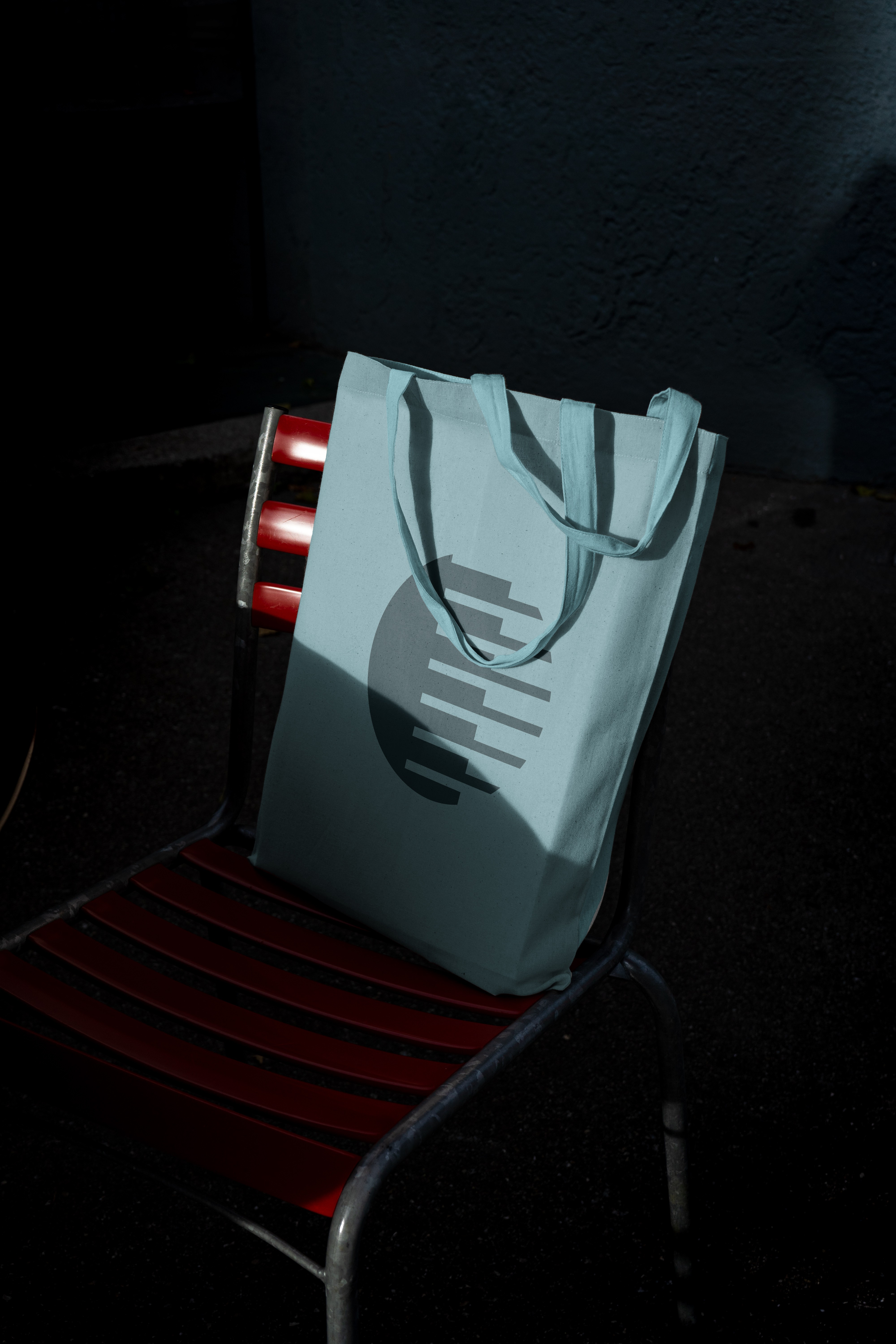
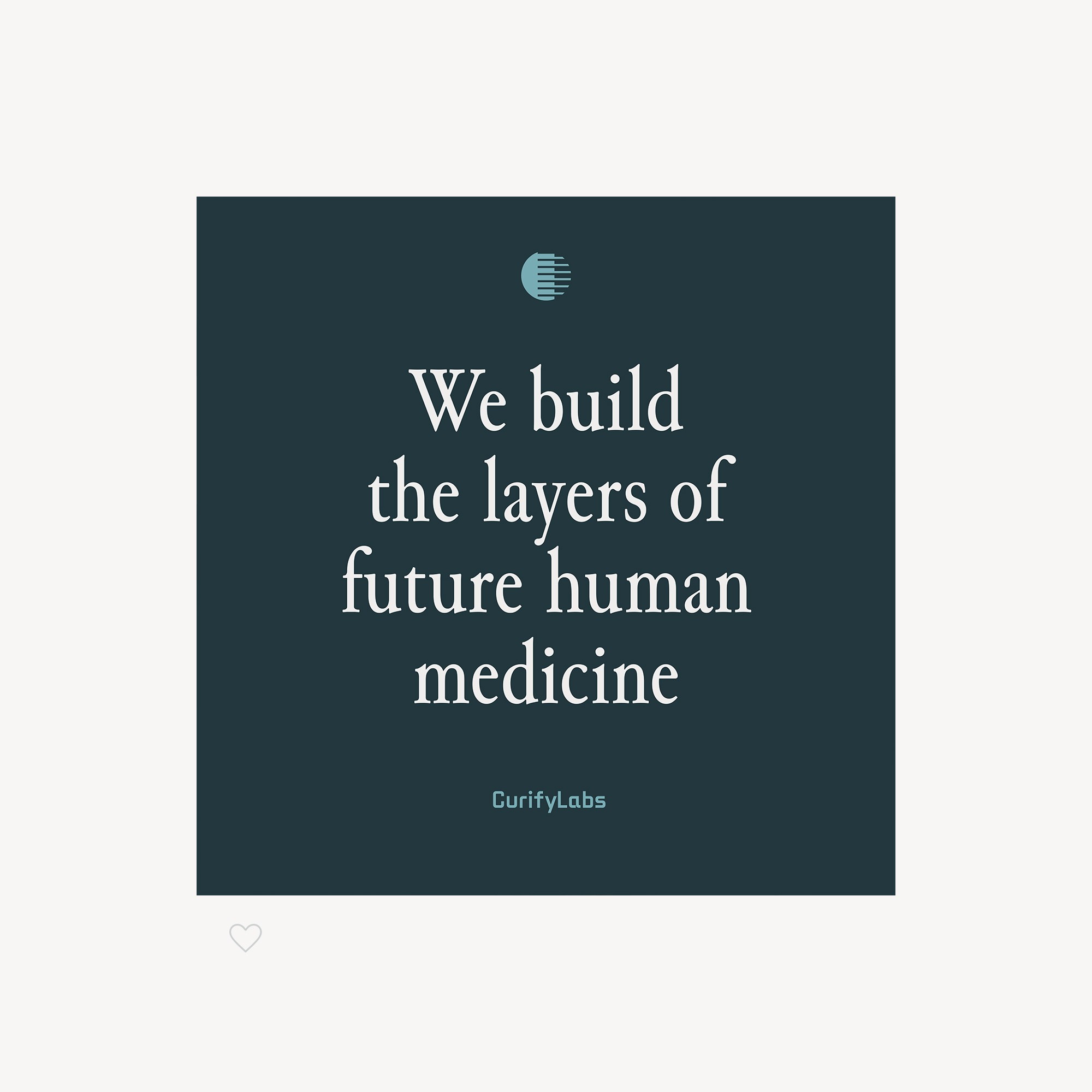
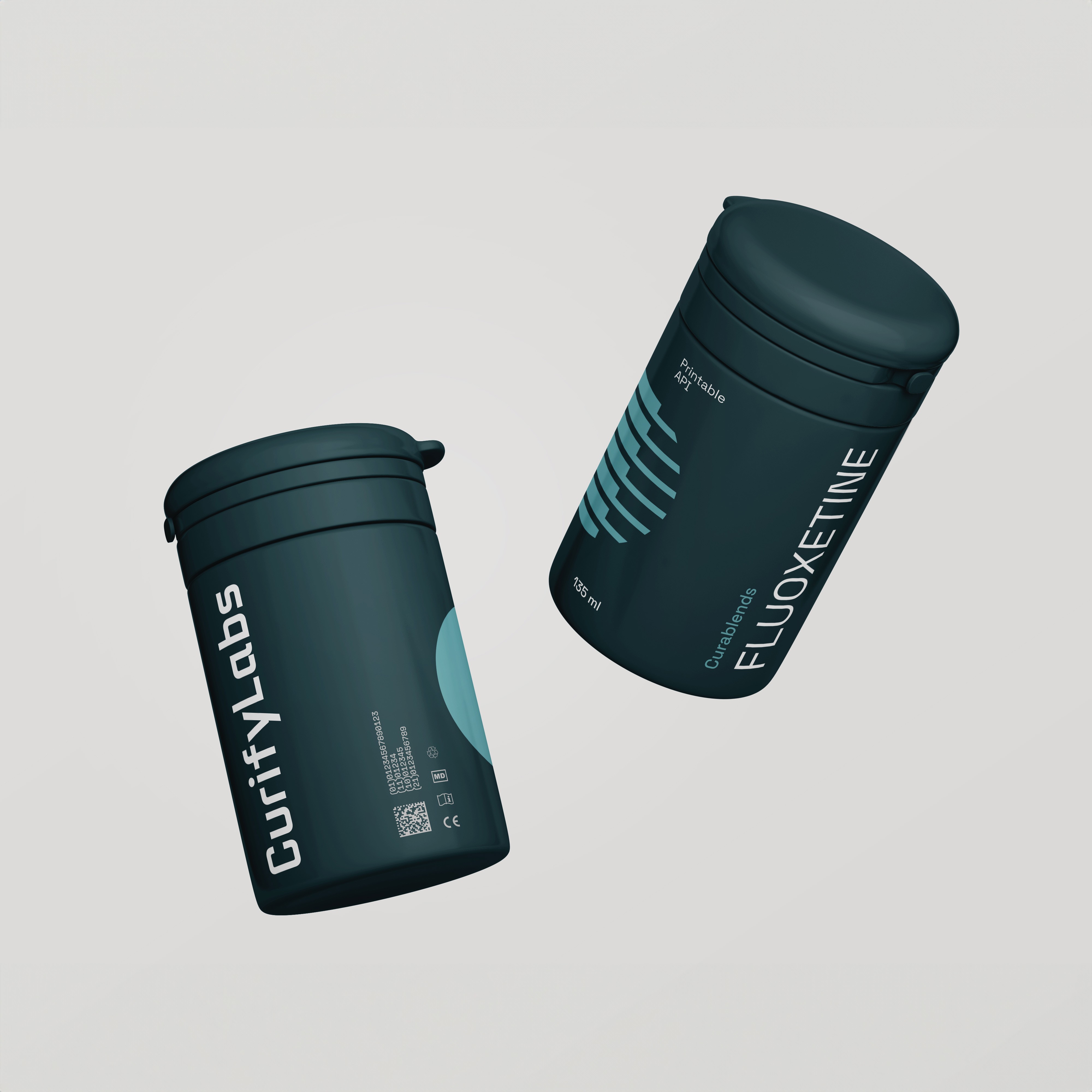
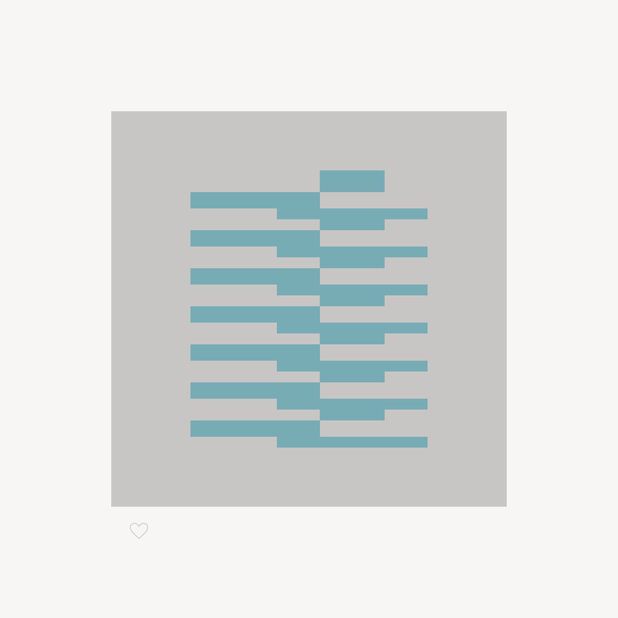
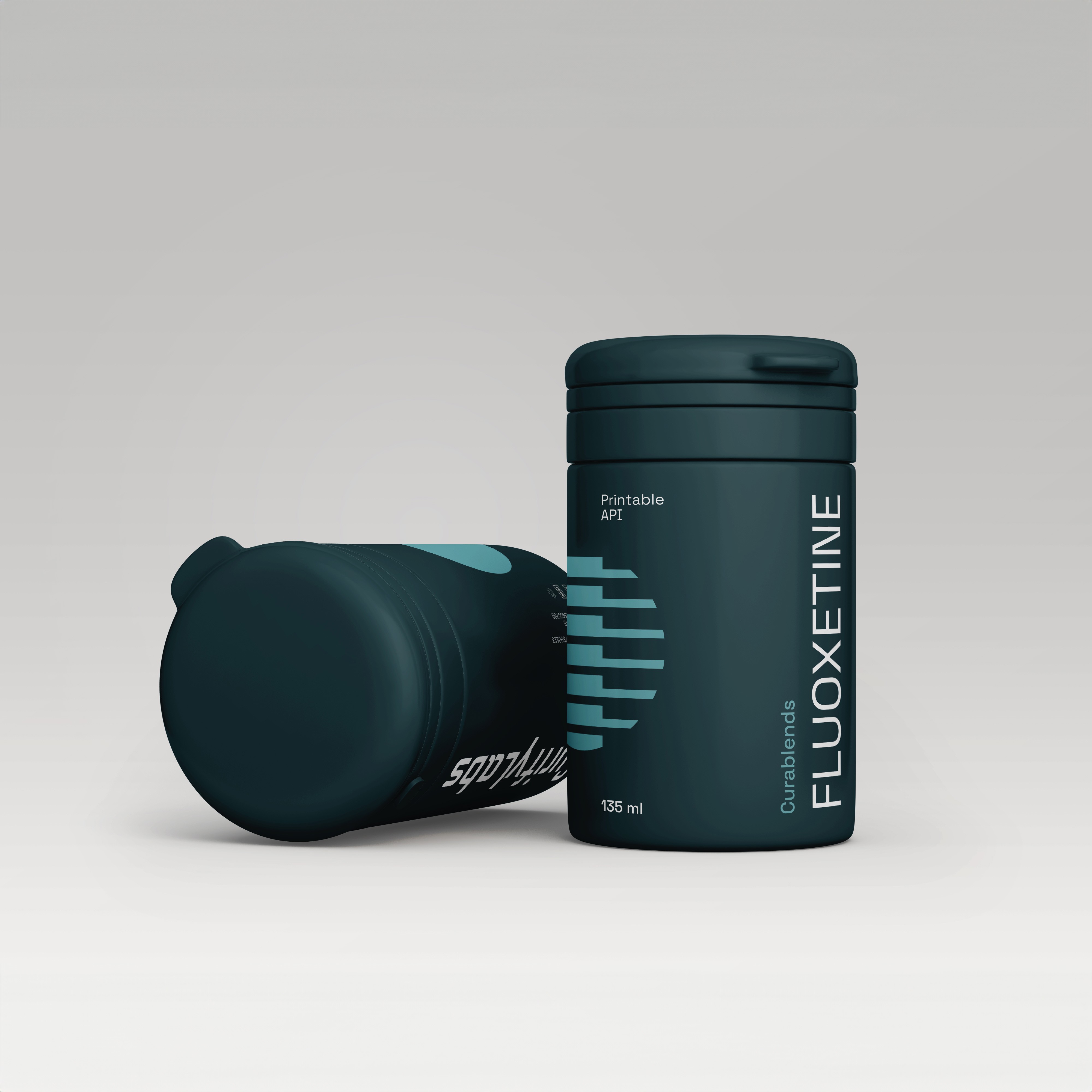
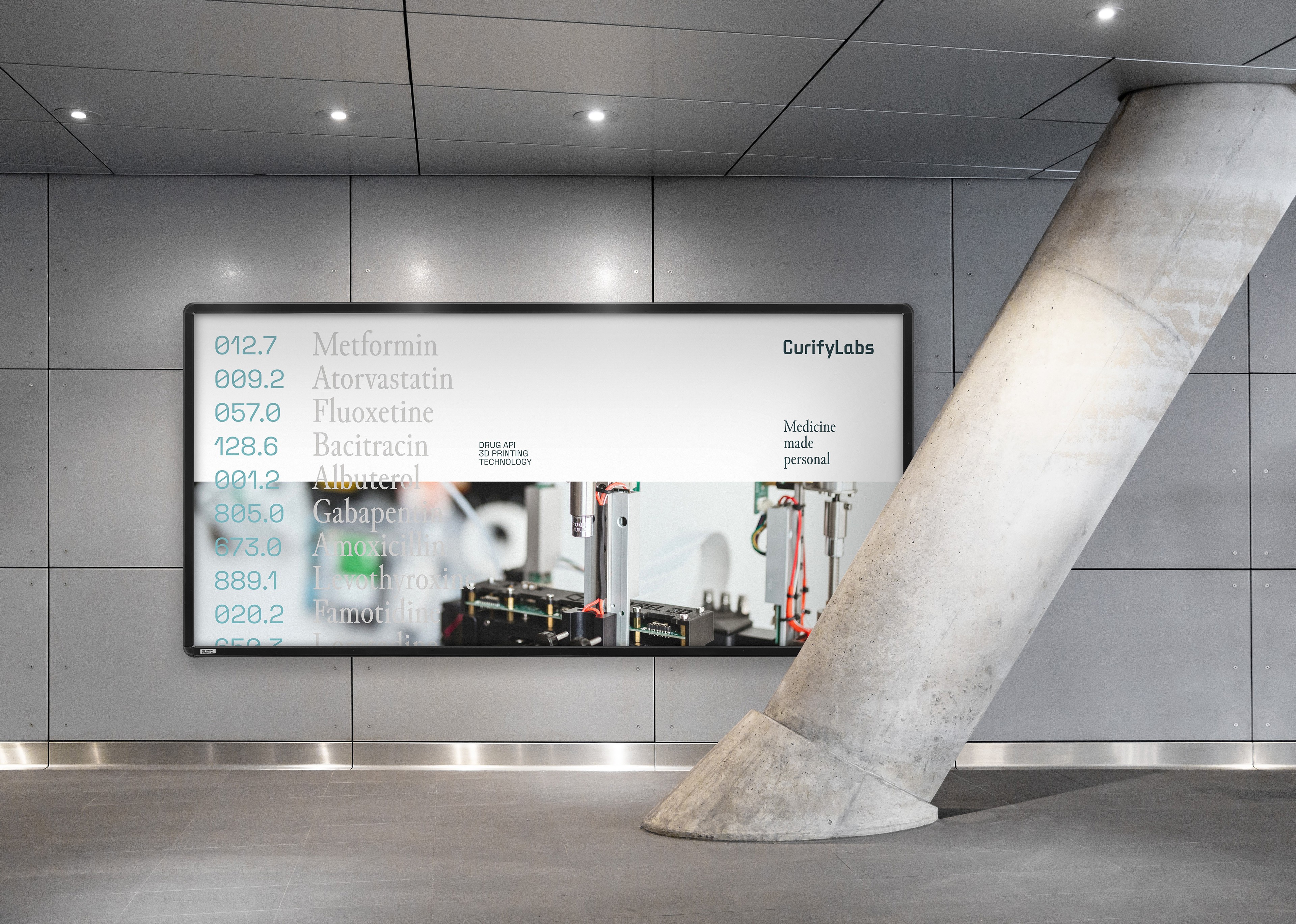
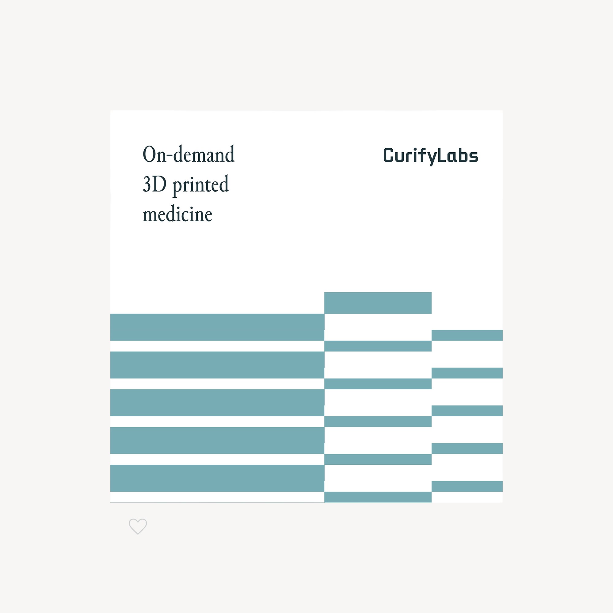
The creative concept is short: "We build the layers of future human medicine." The symbol is a pill and the layers a printer lays down, so the technology sits inside the mark. Every animation and graphic comes from the same idea: the pill, the print layers and the printing mechanics.
How the website was built to capture leads?
The website is where CurifyLabs captures its leads, so its content was designed around the customers and their journey. Five key pages set the concept, with a digital style guide to build and grow the rest. The site is built on HubSpot, on a marketplace theme adapted to the identity, so the marketing runs on one platform.
CurifyLabs key facts
- Client
- CurifyLabs
- Expertise
- Brand building, digital transformation
- Disciplines
- Visual identity, content design, UX and UI design, art direction
- My role
- Lead designer (sole designer)
- Timeline
- 2023
- Agency
- Werklig
- Photography
- CurifyLabs