Porvoo kaupunki
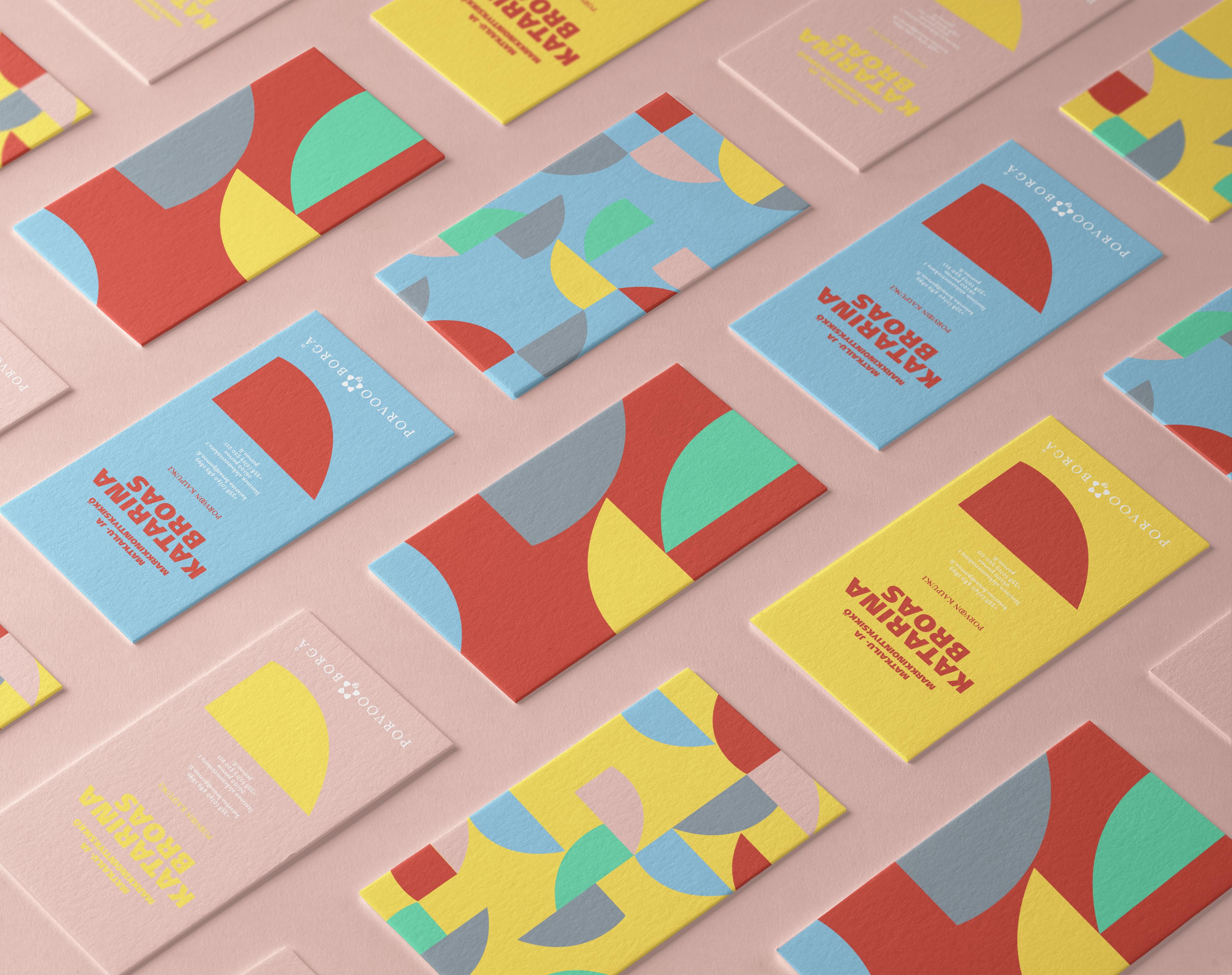
The city of Porvoo felt its visual identity was getting dated and lacked a visual language. It did not want a new identity. It wanted a simple way to use the one it had, creatively. I art directed a graphic system built from the city's existing assets and heritage.
How I brought a city's identity to life without changing it?
The logo stayed. What was missing was a way to bring it to life across the city's communication: a visual system that goes beyond a single logo, with a consistent and recognisable expression. I was art director and lead designer.
How the coat of arms became a doorway?
The coat of arms has marked Porvoo for generations, on stone posts, stamps and souvenir spoons. A shield stands for protection, like a city's duty of care for its people. This one also stands for the wider region and the city's history. As a modern symbol, it became a doorway between the city's heritage and what its future can become.
How the system lets people know, explore and live the city?
The shield splits in two: one half for the past, the other for the future, and the whole for the present. Each part works alone or with the others, framing photographs and building the rest of the system. The shield and the colours help people know the city. Icons invite them to explore its places, landmarks and activities. Patterns and illustrations, cut from the same shapes, show the city as people live it, and anyone can draw them.
The colours come from Porvoo itself, from the traditional cooked paint on its wooden houses, refreshed for today. Two original city colours stayed, so the change felt natural. The city adopted the system across its communication.
Porvoo kaupunki key facts
- Client
- Porvoon kaupunki (City of Porvoo)
- Expertise
- Brand building
- Disciplines
- Graphic system, visual identity
- My role
- Art director, lead designer
- Timeline
- 2019
- Agency
- Mirum (now part of VML)