Tirol digital brand identity
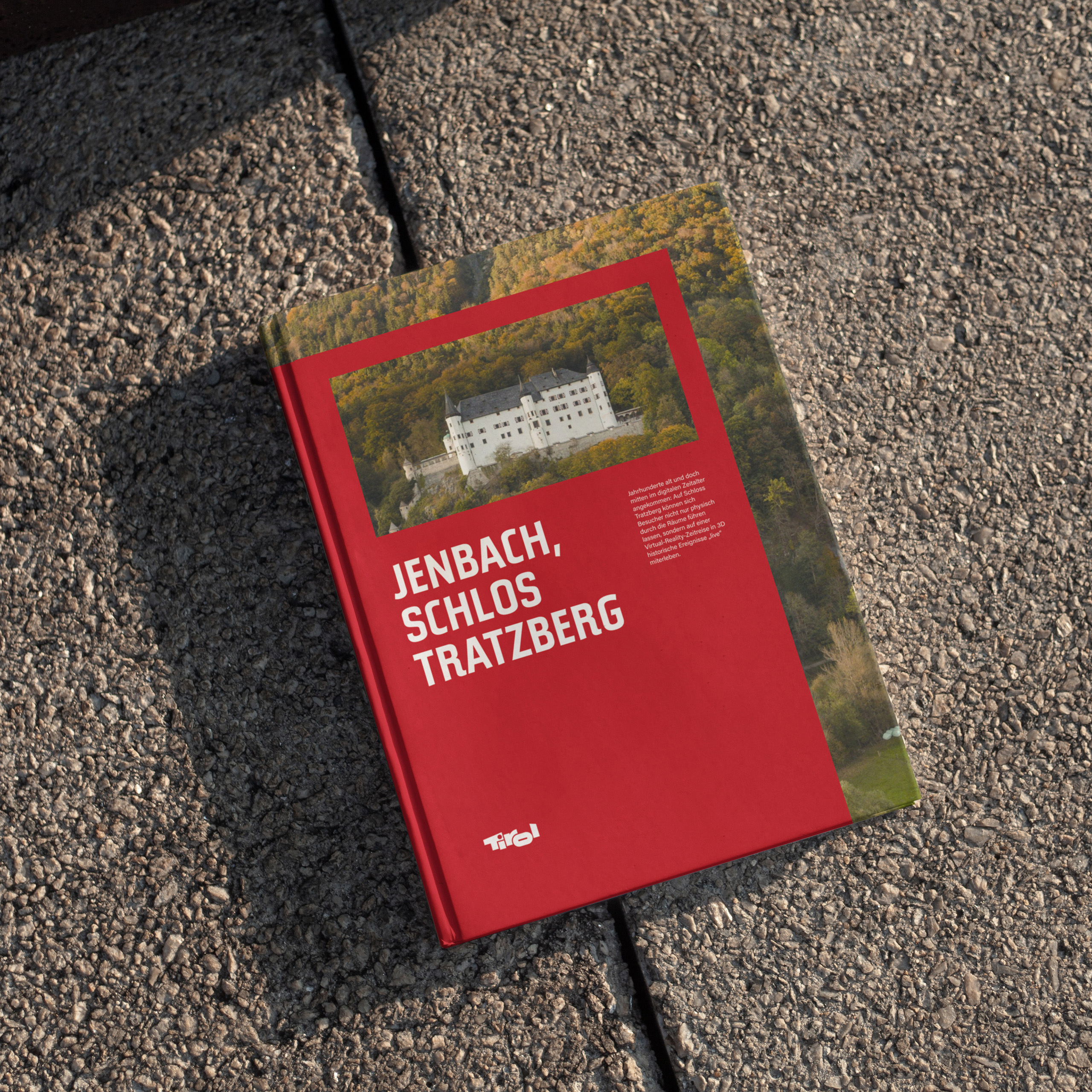
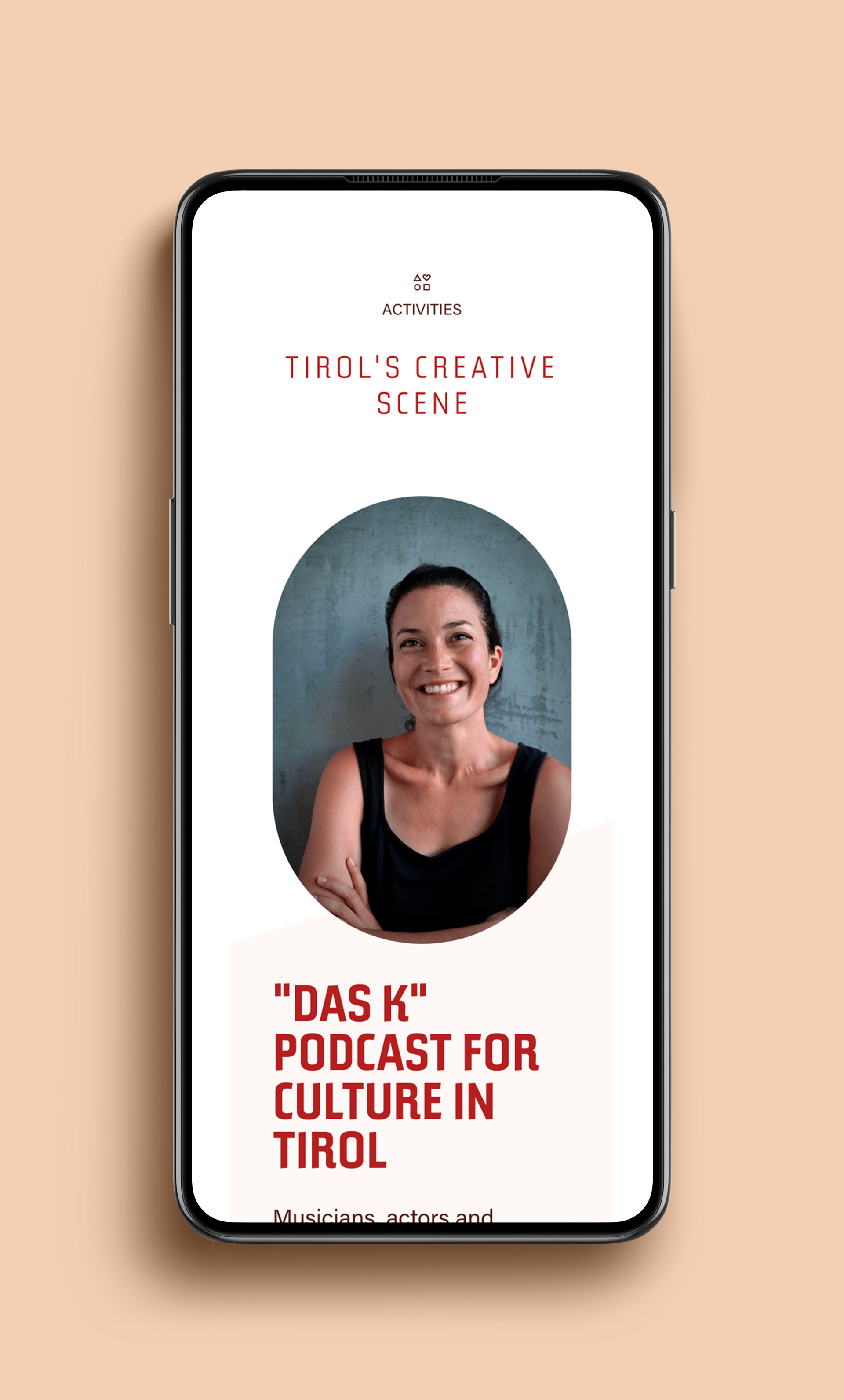
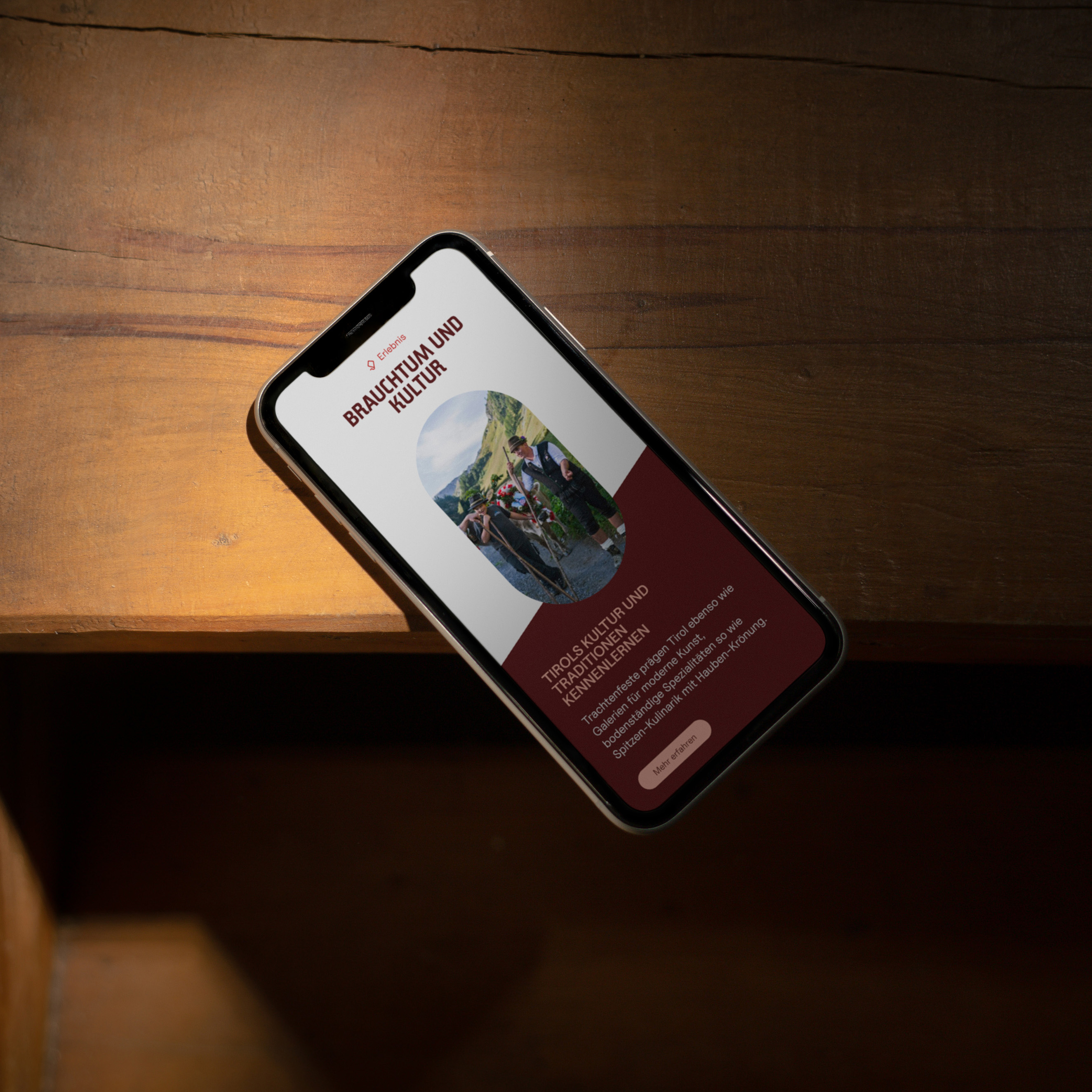
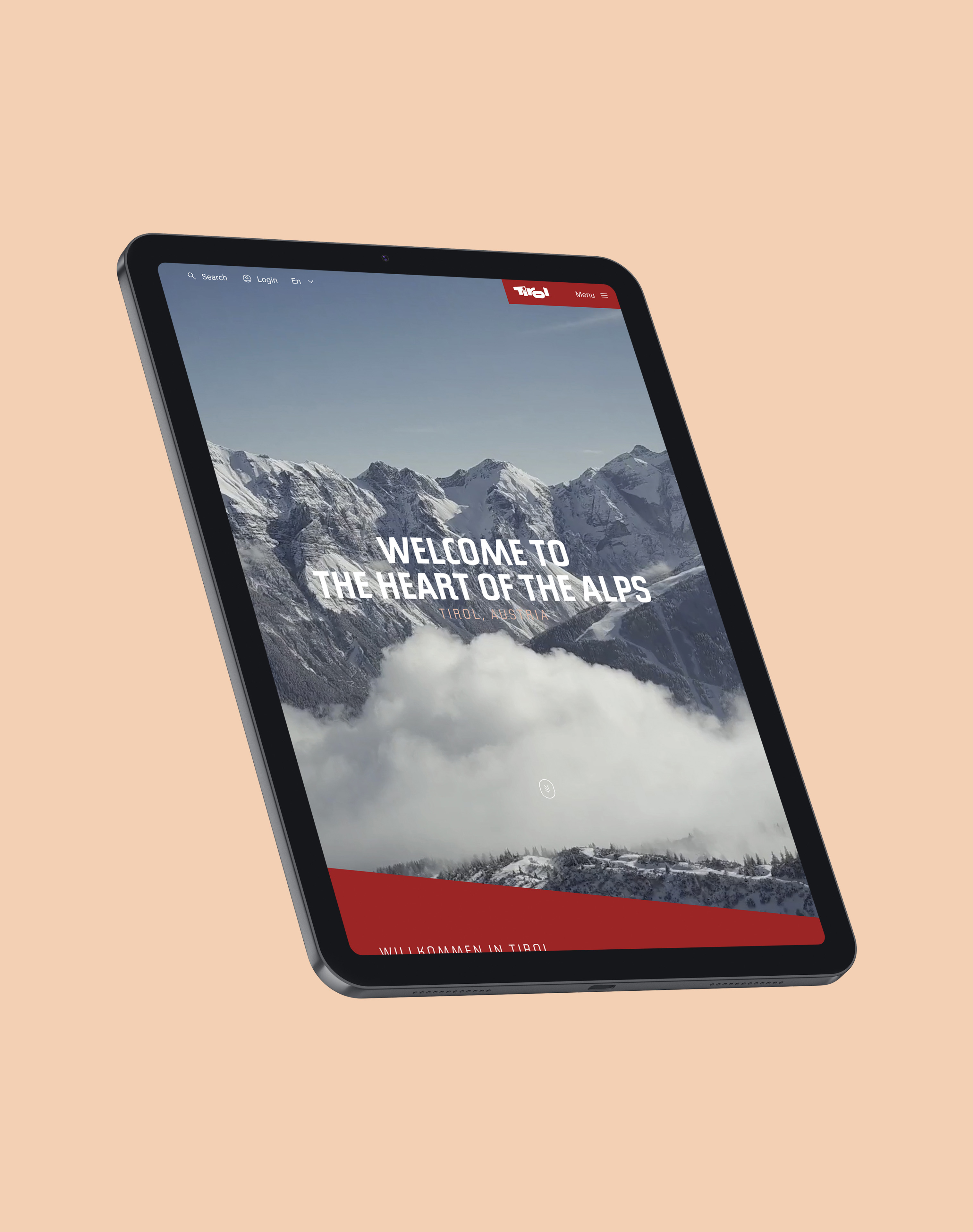
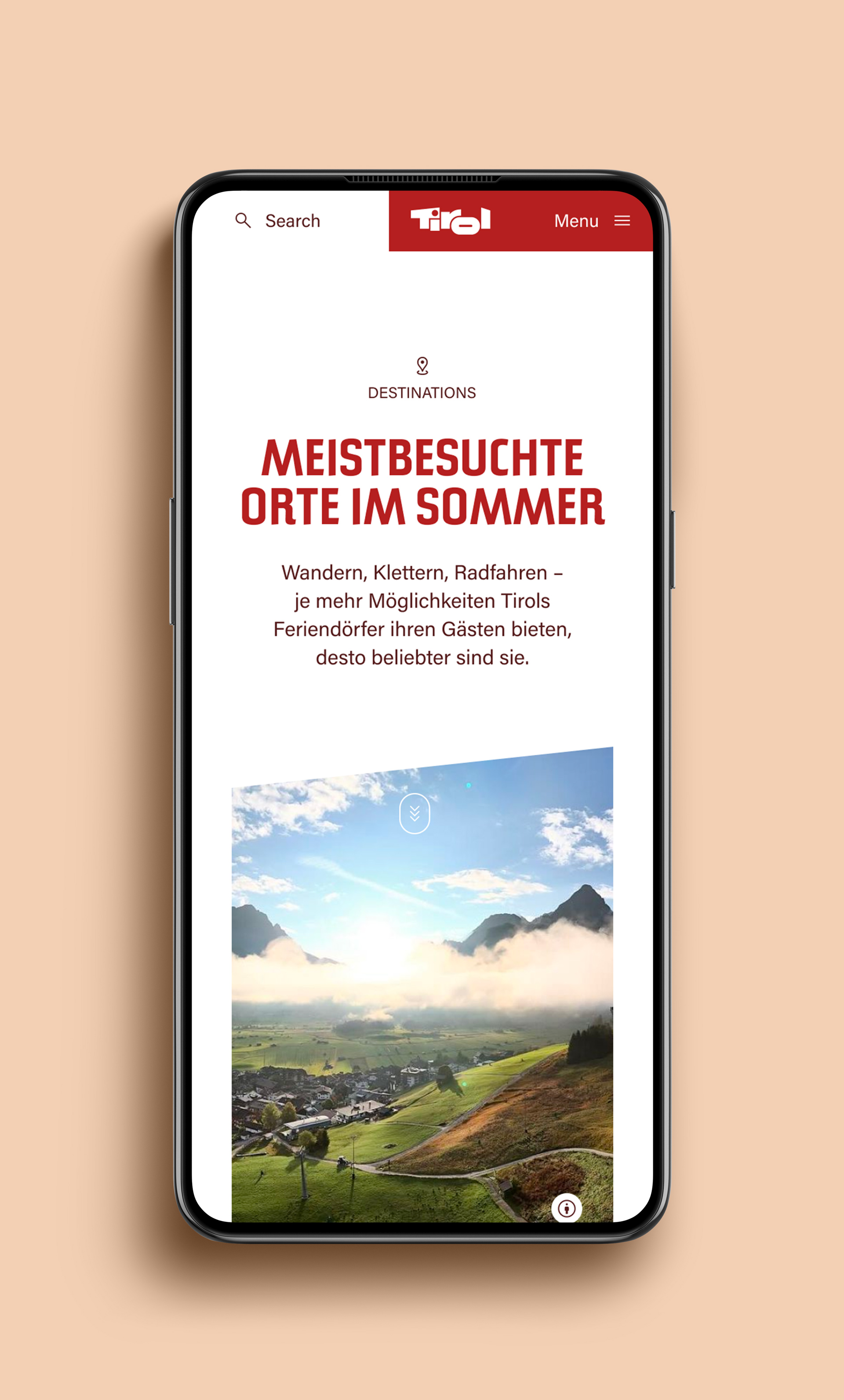
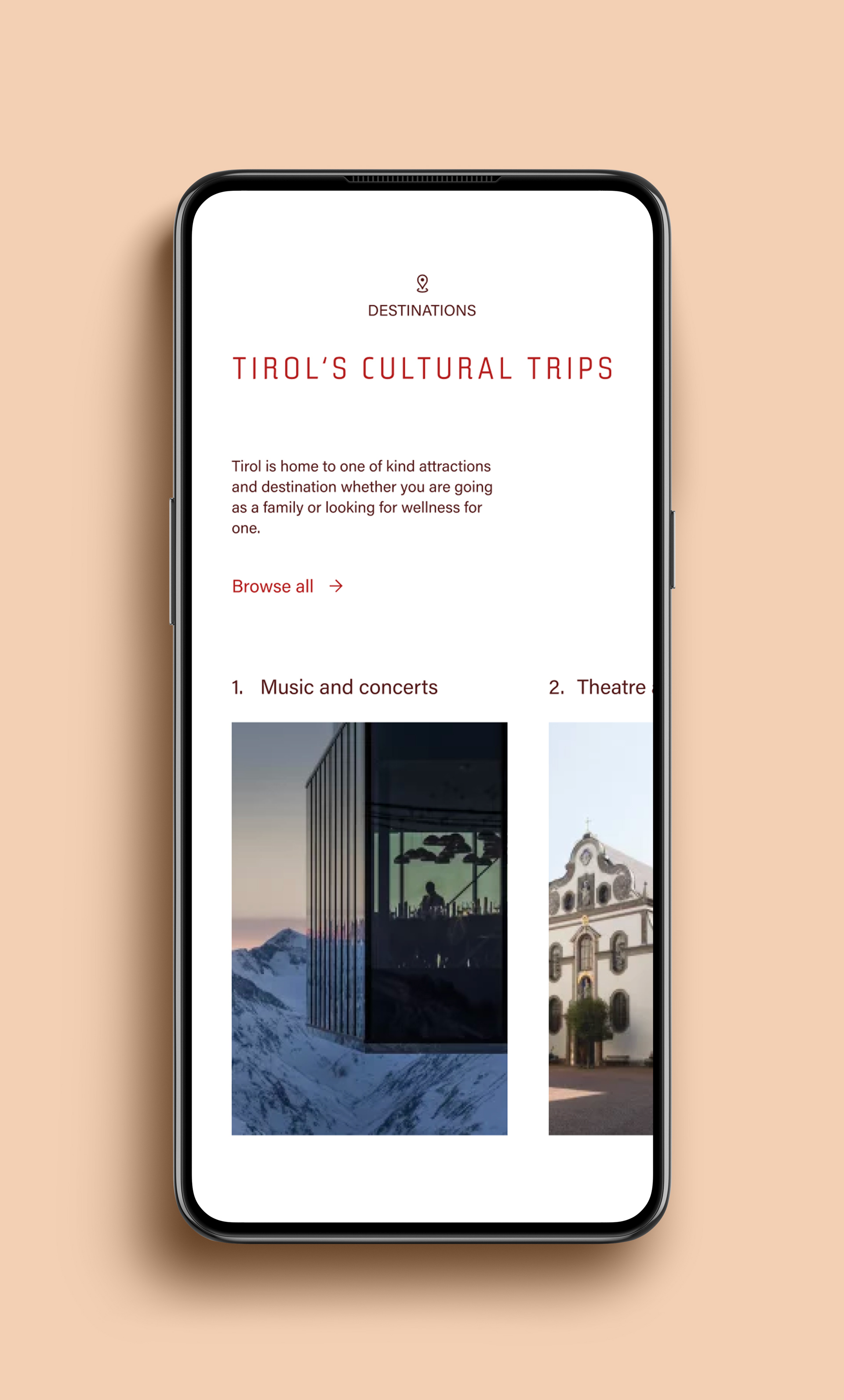
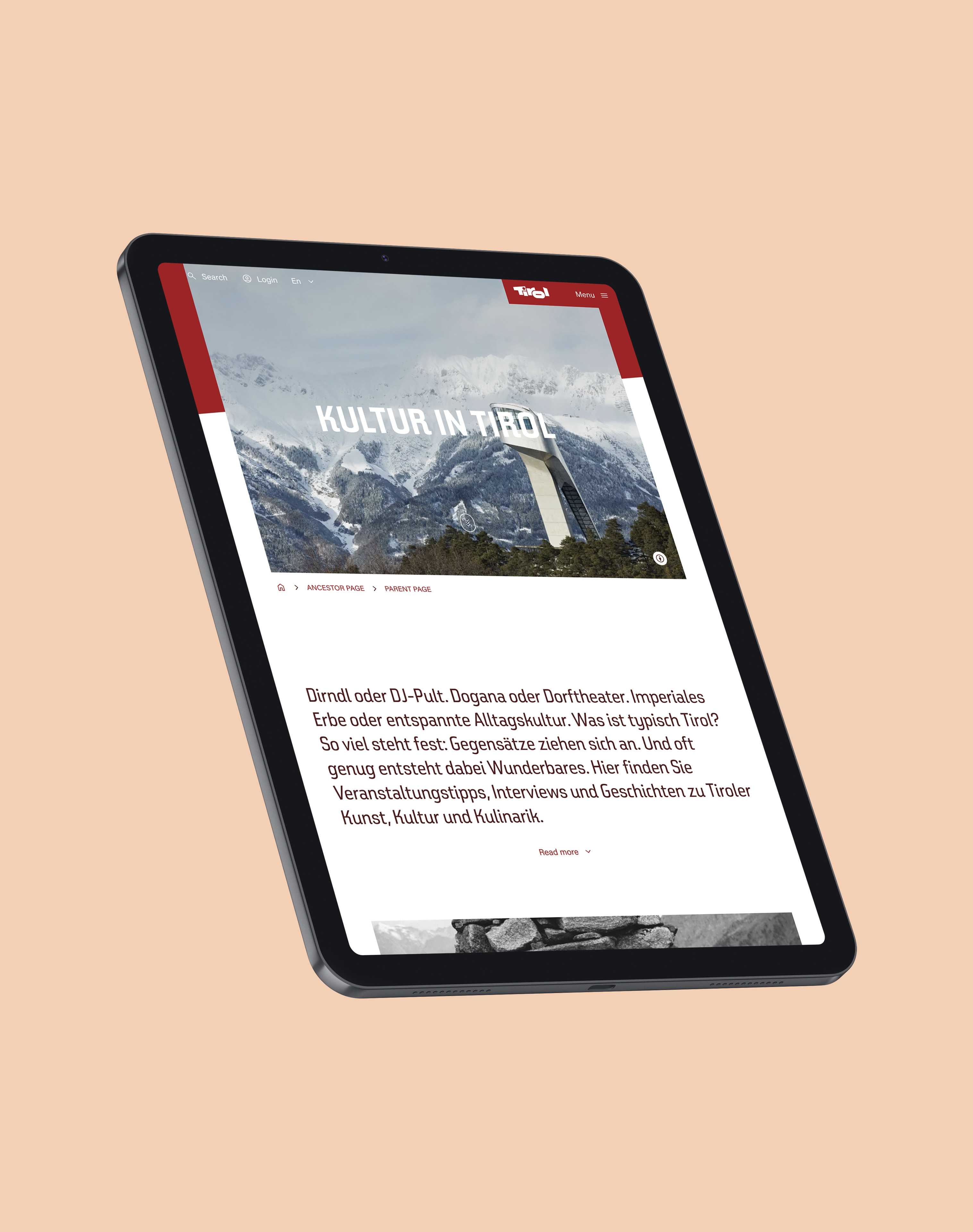
Tirol asked for a contemporary digital interpretation of its brand, without changing the logo or the typefaces. I worked out how the brand should behave on screen and beyond. The answer is a brand ready for the contemporary world, with a motion system and toolkits for social media, banners and video, built around the frame of Tirol's red logo. The window to Tirol was born.
How I brought a print-era brand to life on screen?
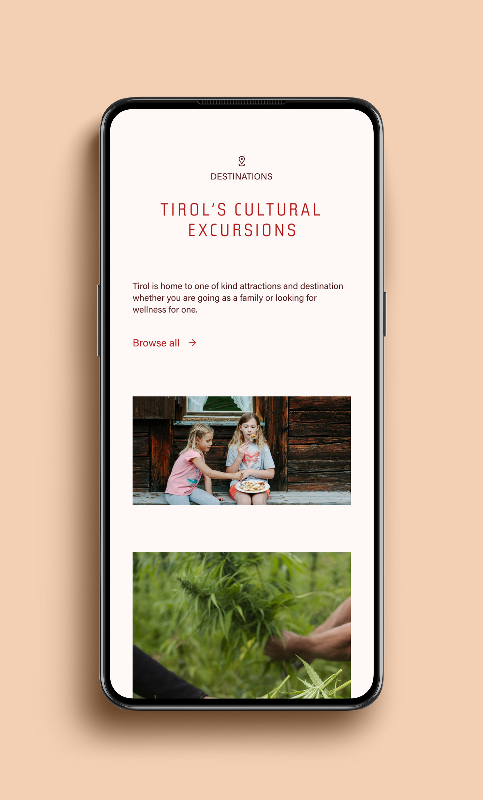
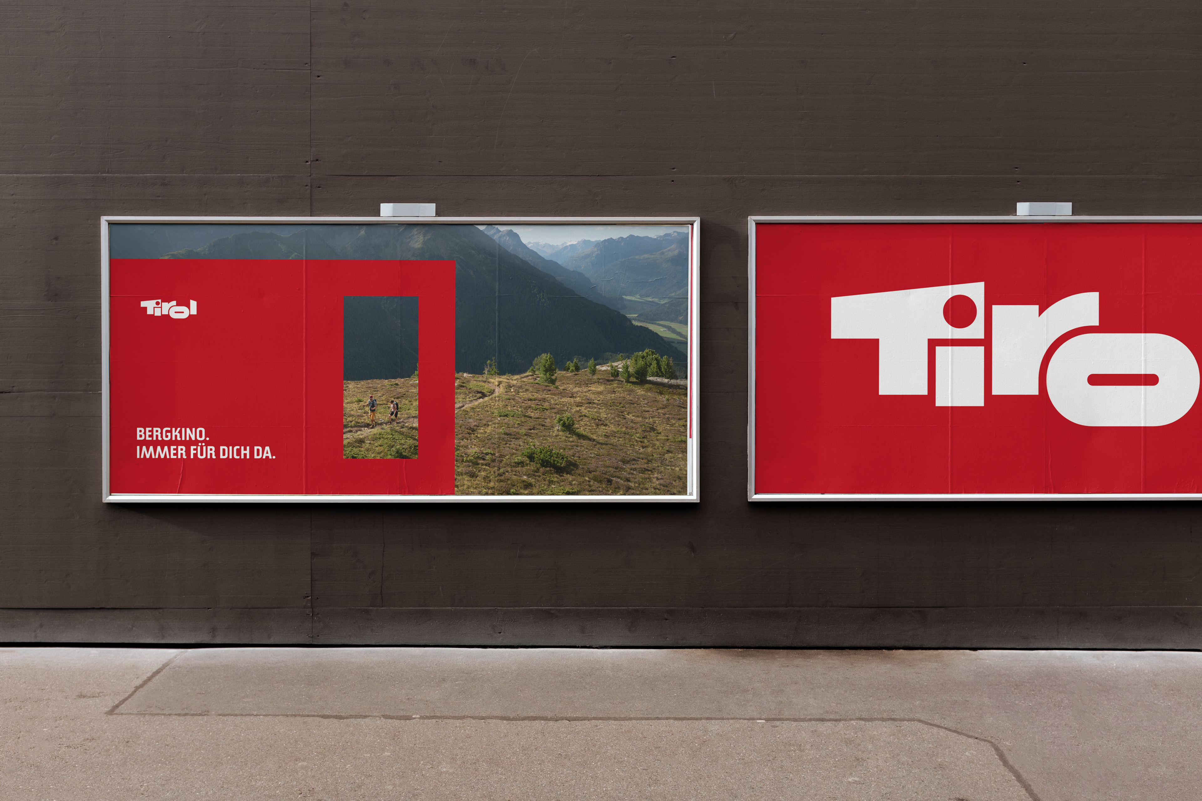
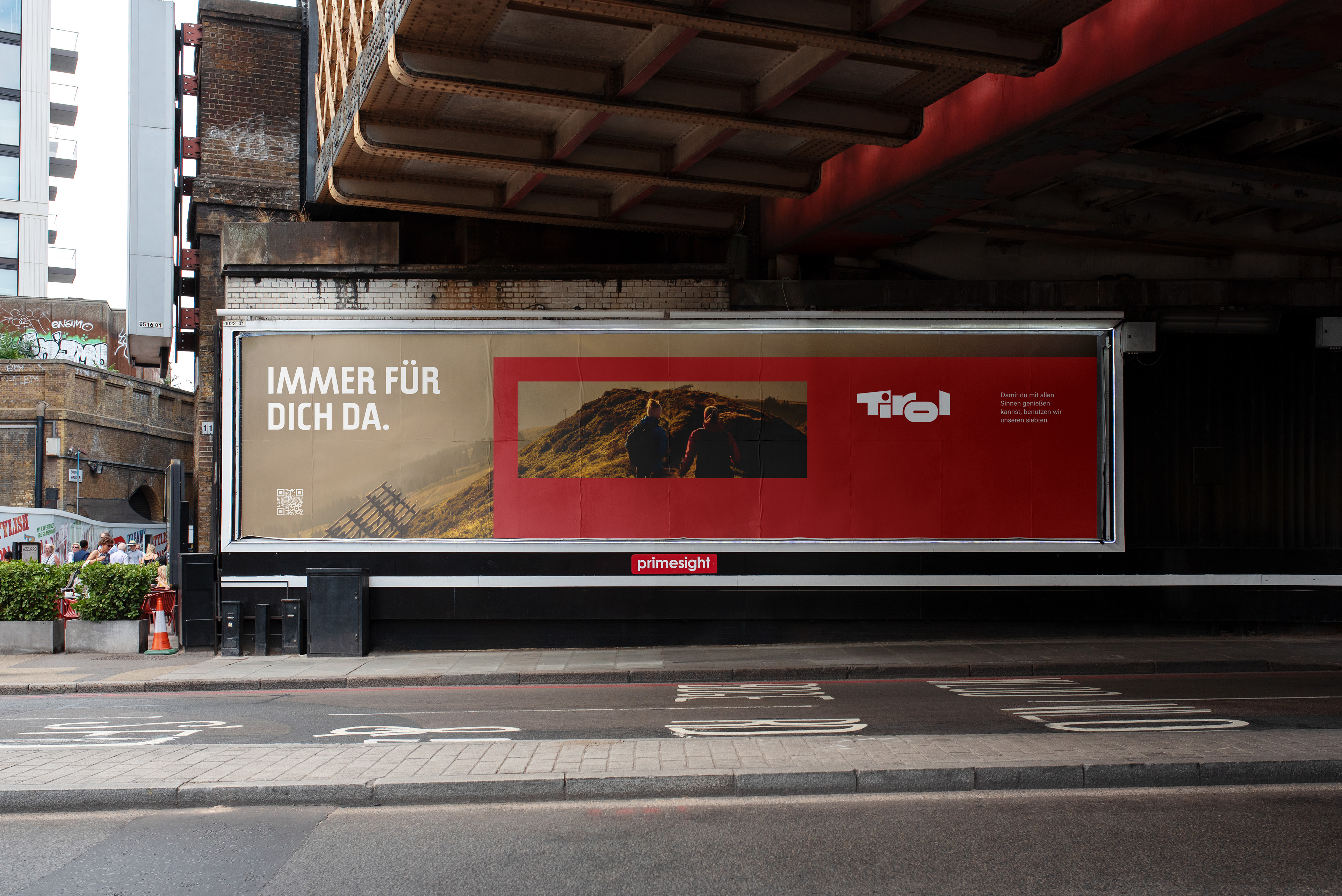
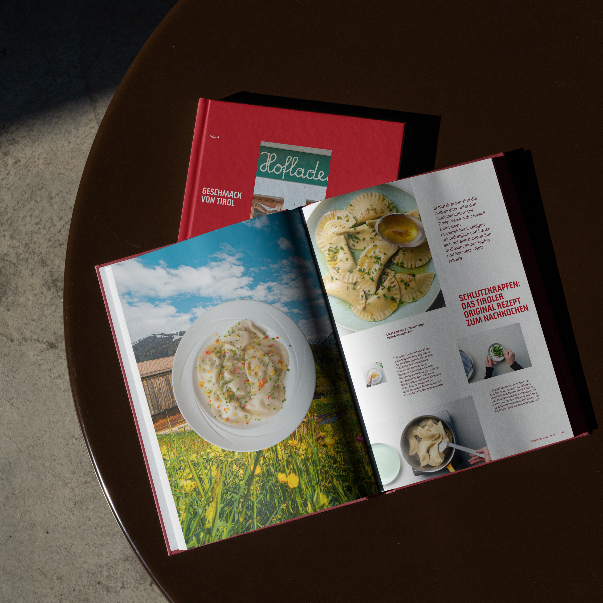
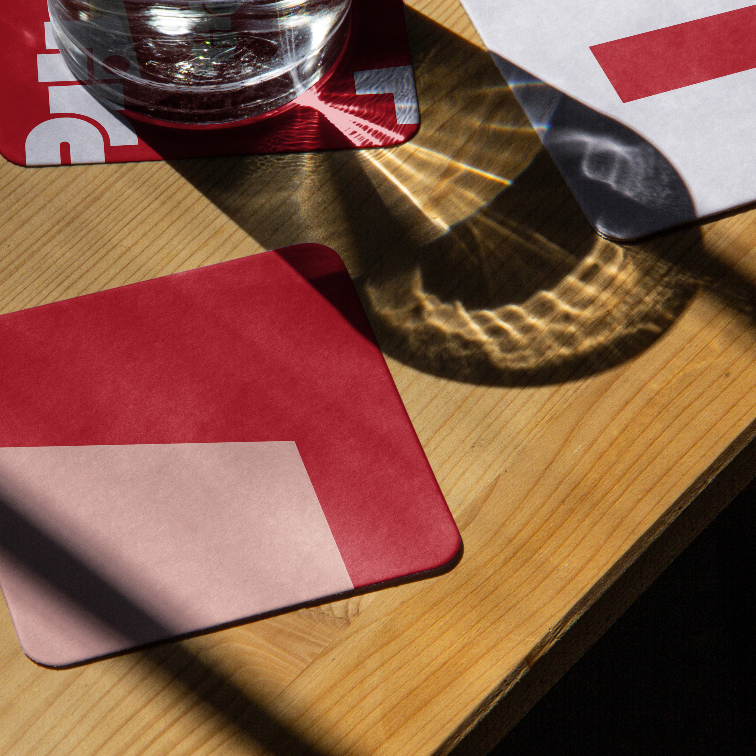
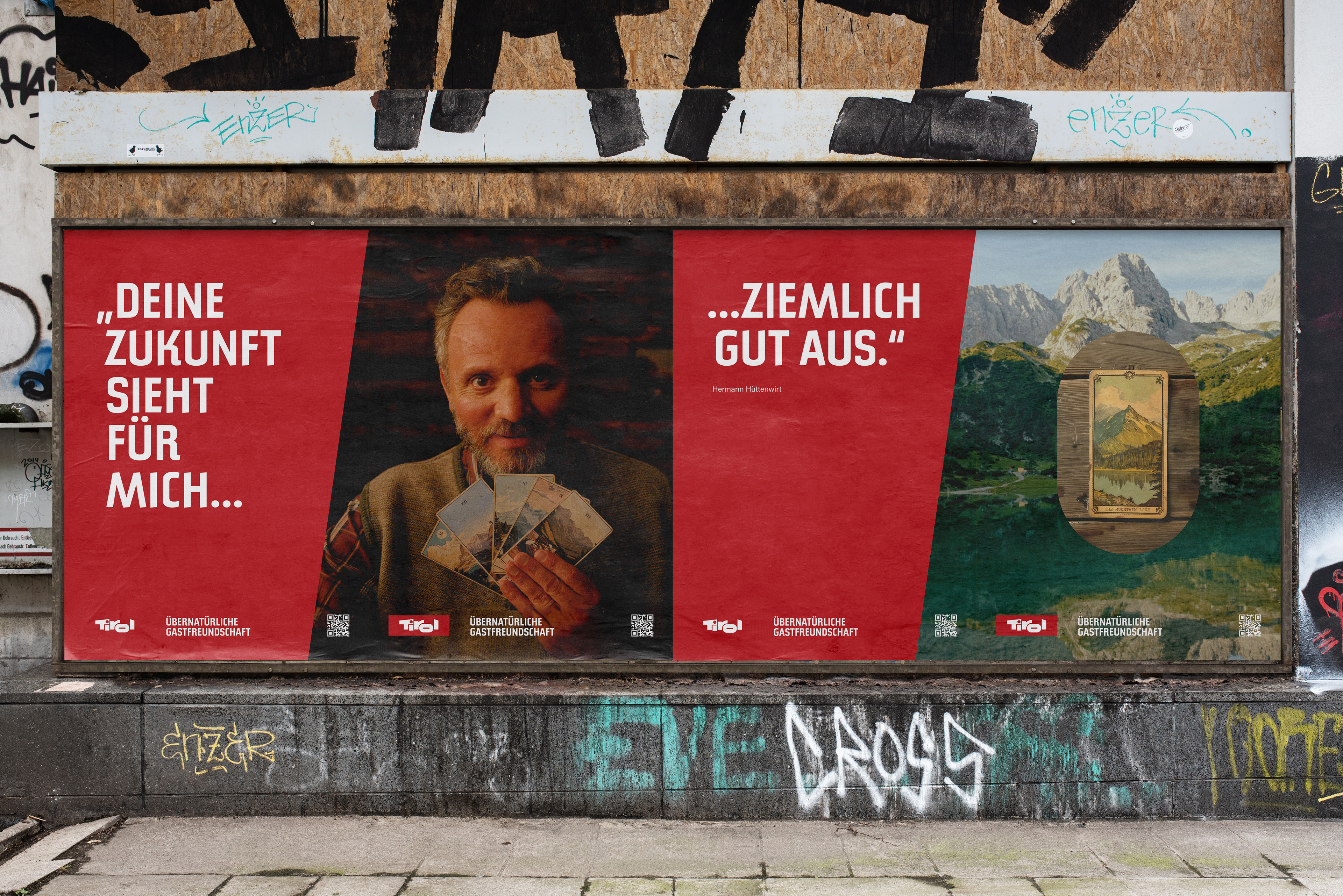
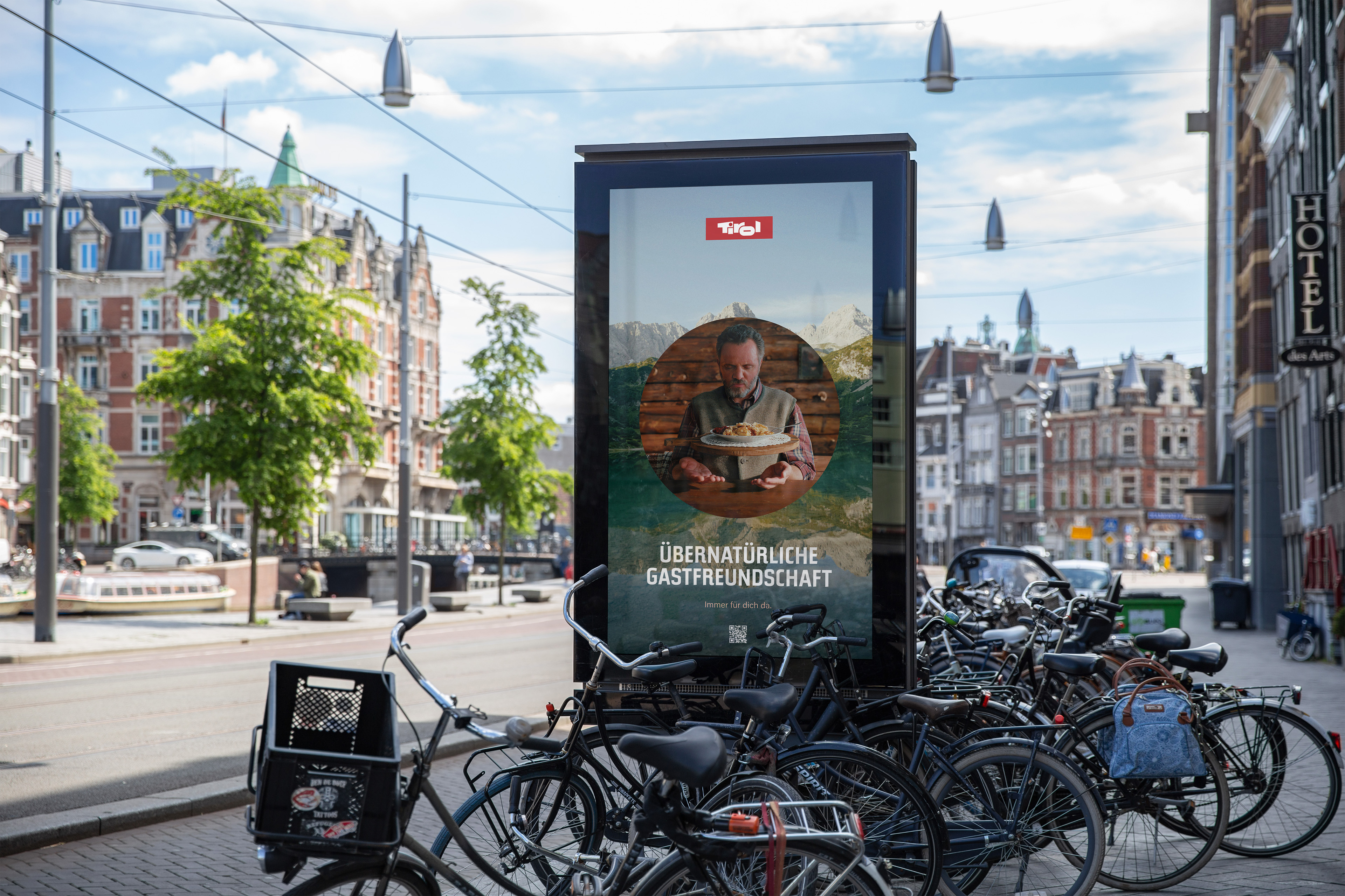
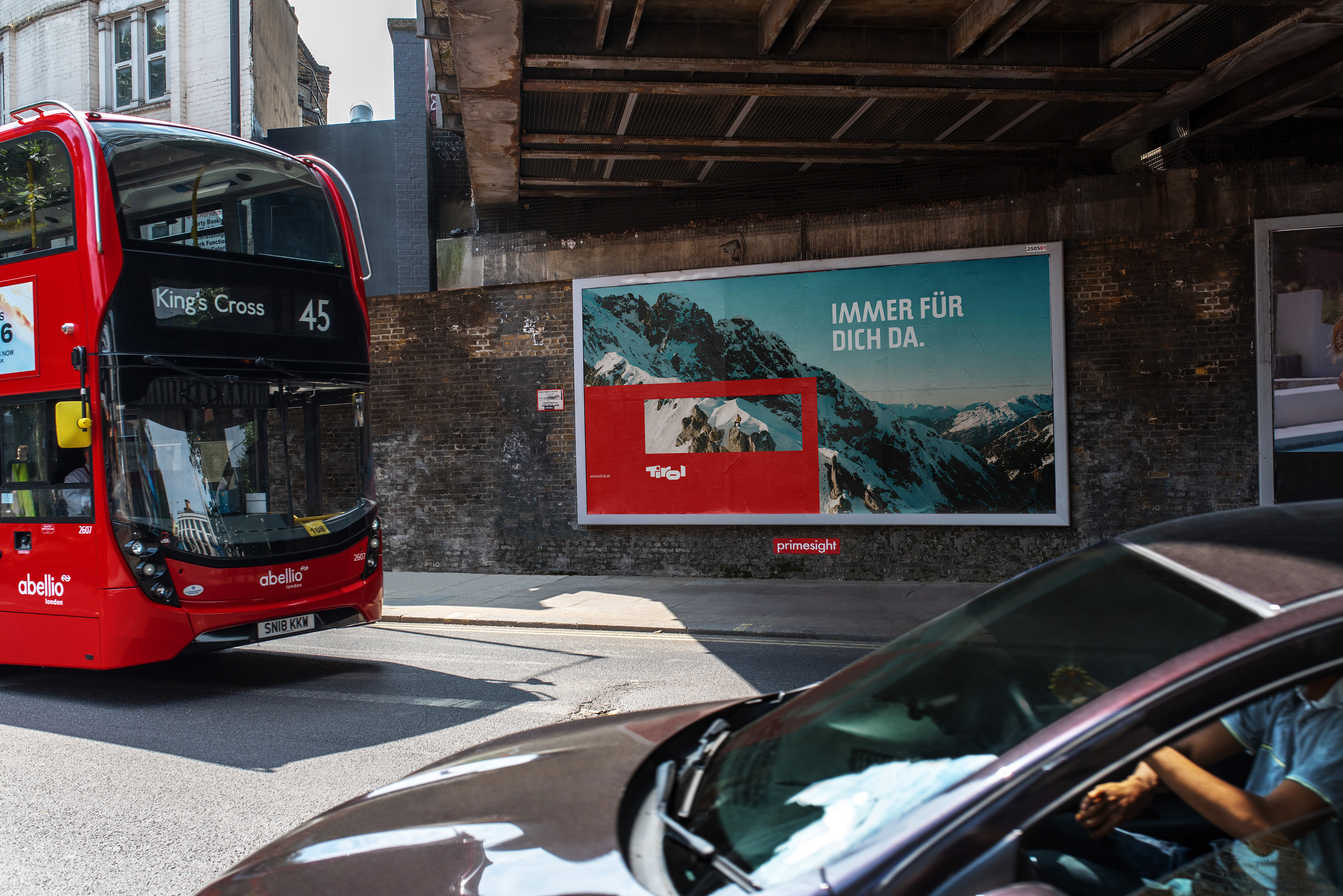
Tirol's tourism brand was built for print and static campaigns, while the region now speaks on video, social and the web at once. The brief kept the essentials fixed: the 1974 logo, the house typeface Tirol Sans and its icons. It asked for brave ideas for the website, social media and other online channels. As the sole designer, I took it from the creative direction to the final design. The result is a complete new brand expression, made for expressive use across media. Simplified colours, type usage and layout principles keep it consistent and on brand. The work later became the starting point for the tirol.at design system, an outdoor and print campaign, and the Moments Tirol concept store.
How the logo's frame became a window?
The answer was to focus on the essential: the red frame around the Tirol lettering. Embracing the frame as a window turned the brand into a window to a destination: an invitation to dive into its nature, its history and the experiences it holds.
The wordmark has always carried Tirol's landscape and culture, so the whole graphic language grows from it. Its shapes became windows of their own, each one framing a view and giving the content room. On screen, they open over photography, with the place showing through. The graphics become a way of telling stories, taking people into Tirol and out again, from one experience to the next.
Four design drivers keep every piece on brief: brave, authentic, connected and headstrong, the values of Tirol itself. Pride in where Tirol comes from makes the expression bold and unapologetic. Openness keeps it simple and clear, with everything in its place. A bond with culture and nature gives it rhythm, layers and structure.
A motion toolkit sets how the window opens, moves and frames a story, from an alpine farm at 4:30 in the morning to a poster in the city. Its templates went to Tirol's own video team, and the new guidelines joined the brand's existing Figma guidelines.
Tirol digital identity key facts
- Client
- Lebensraum Tirol Holding
- Location
- Tirol, Austria
- Expertise
- Brand building
- Disciplines
- Brand audit, creative direction, motion design, social media design
- My role
- Creative direction and design (sole designer)
- Timeline
- 2023
- Agency
- Werklig