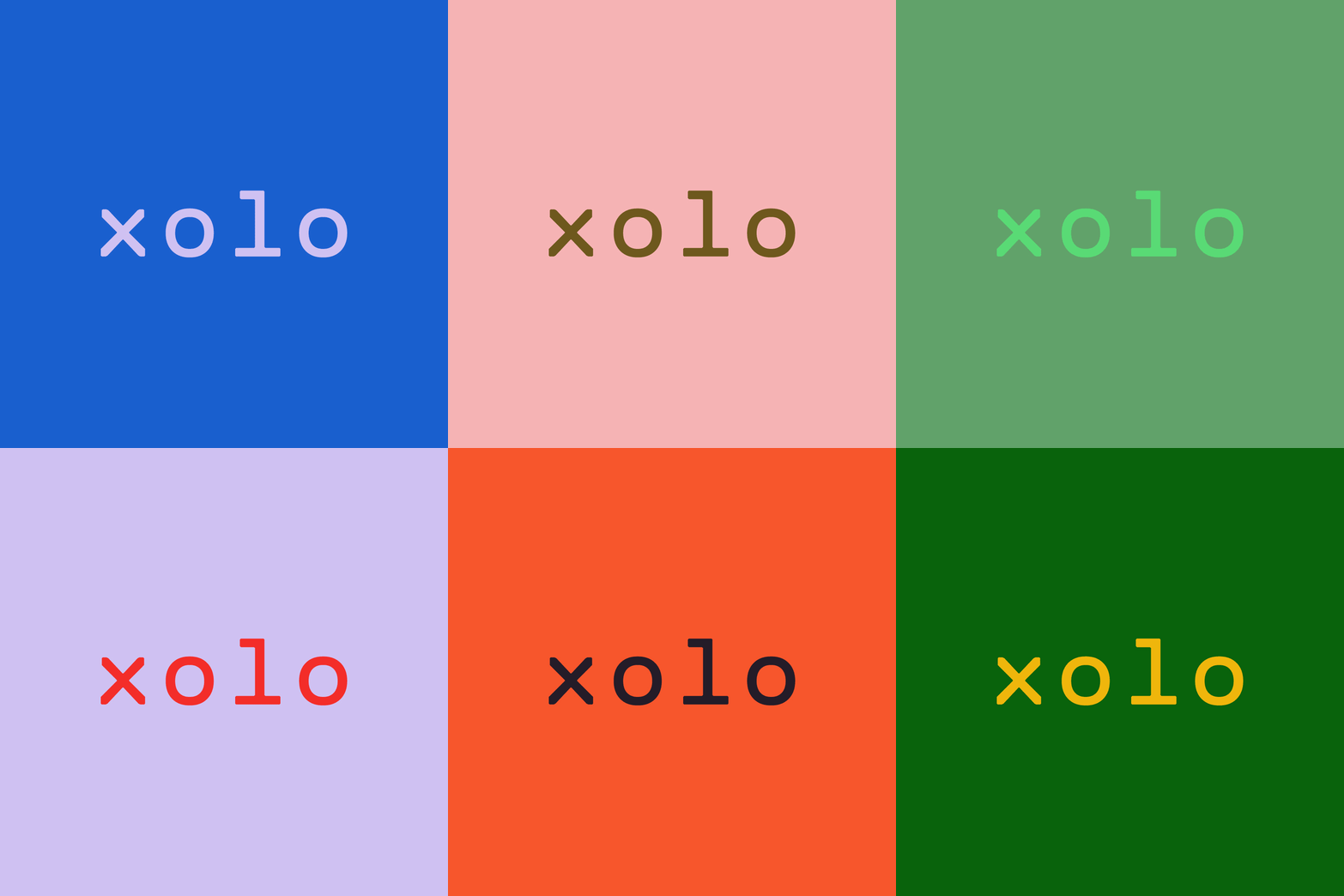
xolo
Solopreneurs across Europe run their business on xolo, formerly LeapIn. Its offering had grown faster than its focus. I led the design of a new graphic system as the foundation of the identity. Xolo's own design team then took it forward.
How we gave a fast-growing brand a sharper look?
Growth was not xolo's problem. Focus was. As the SaaS company's offering for solopreneurs, people who work for themselves all over Europe, kept growing, its brand needed a clearer focus to keep its momentum. I was the lead designer of the new graphic system.
How xolo's values became a graphic system?
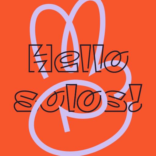
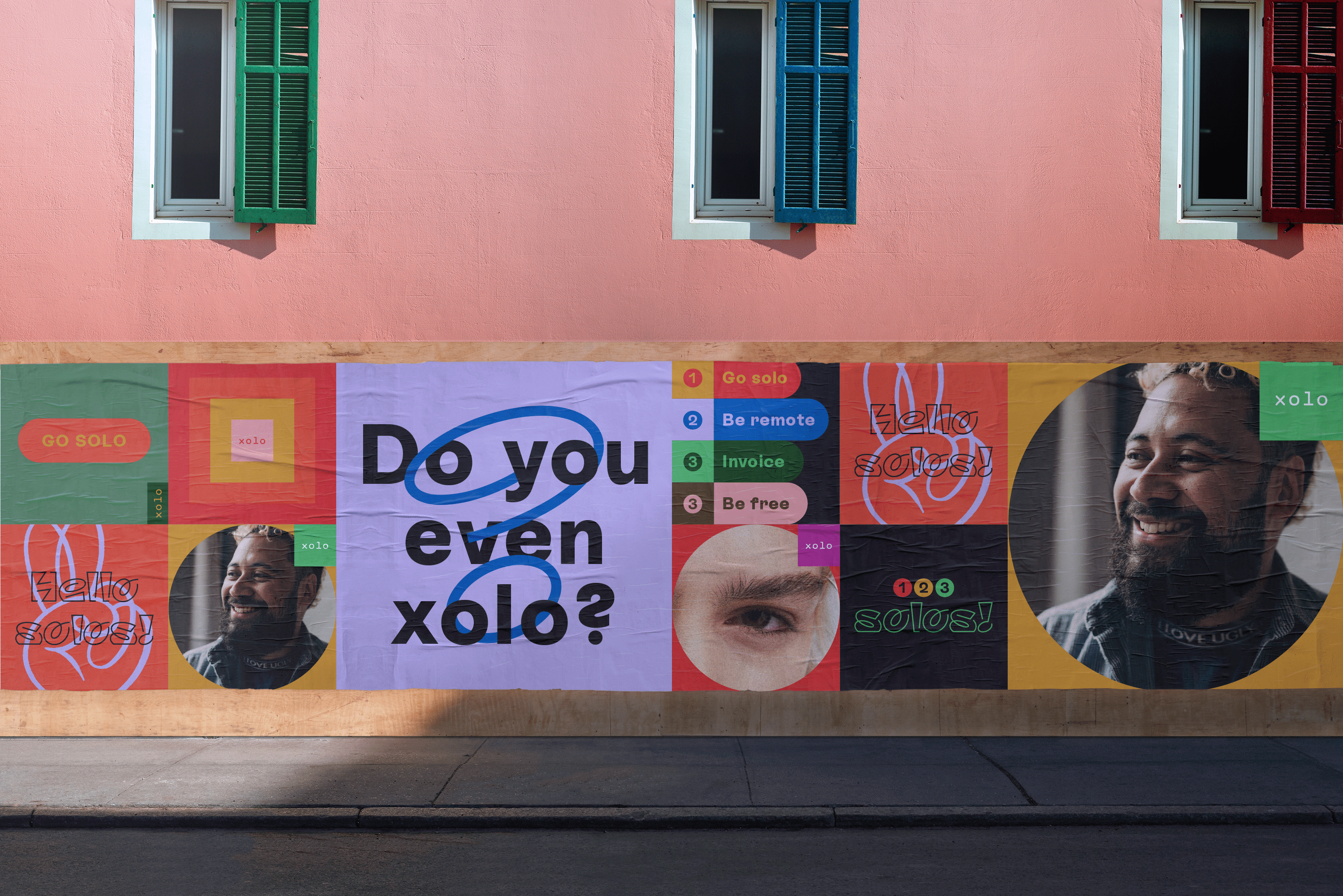
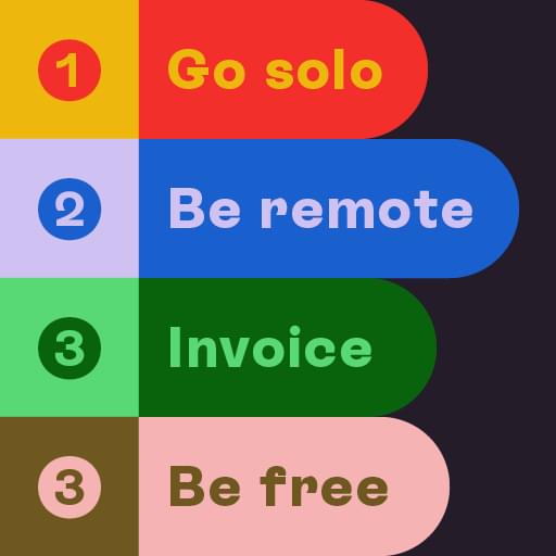
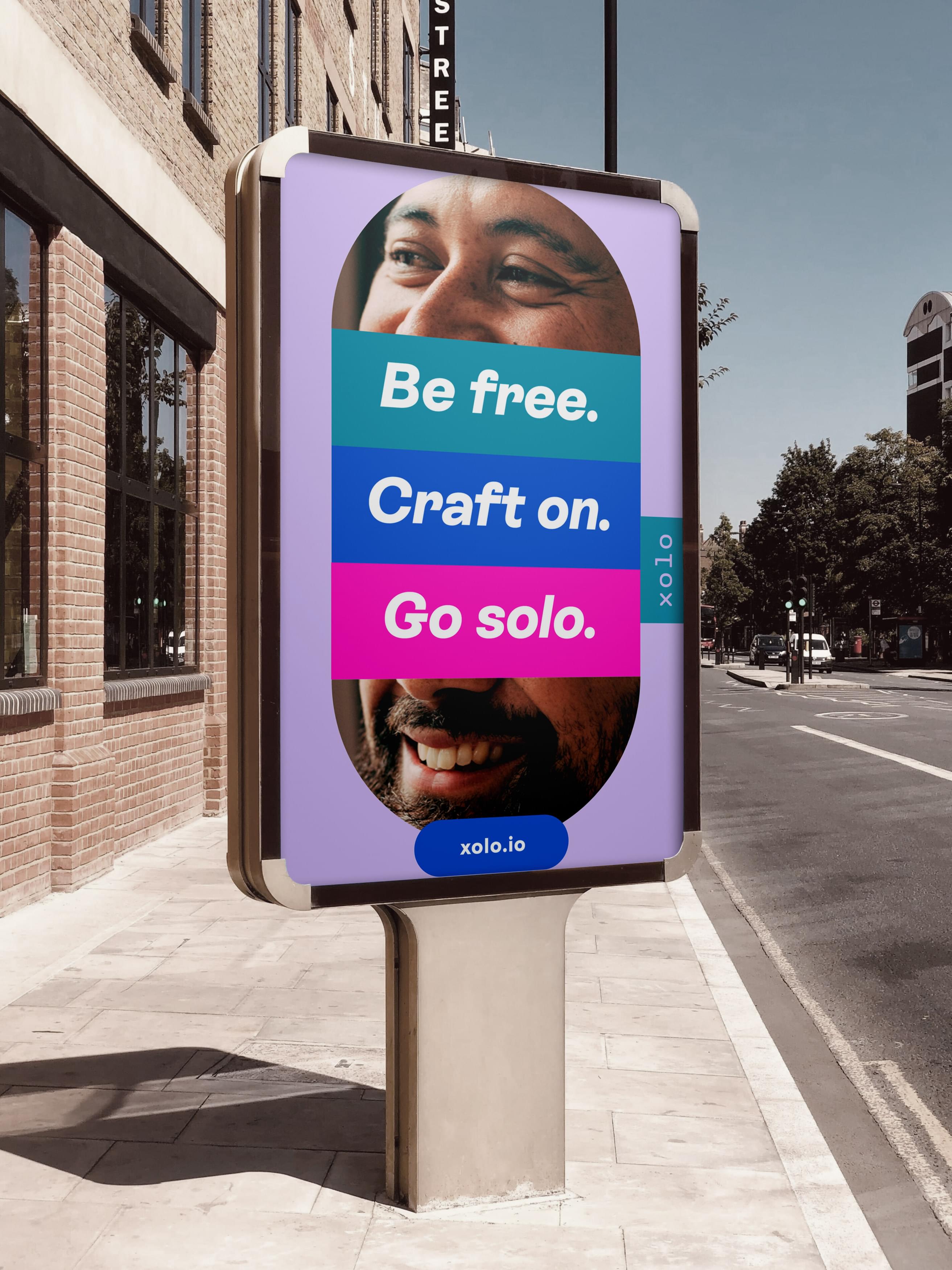
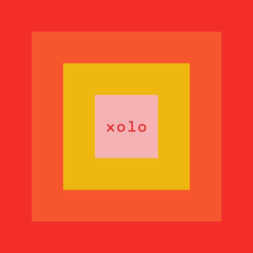
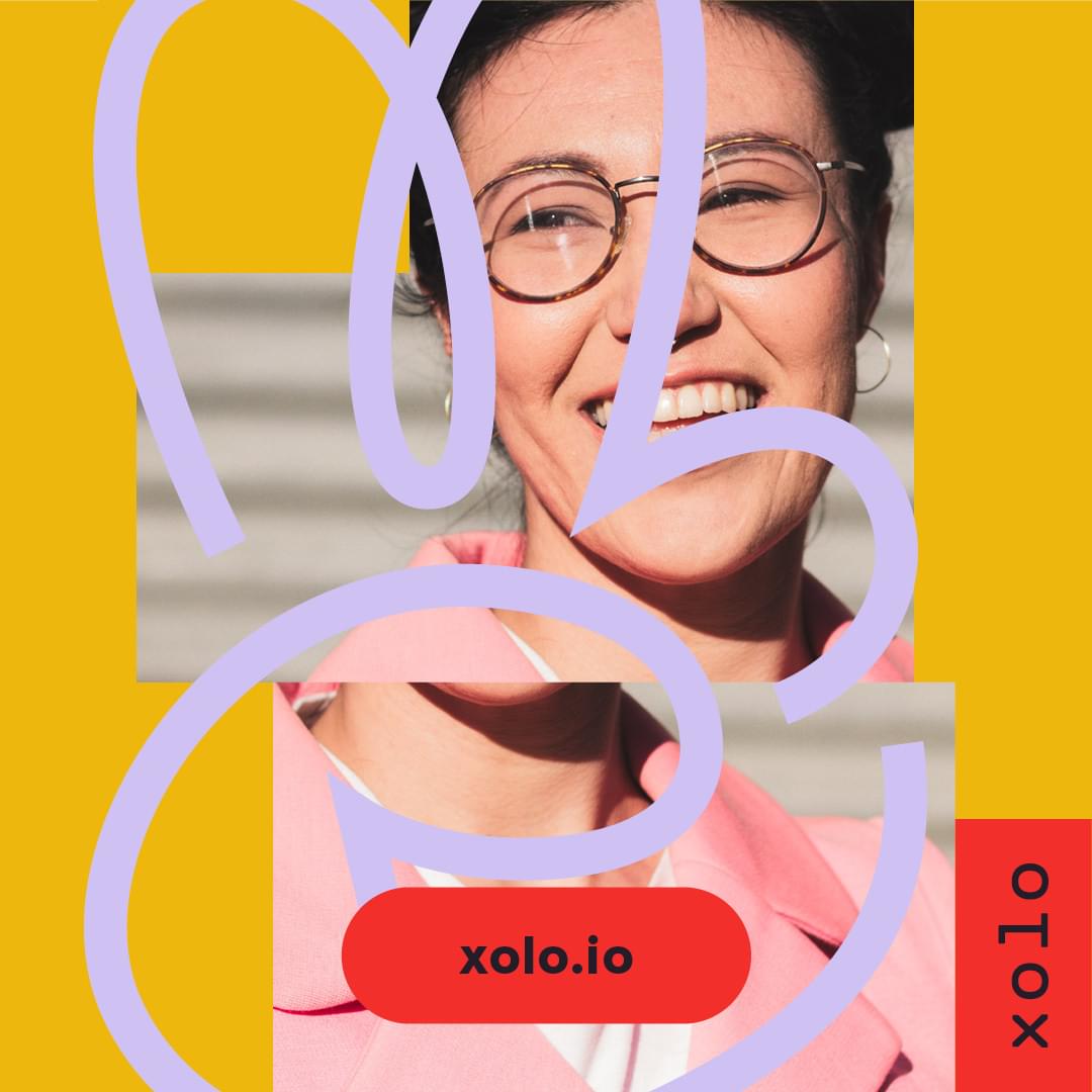
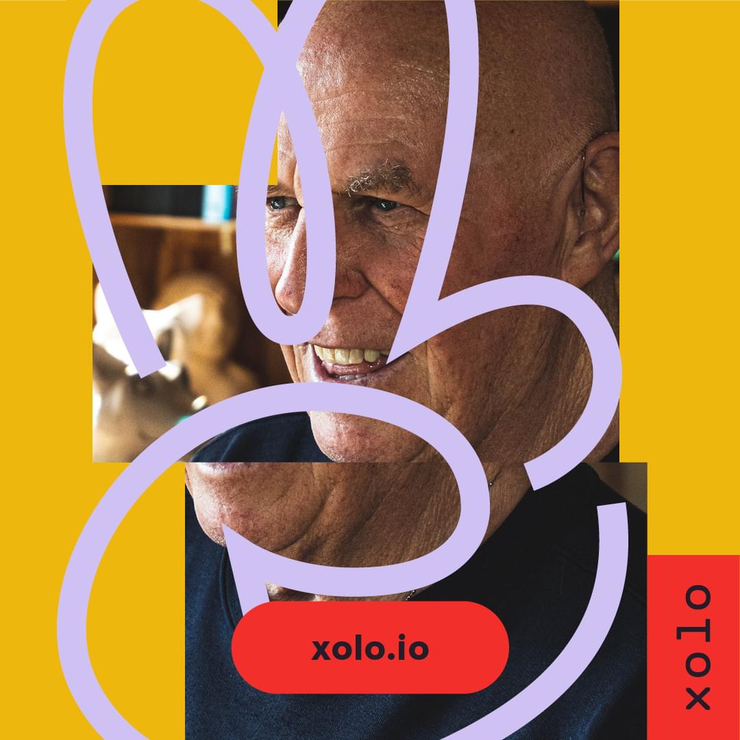
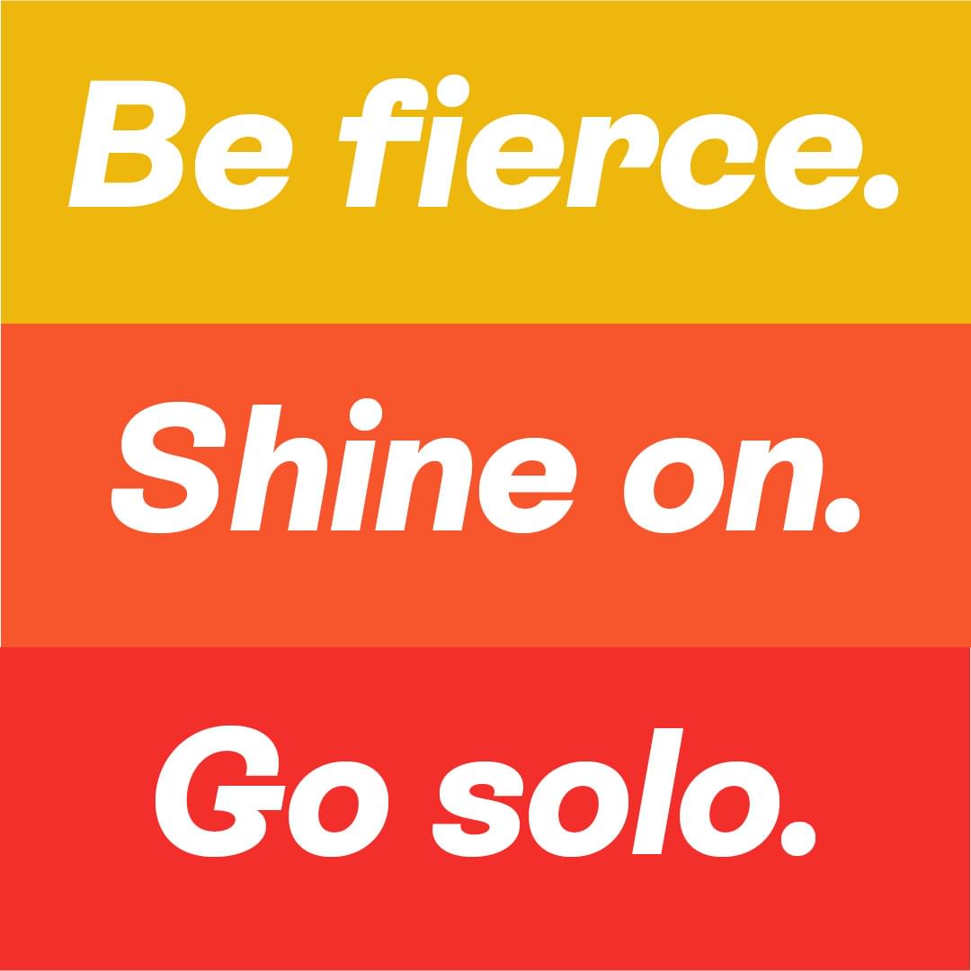
The system takes its cue from xolo's three brand values: bighearted, maverick and clockwork. The free, hand-made side carries the first two, and a simple grid carries the third, so the system can repeat without breaking. Xolo's design team then took it in-house and built their own brand expression on top.
xolo key facts
- Client
- Xolo OÜ
- Expertise
- Brand building
- Disciplines
- Graphic system, visual identity
- My role
- Lead designer
- Timeline
- 2021
- Agency
- Werklig
- Live
- xolo.io
- Designer and line drawing
- Mikko Reponen