Atelier de parfum Kseki
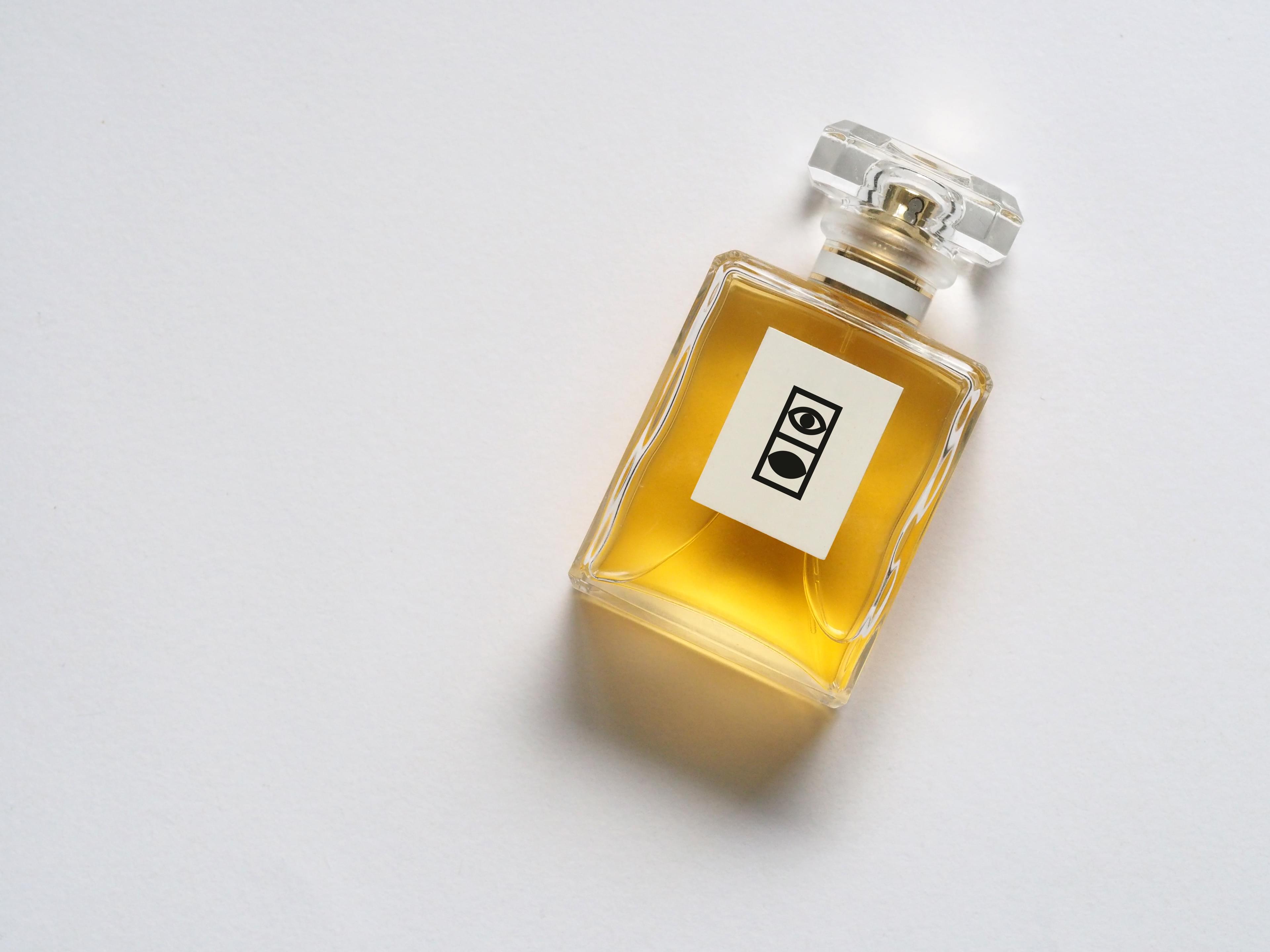
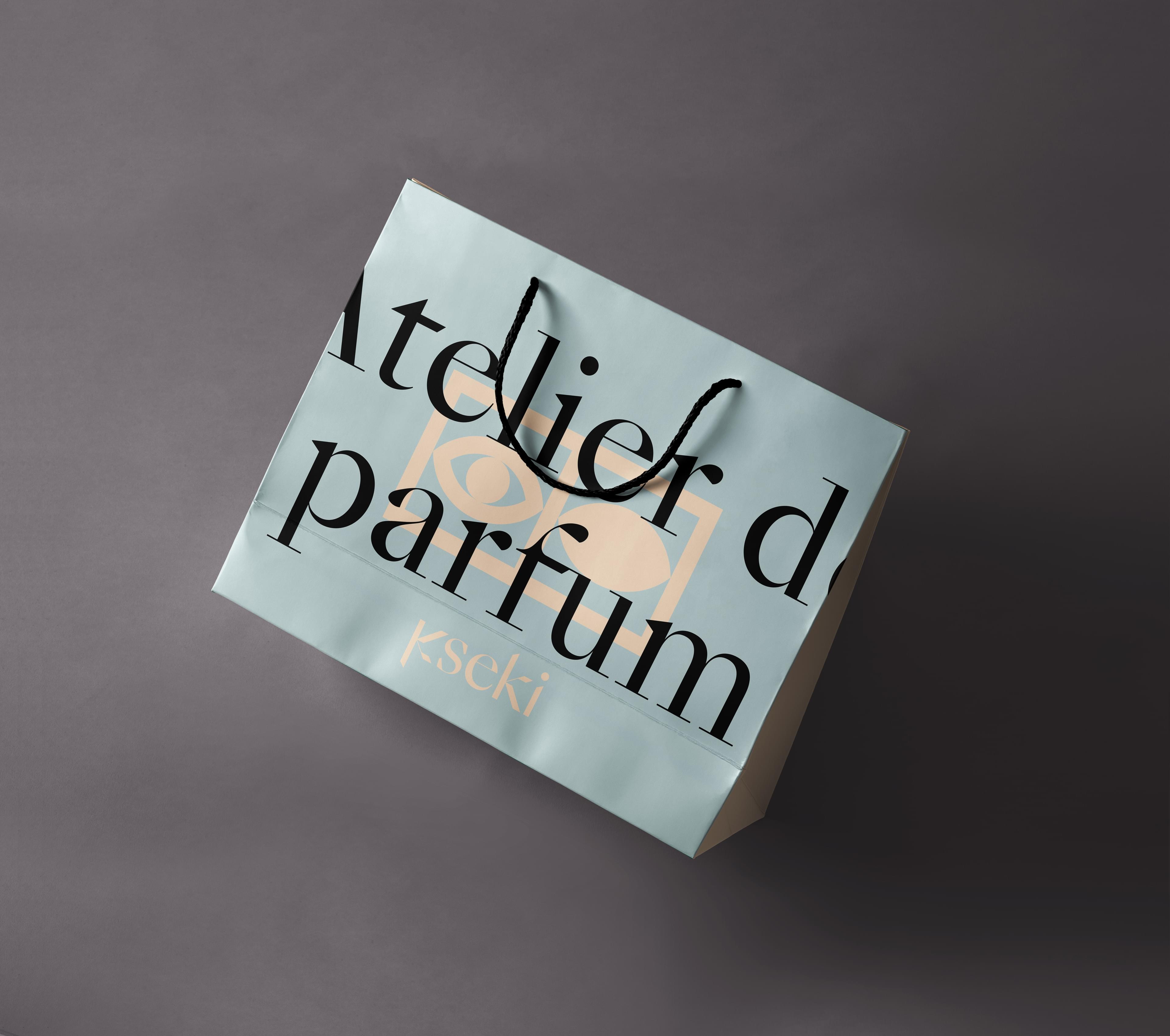
A niche perfume house in Helsinki, Kseki was founded by Ksenia Kakhnovich and Kim Öhrling. I art directed and designed its visual identity.
How I designed an identity for something you cannot see?
Kseki's perfumes come from its founders' own view of the world. Its scents are meant to intrigue and start conversations, even divide opinion. They are not there to please everyone. I was art director and lead designer on the identity.
How a kaleidoscope shaped the identity?
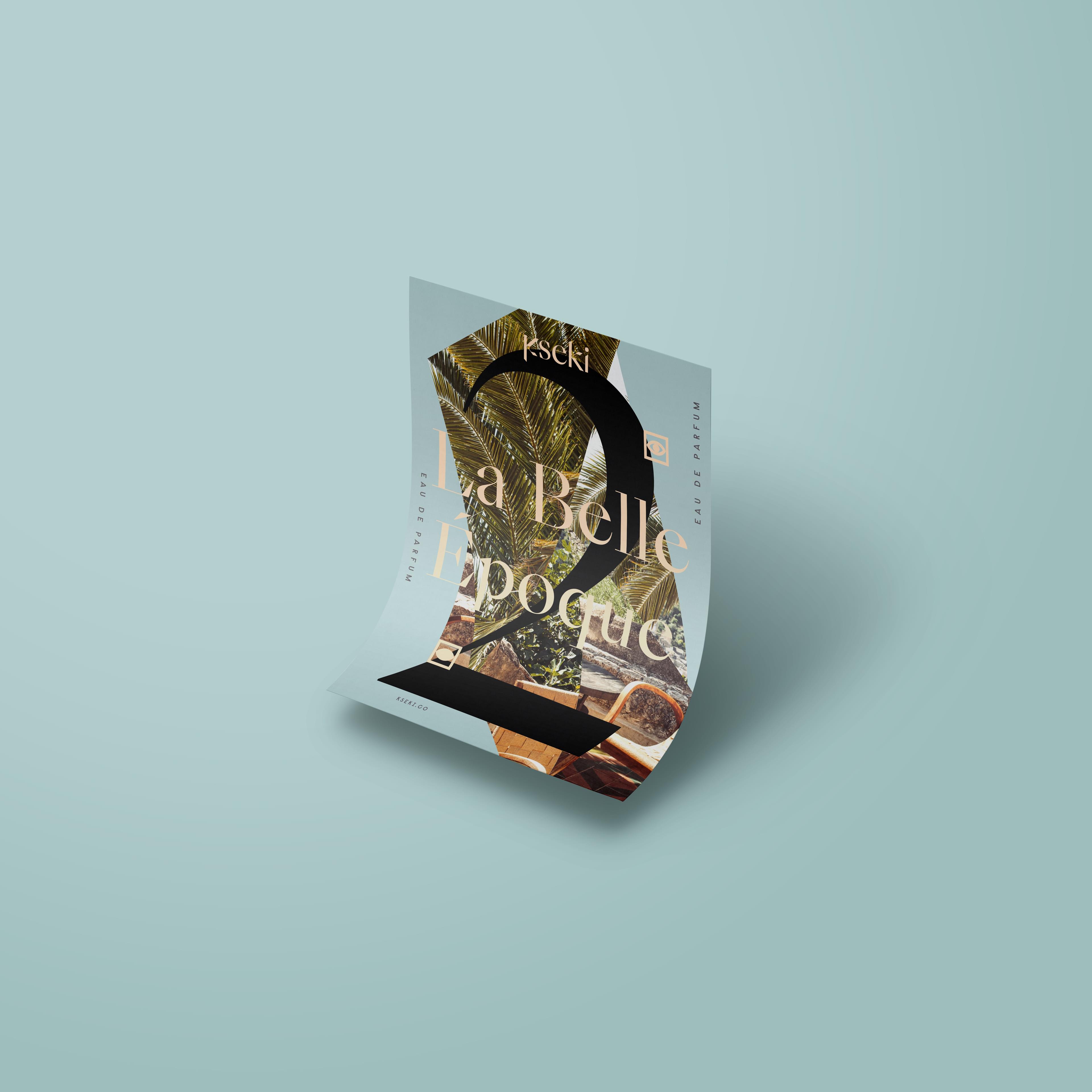
Kseki looks at the world through its own lens, and a kaleidoscope does exactly that. The word comes from the Greek for observing beautiful forms. Through its mirrors, you see the creator's idea of beauty, and your own curiosity takes over. The identity draws on the founders' influences, from Bauhaus to surrealism to art deco.
Its base element is a golden triangle, like the mirrors bending light into a personal view. The same golden proportions set the grid, a balance between art and science. The logotype's strong geometry comes from Bauhaus. The art deco monogram works as a lens: it reveals more or less of a picture and lets imagination fill in the rest.
Like a fragrance, the identity is built in notes. The logotype is the base, the typography the heart and the monogram the top. Even the colours carry the names of perfume notes, such as La Sauge (sage), Le Santal (sandalwood), L'Hibiscus and Le Poivre (pepper).
Kseki key facts
- Client
- Kseki
- Location
- Helsinki, Finland
- Expertise
- Brand building
- Disciplines
- Visual identity
- My role
- Art director, lead designer
- Timeline
- 2019–2020
- Agency
- Mirum (now part of VML)
- Photography
- Kim Öhrling