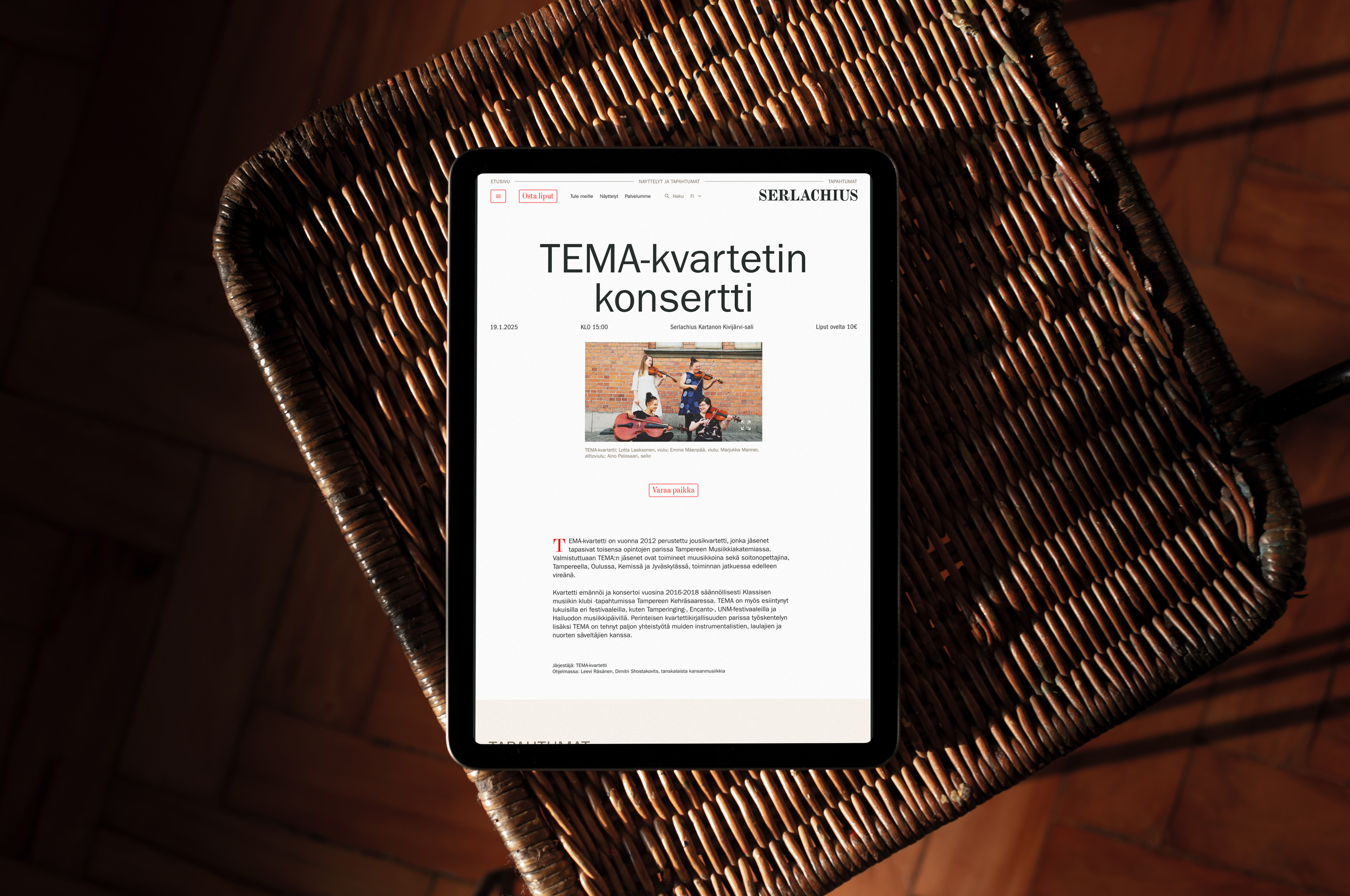
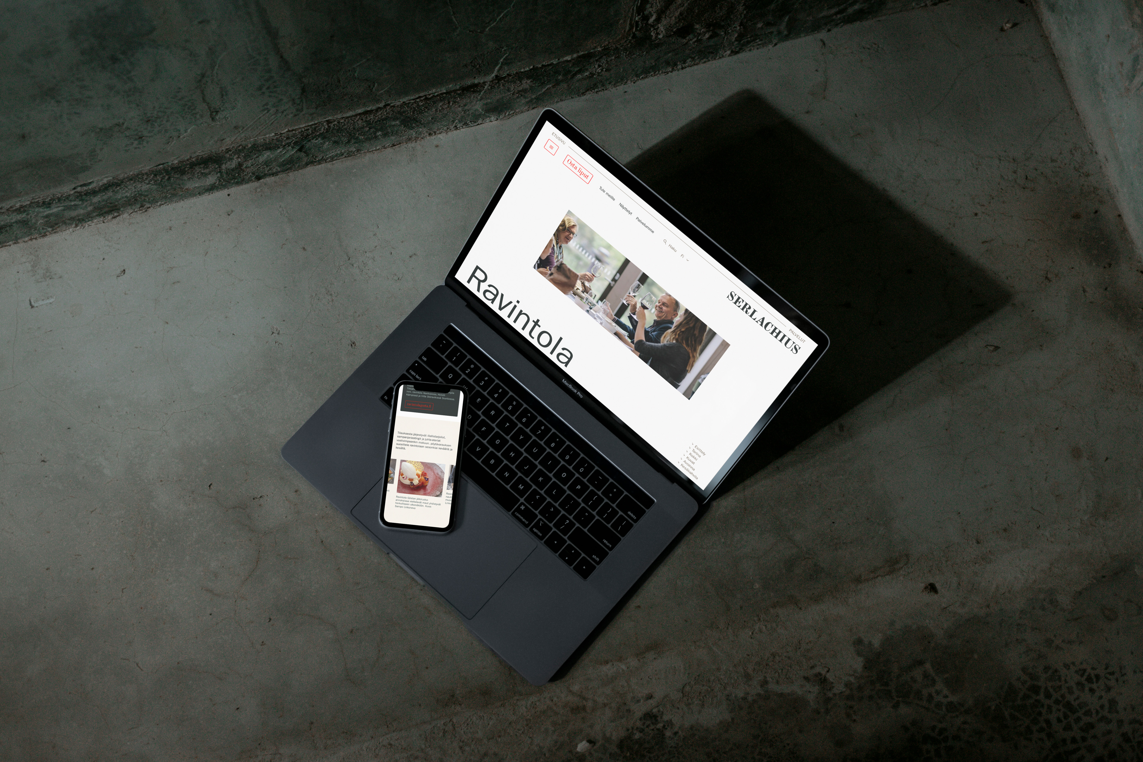
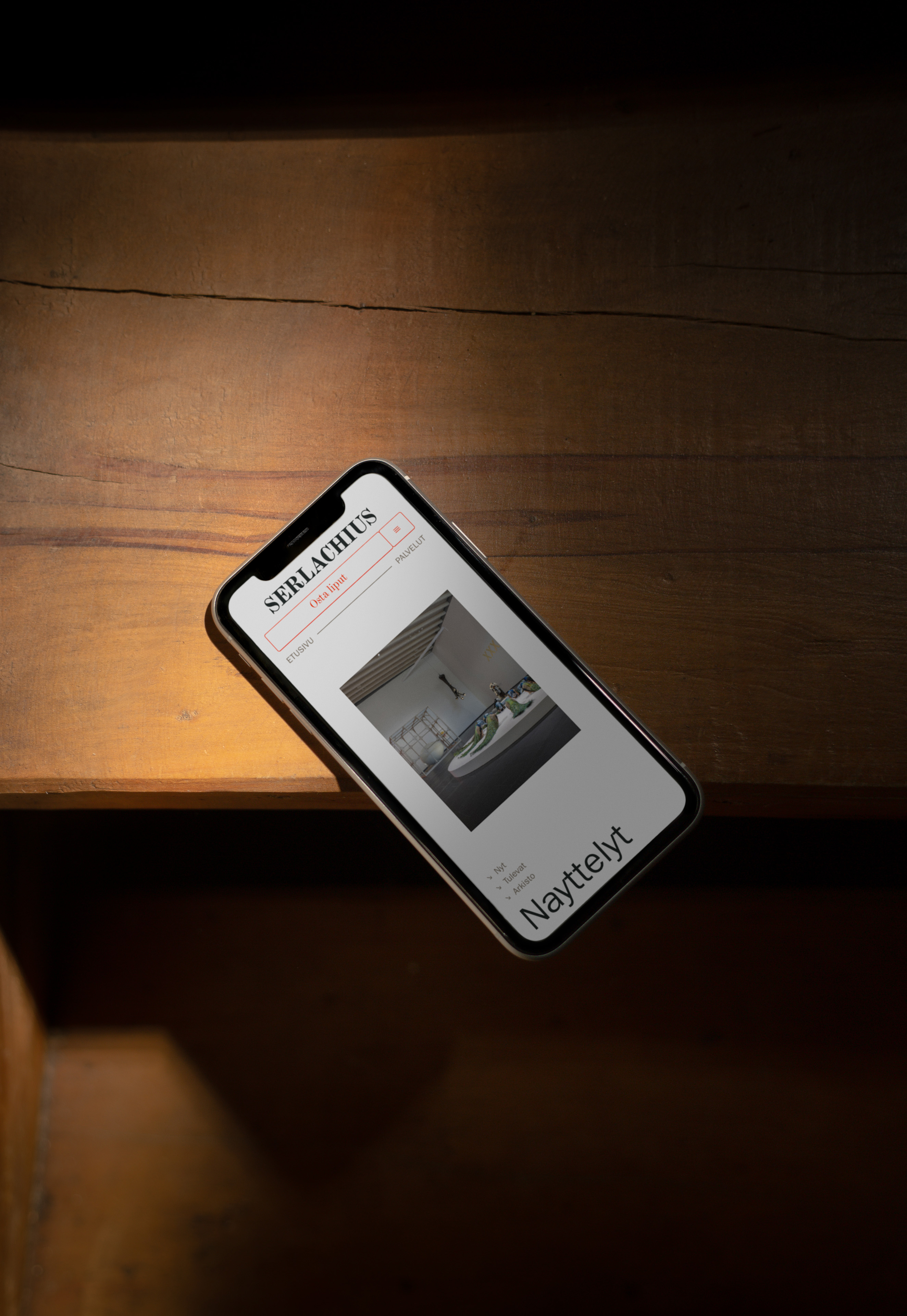
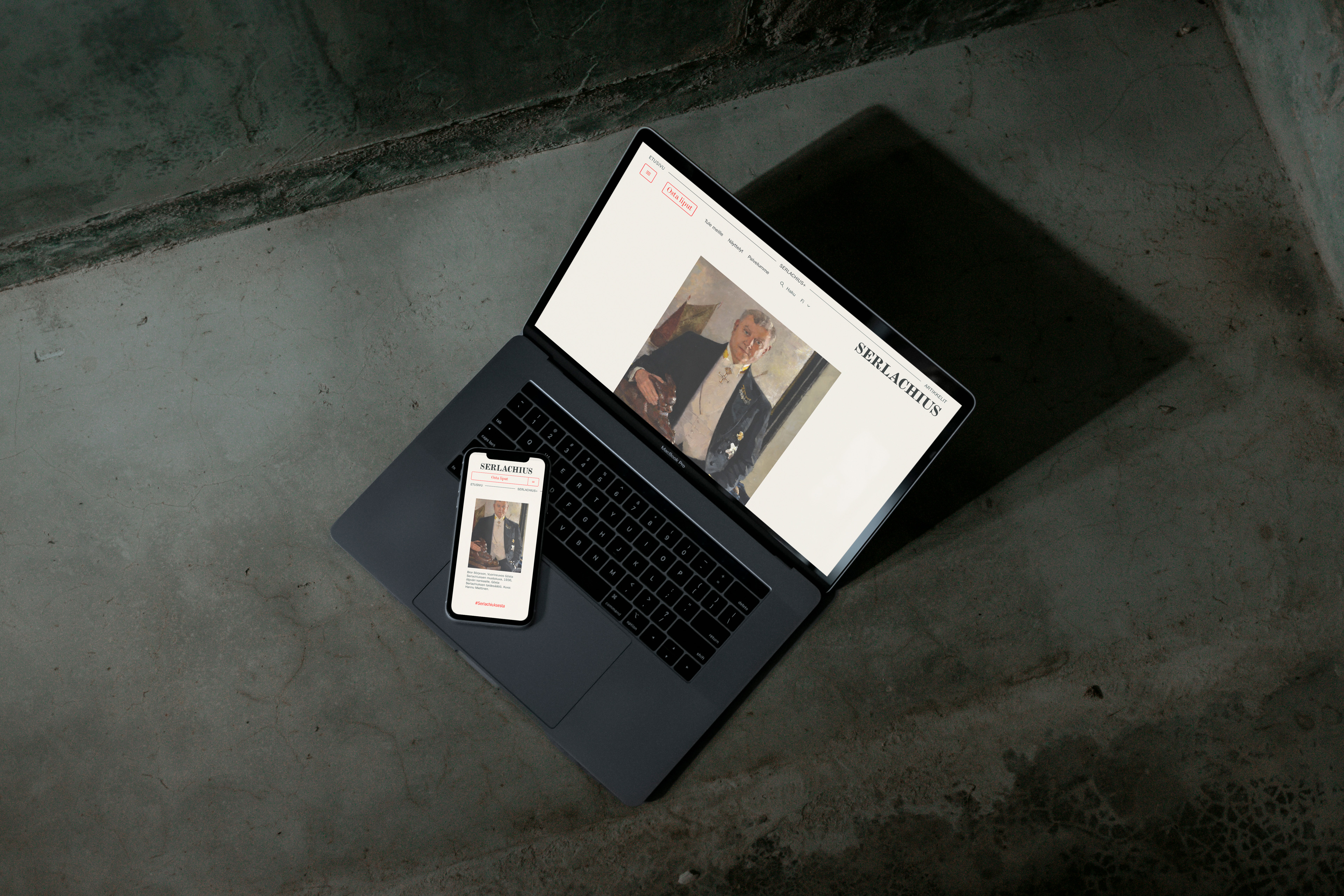
Serlachius.fi
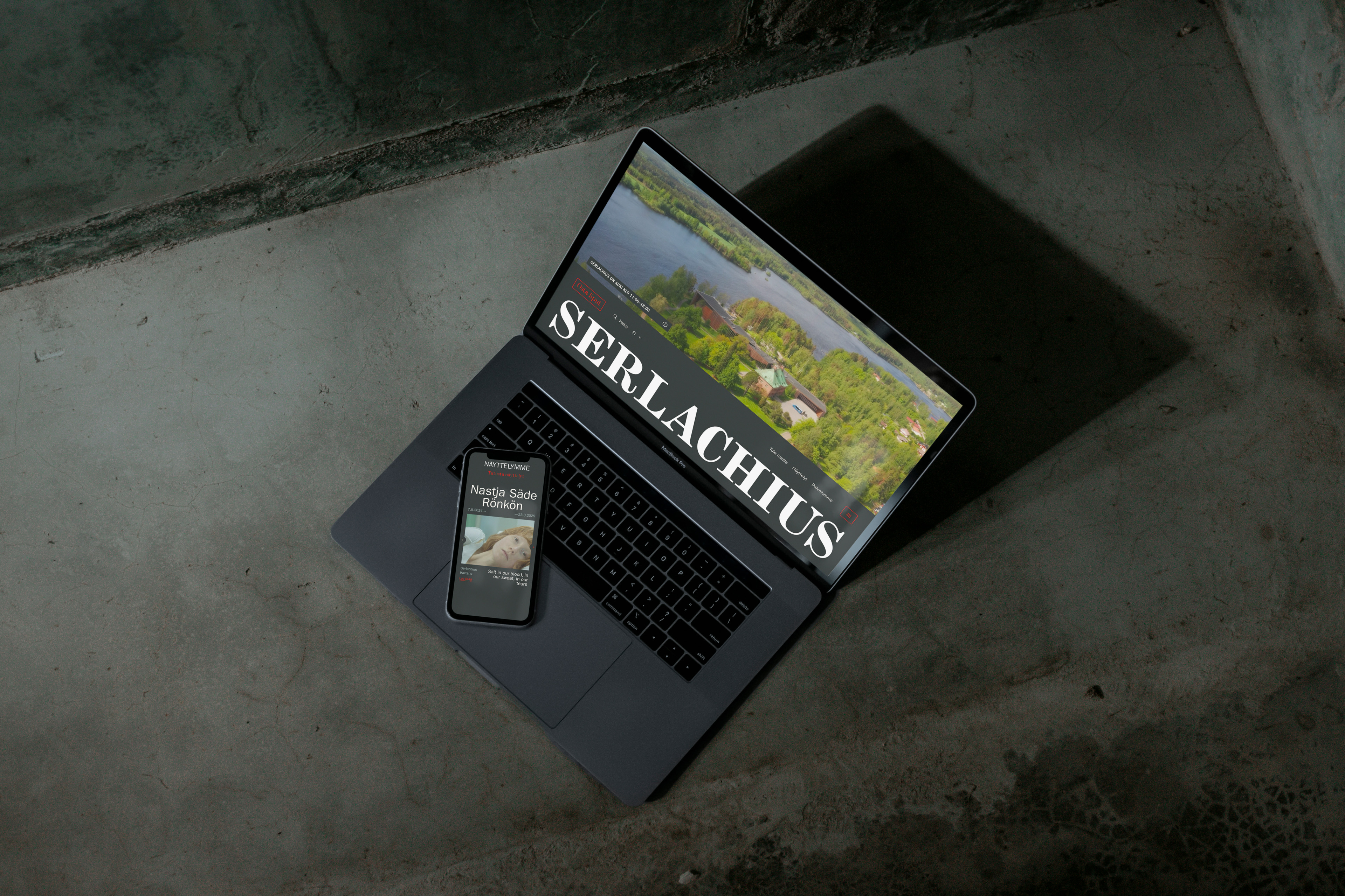
The website of Serlachius, the art destination in Mänttä, had fallen behind what it offers, in content, technology and ambition. I led the strategy and design of a new serlachius.fi, built from the ground up.
How I turned a website into an art destination?
An art institution and museum, a tourism destination, a residency and a media hub: Serlachius is many things at once. Its website is not the only way into the brand, but it carries the whole visit, before, during and after. So the shared goal from kick-off was simple: people who come to the site should end up in Mänttä.
I was the sole digital strategist and lead UX and UI designer. I led the work from the first insights workshop to the content strategy, the visual concept and the UX and UI design sprints.
How the insights set the focus?
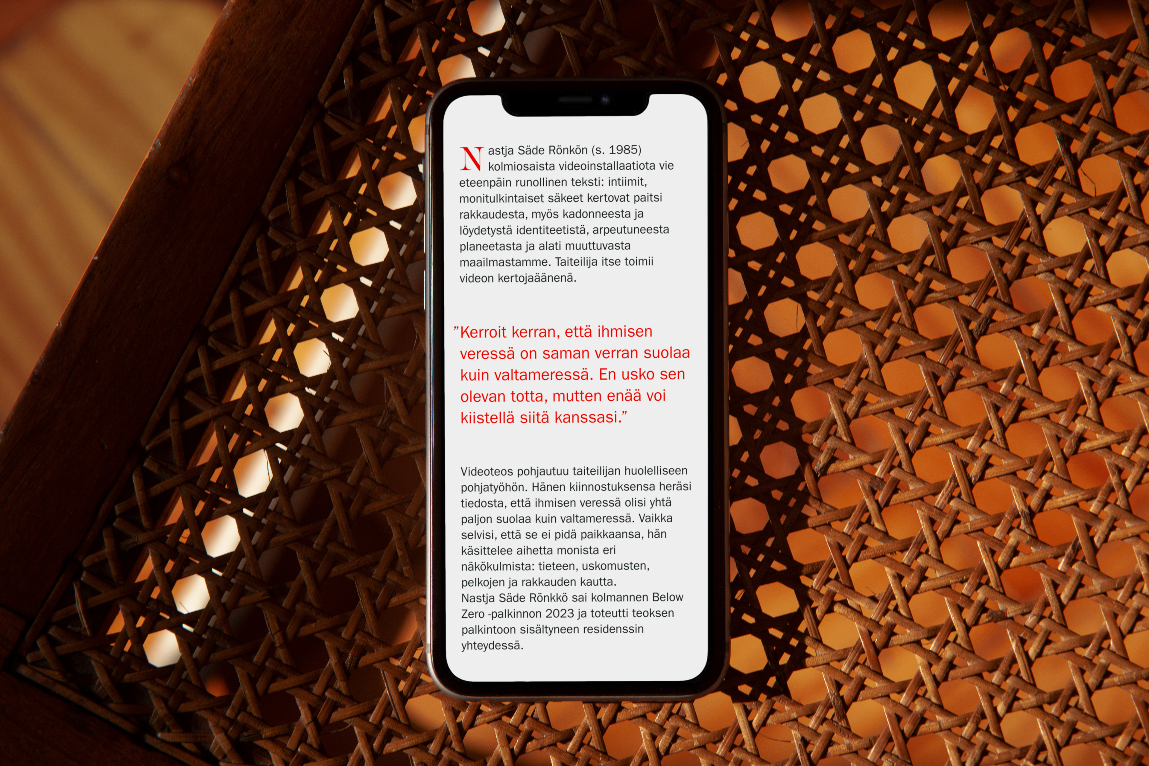
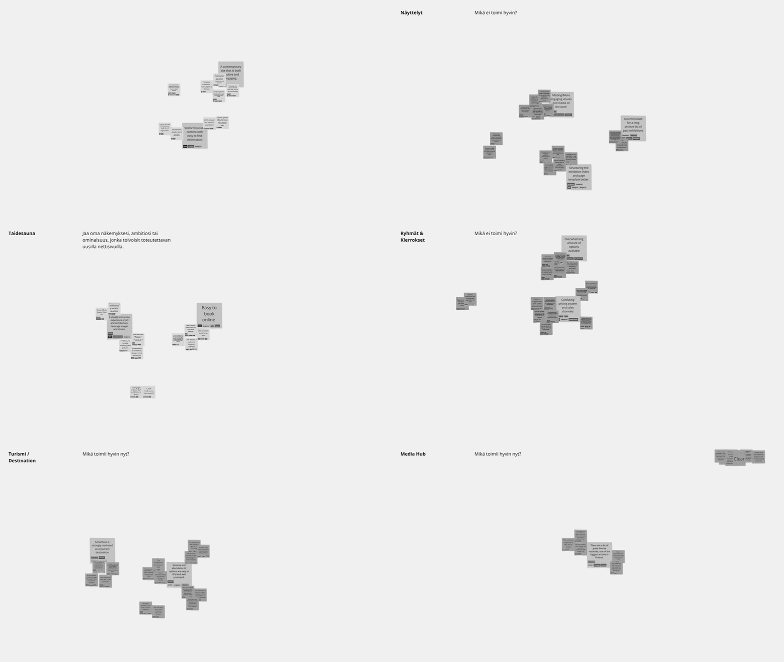
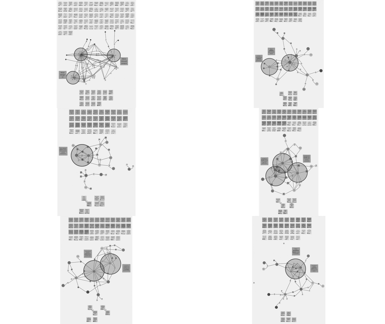
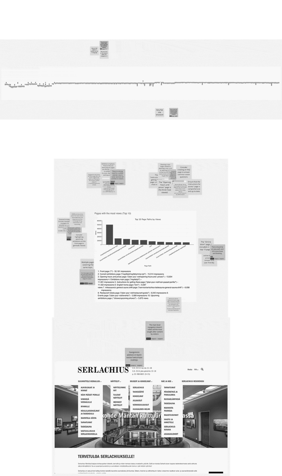
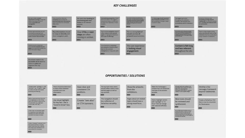
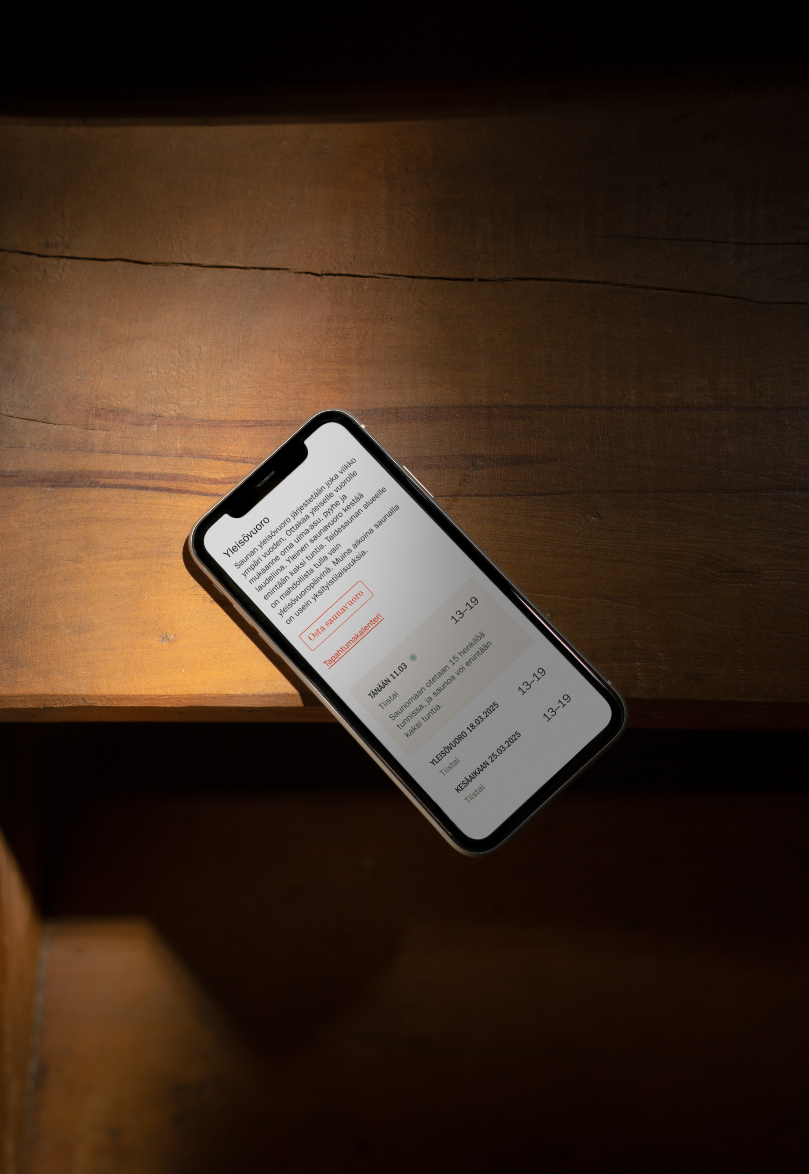
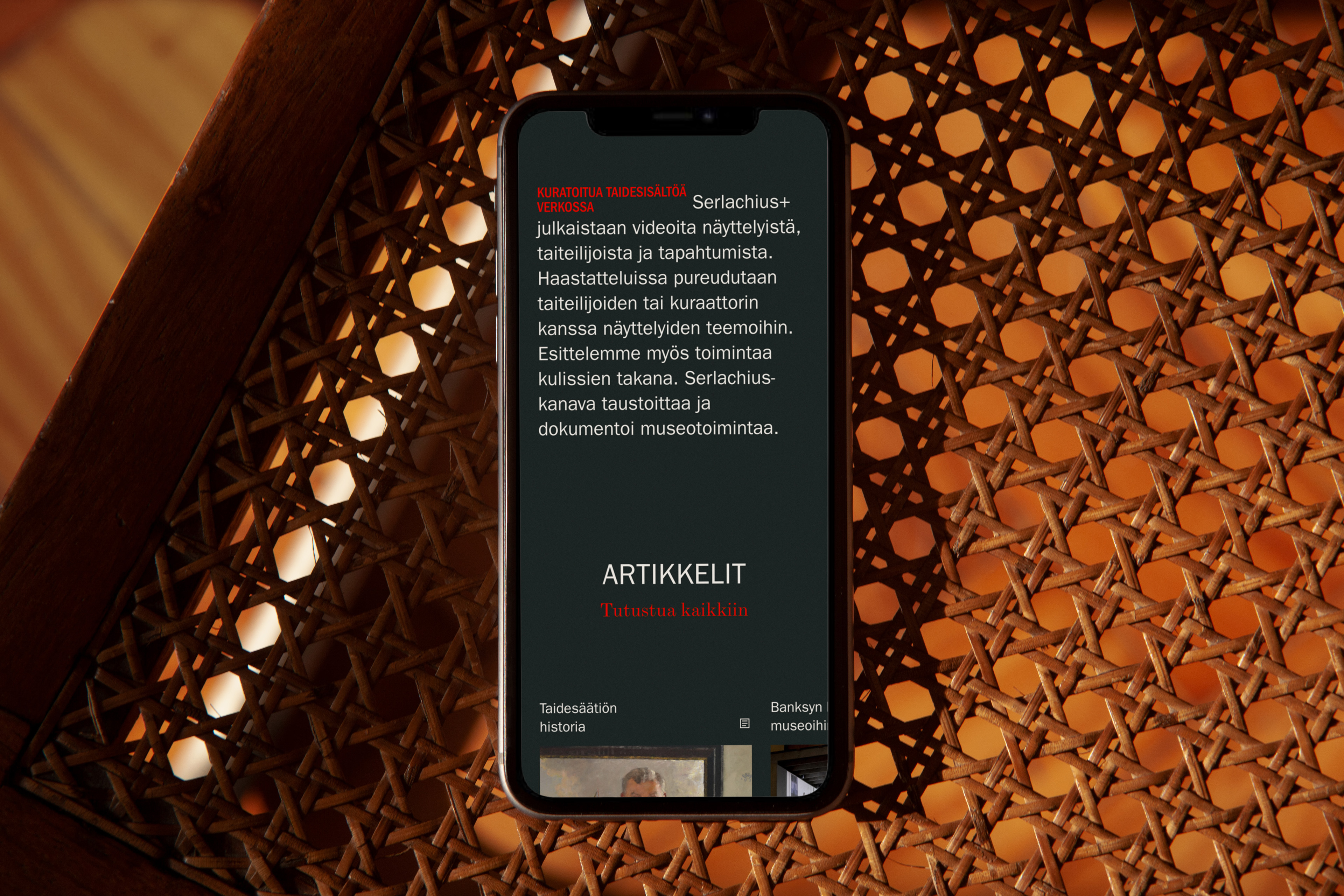
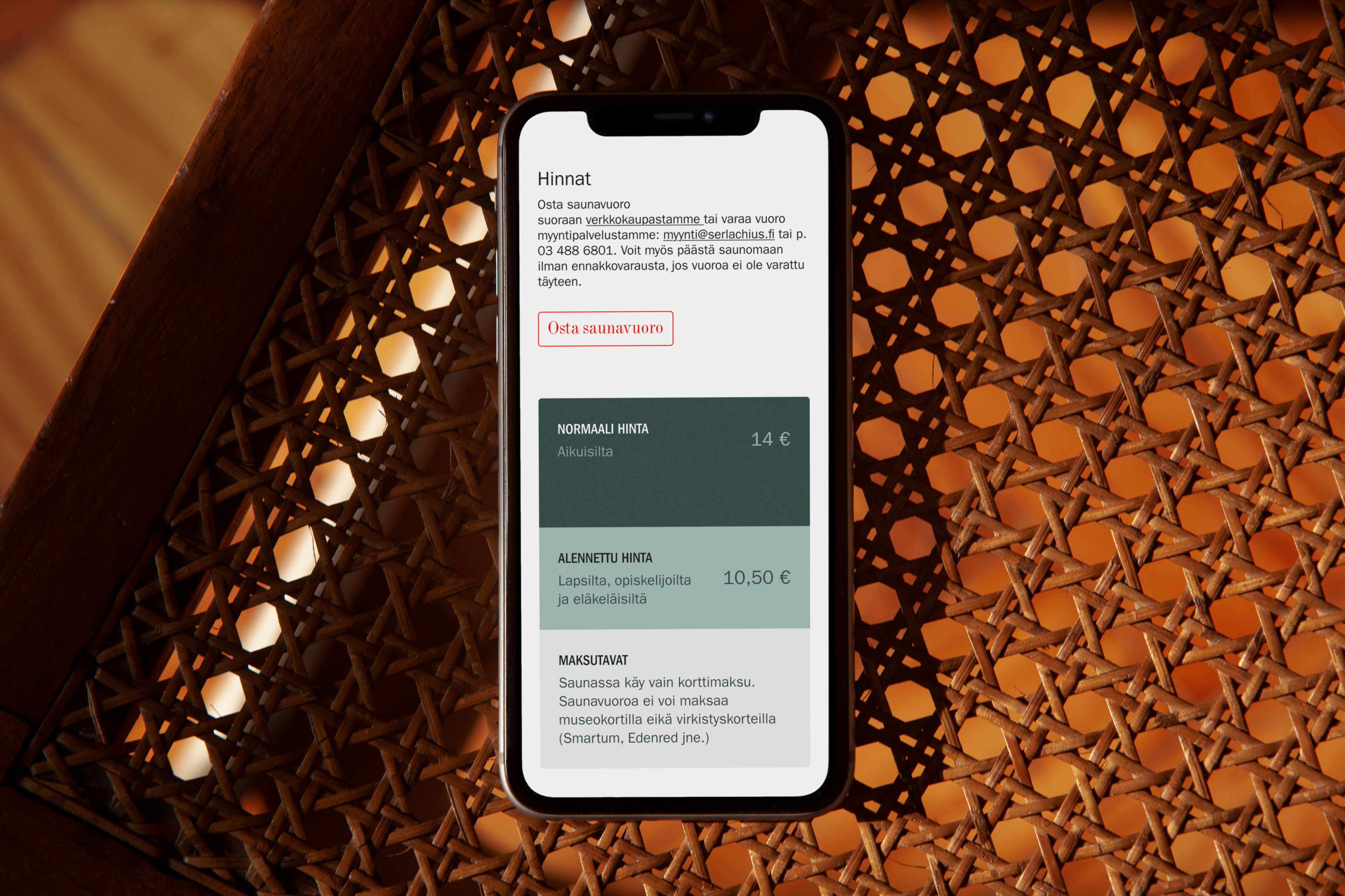
Serlachius' own experts knew what worked and what didn't. Two findings stood out. The site had grown page by page, and its structure no longer matched what visitors came for. And art is a sensory experience, while the site leaned on long text. The first phase focused on the areas that mattered most, from exhibitions and the collection to the art sauna, the residency and the media channel. What worked there would roll out to the whole site.
How a new architecture organised the destination?
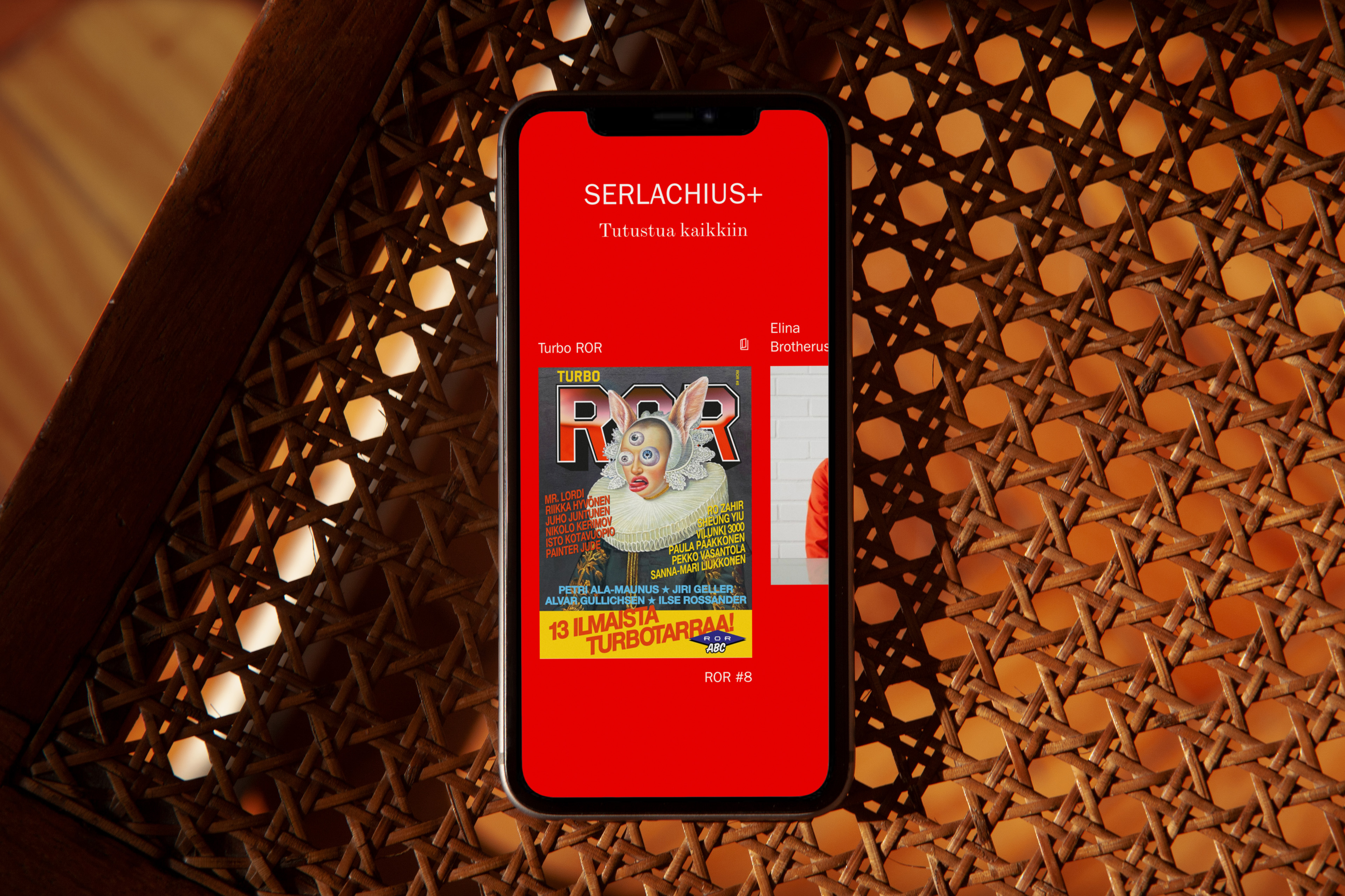
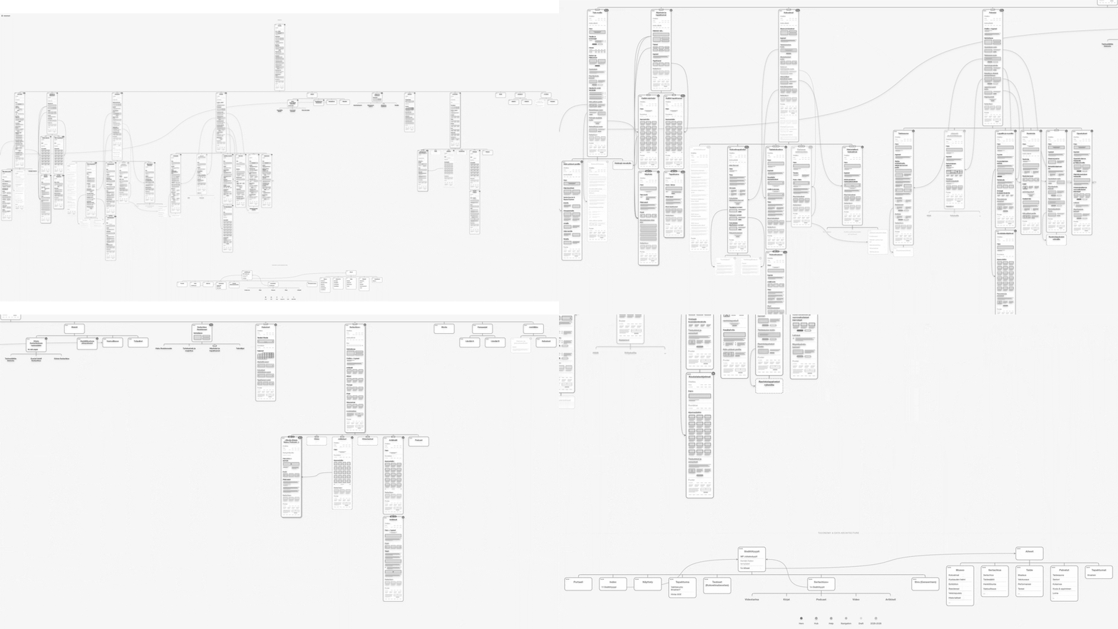
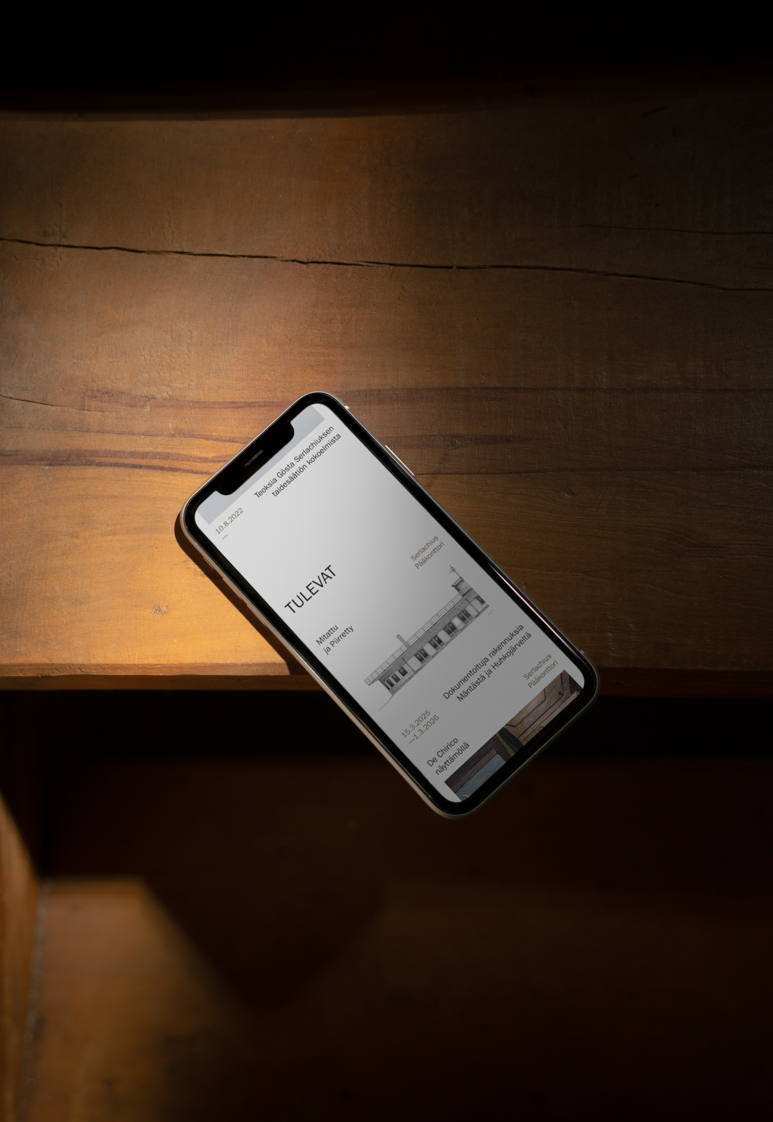
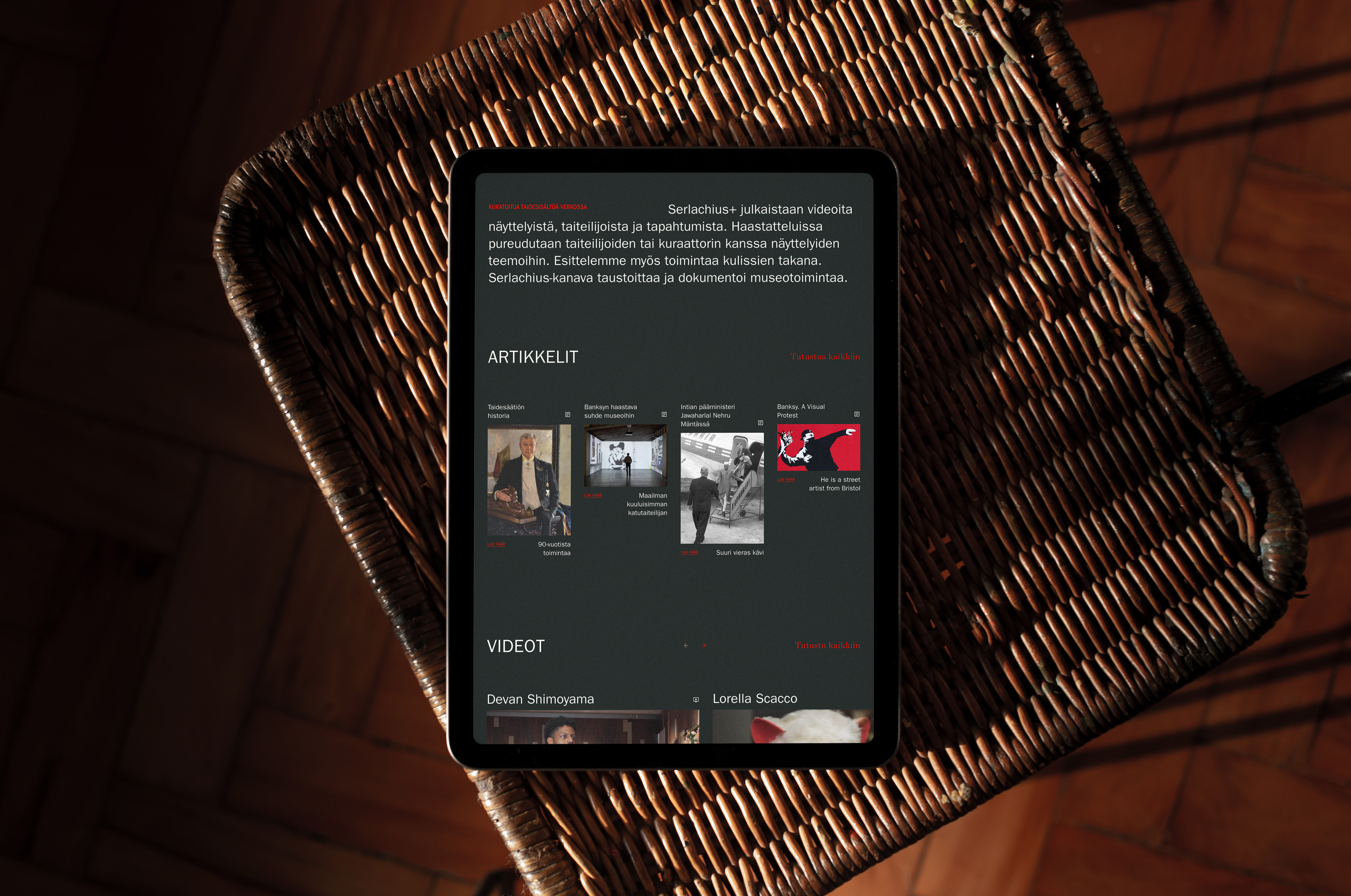
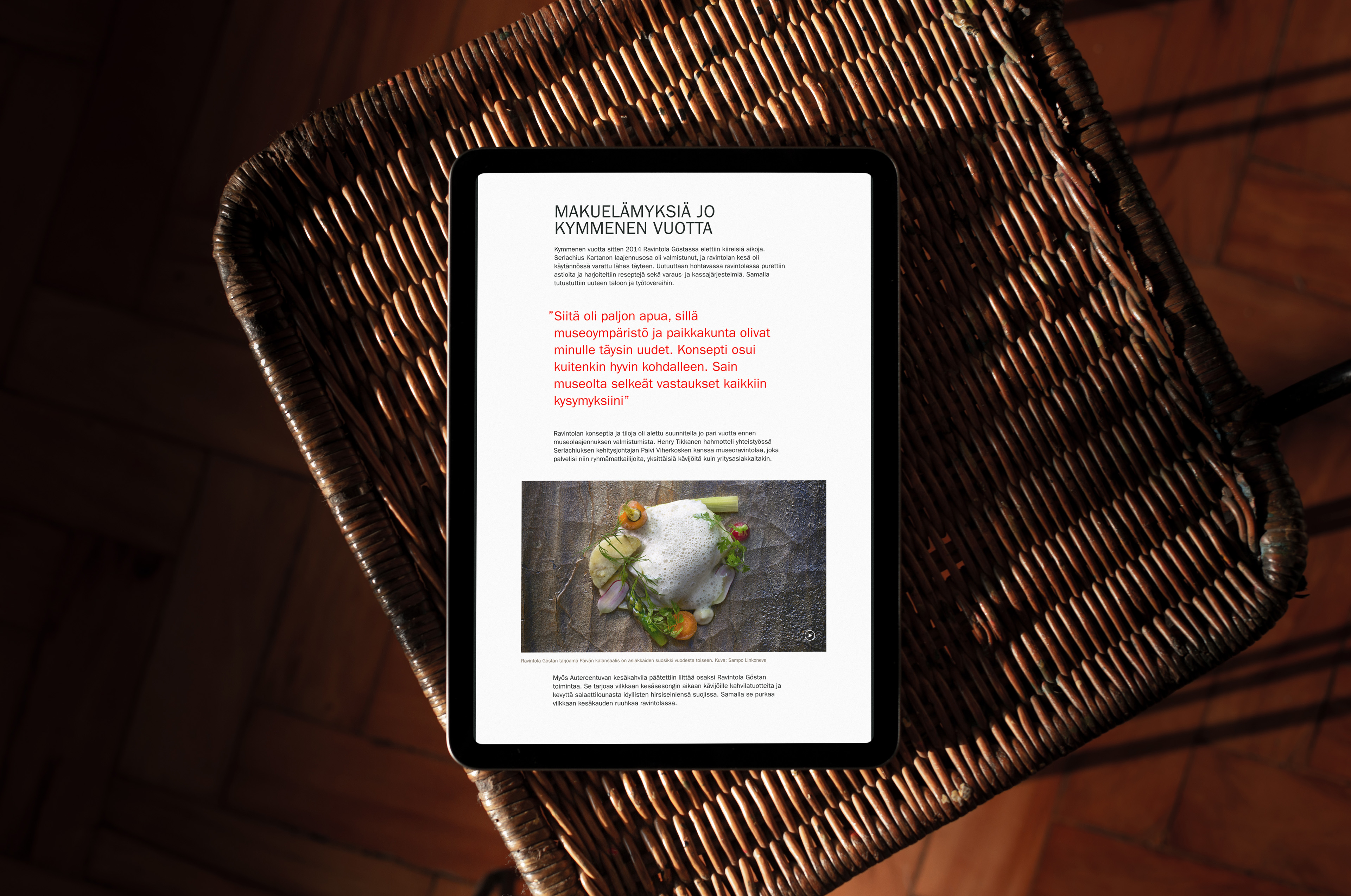
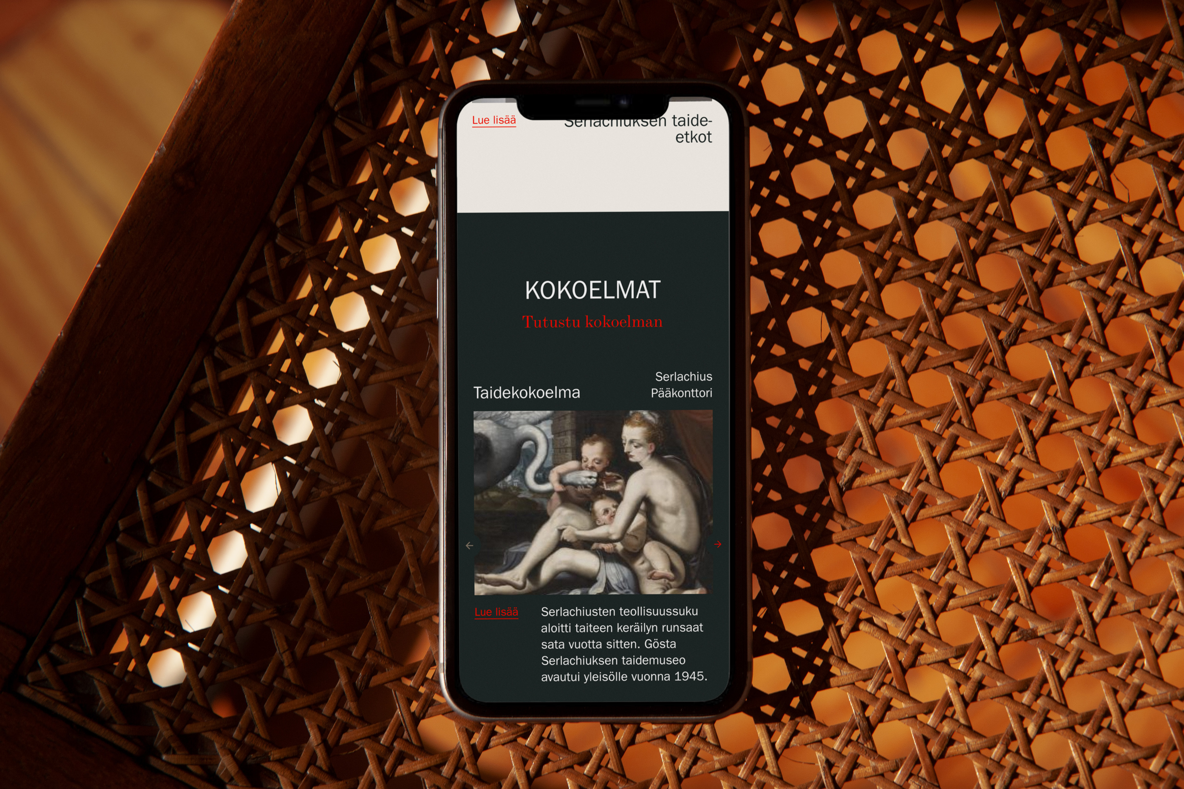
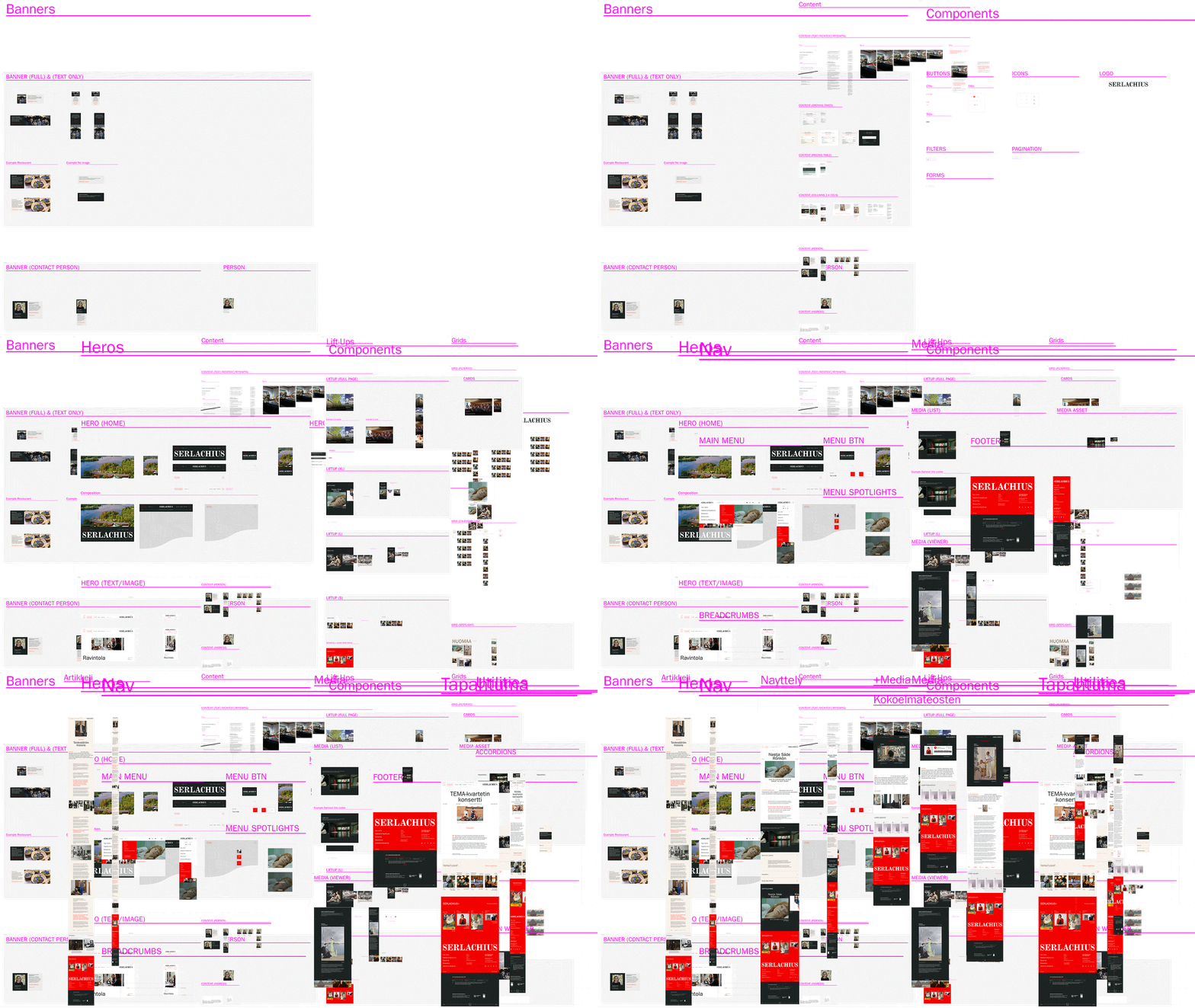
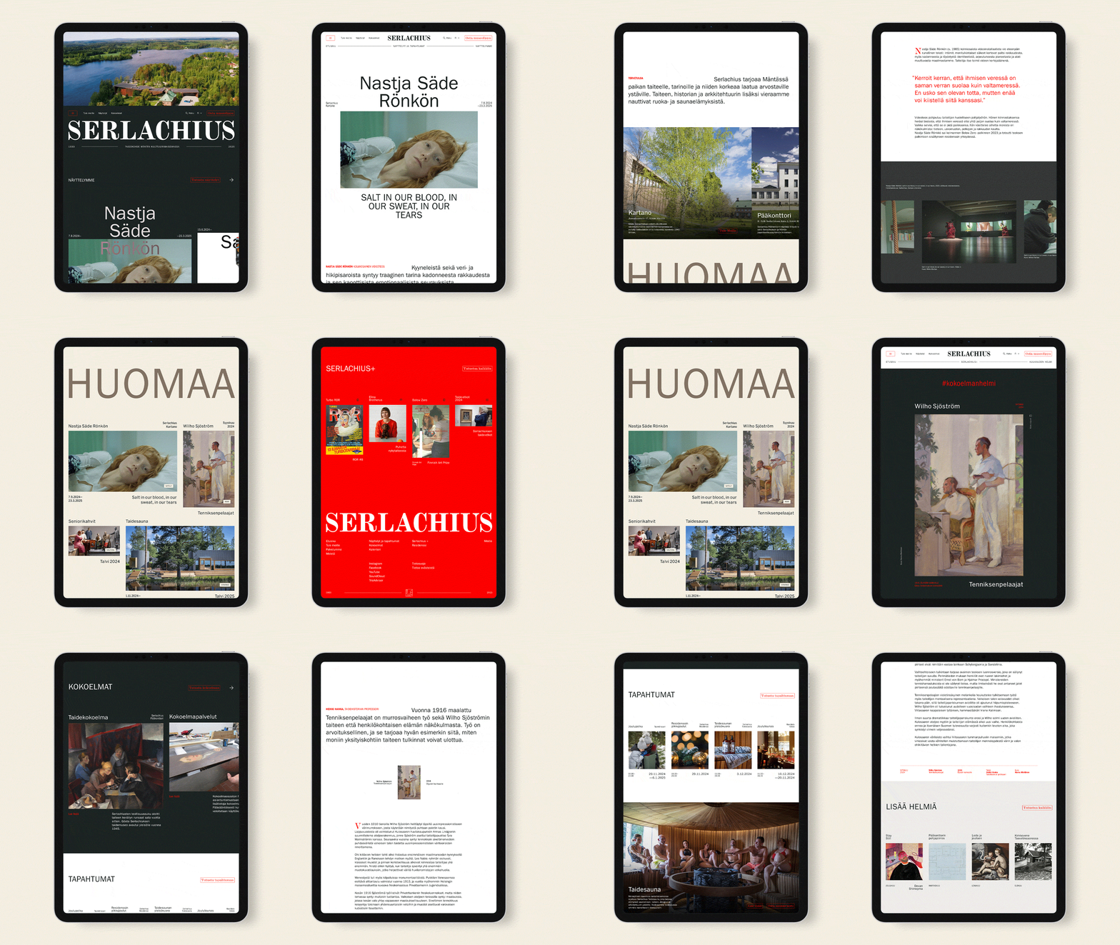
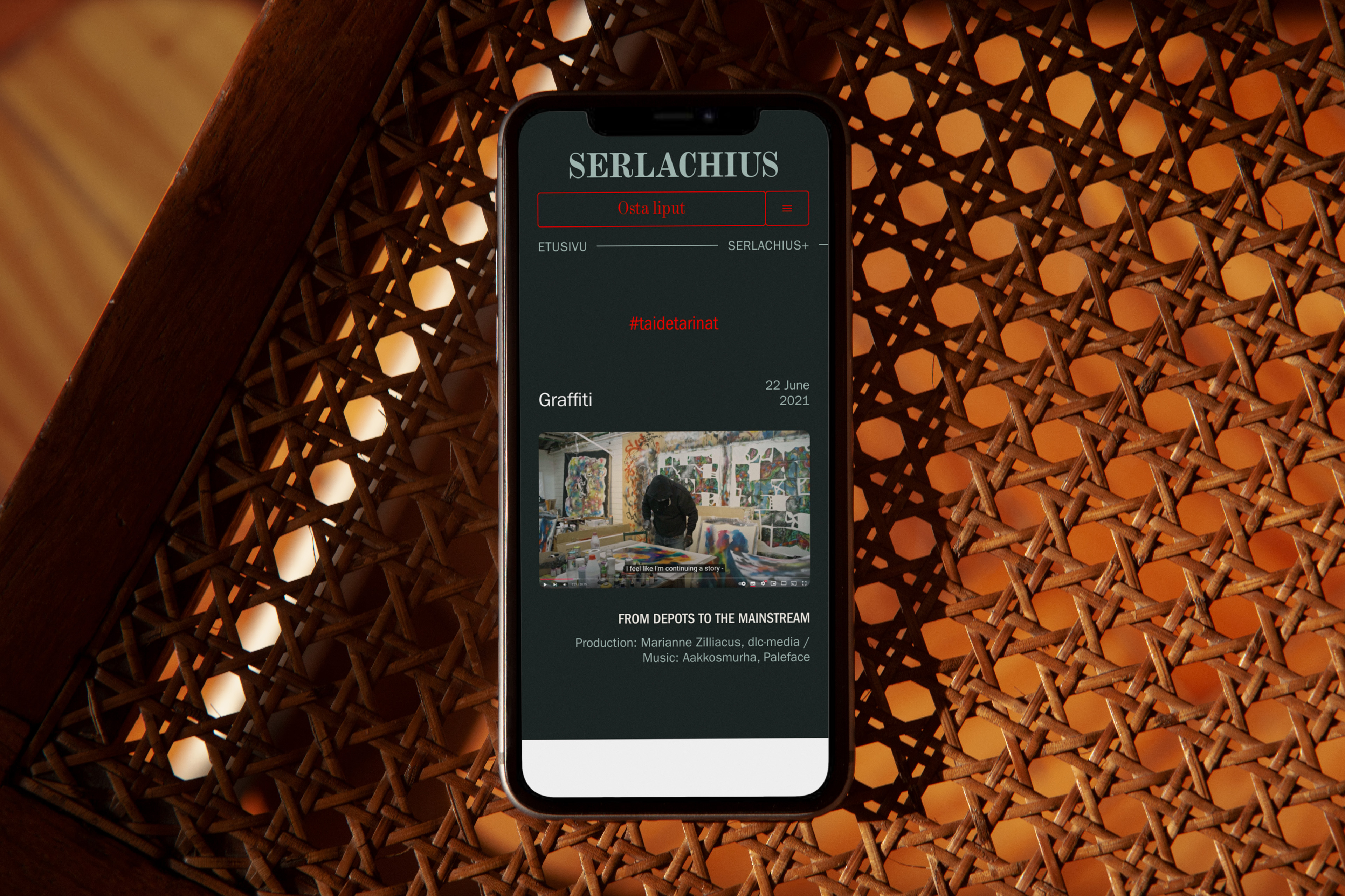
Key messages and a tone of voice set the content to speak like an art destination, not only a museum. The new architecture then gave every kind of content, from exhibitions and events to video stories and podcasts, its own experience and taxonomy. It also meant fewer, easier-to-discover pages, lighter upkeep and better accessibility. The home page became a content hub, with what is on today and a spotlight that changes with the seasons.
How contrast and vastness shaped the experience?
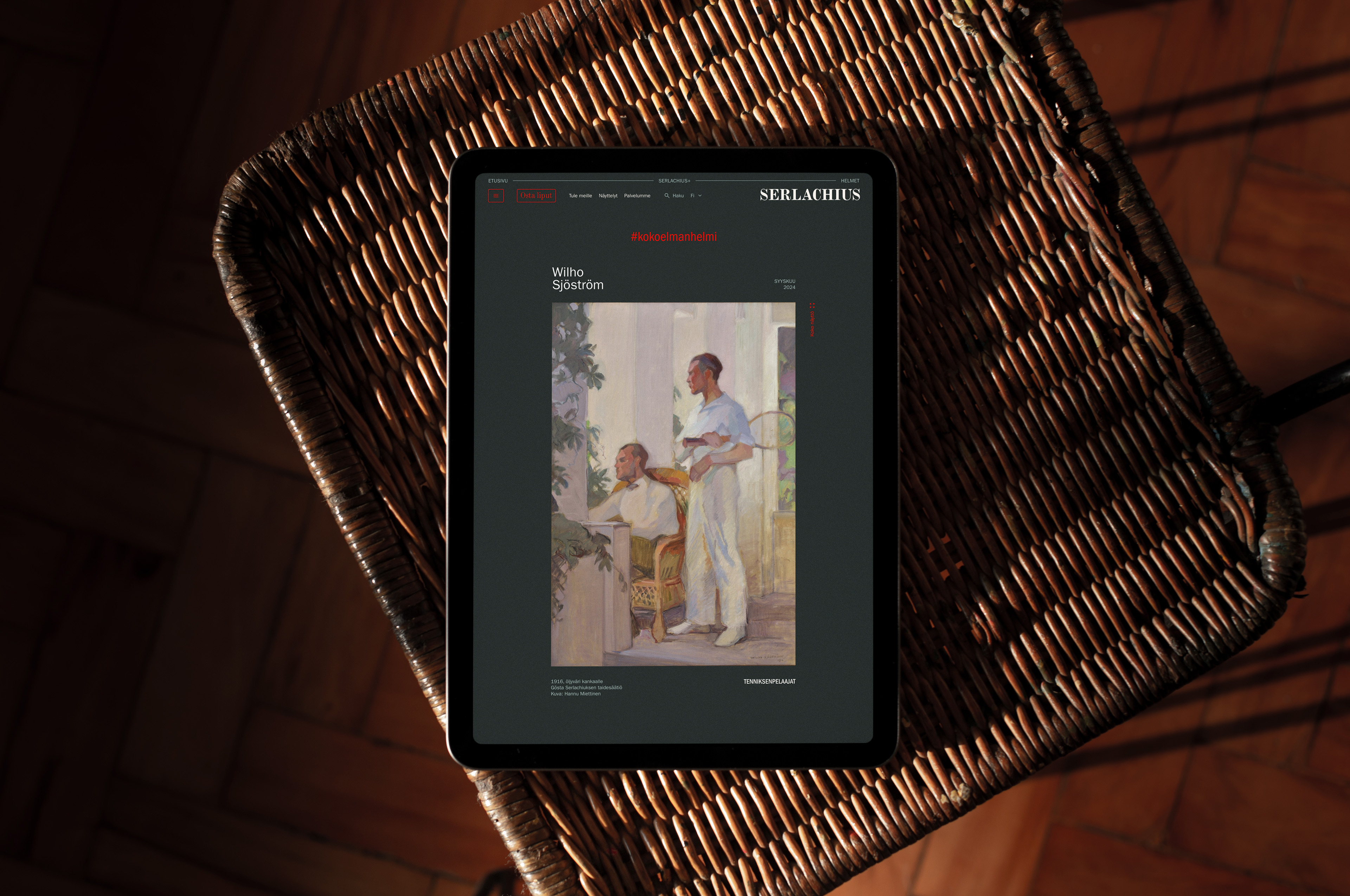
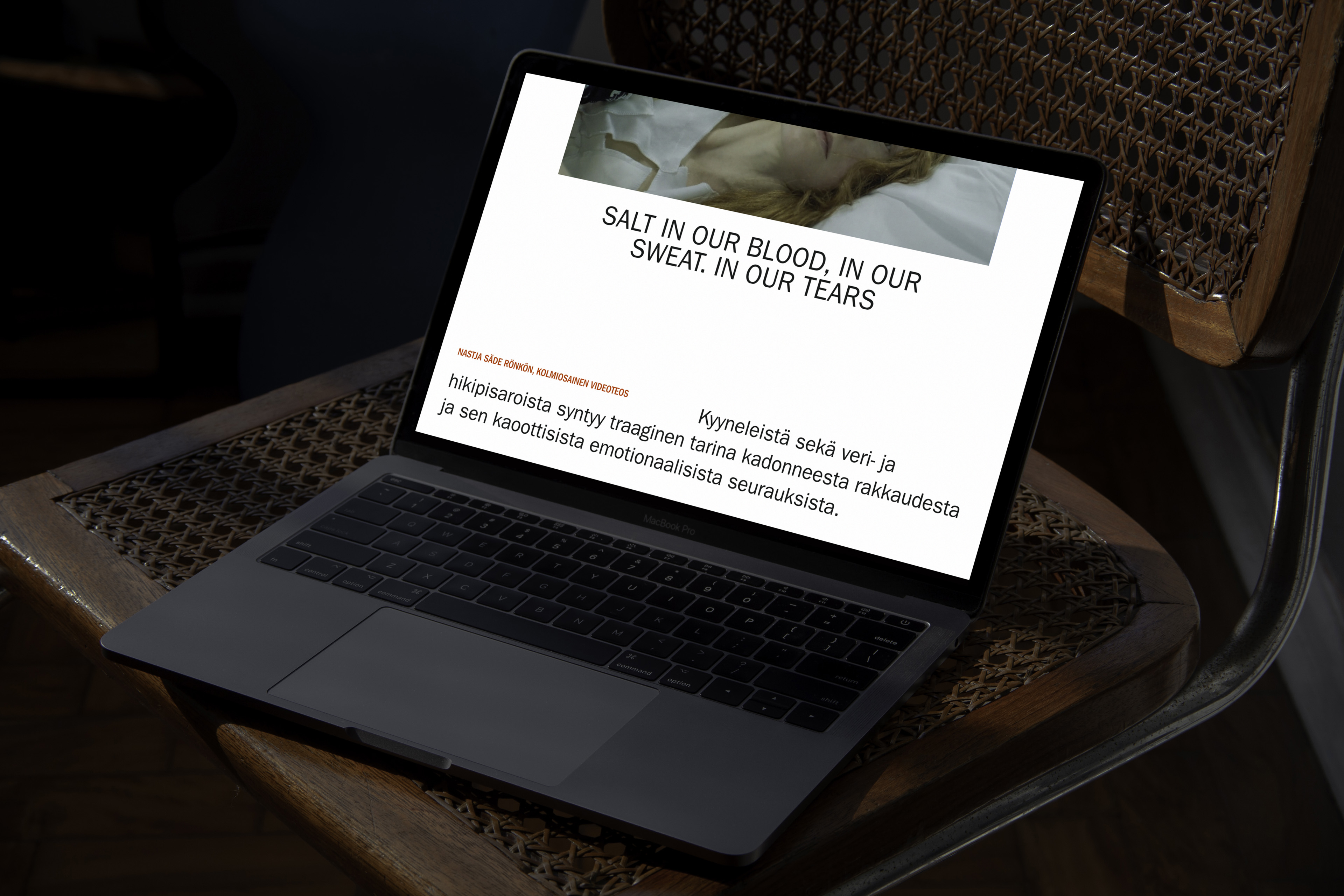
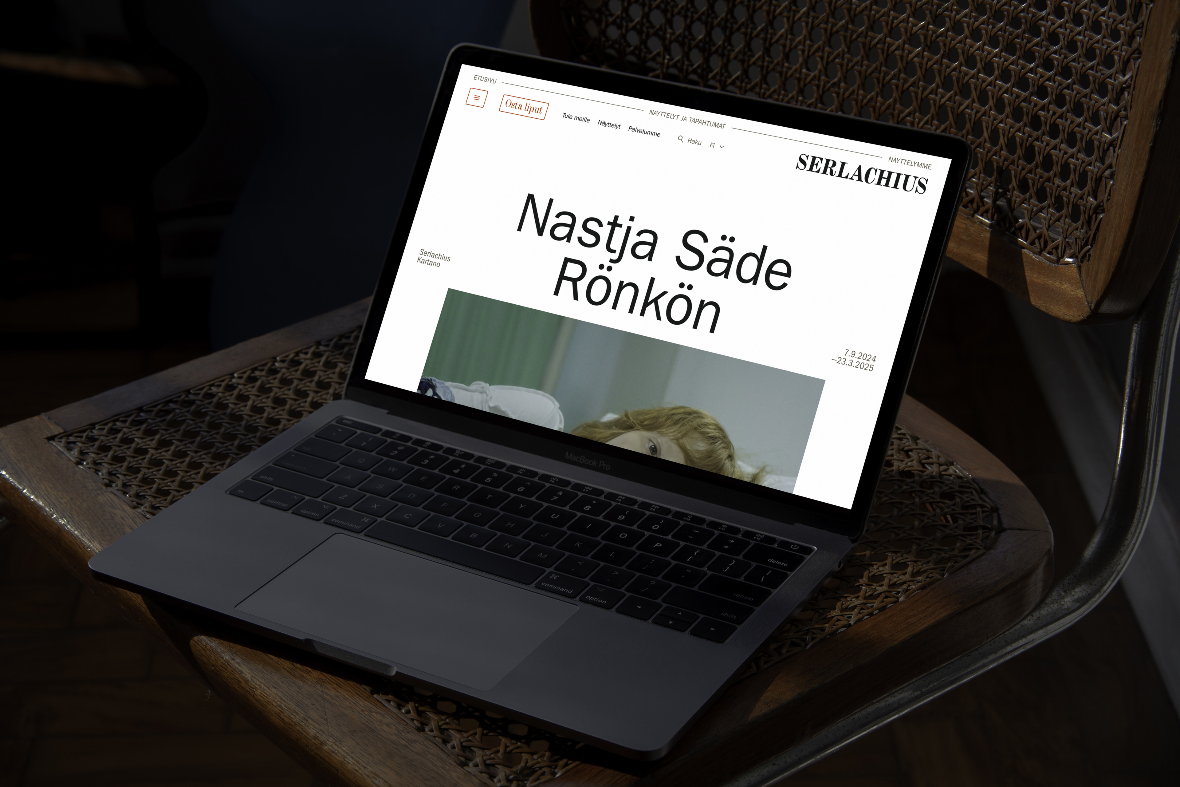
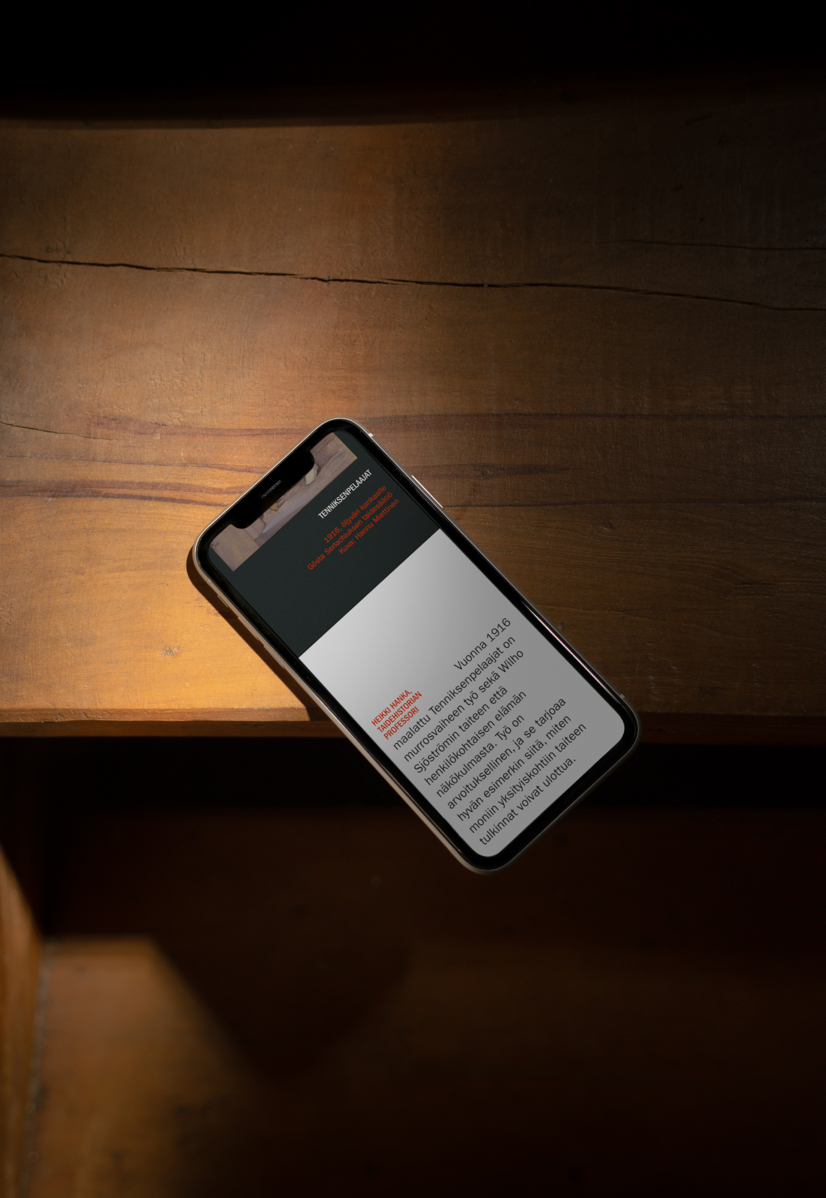
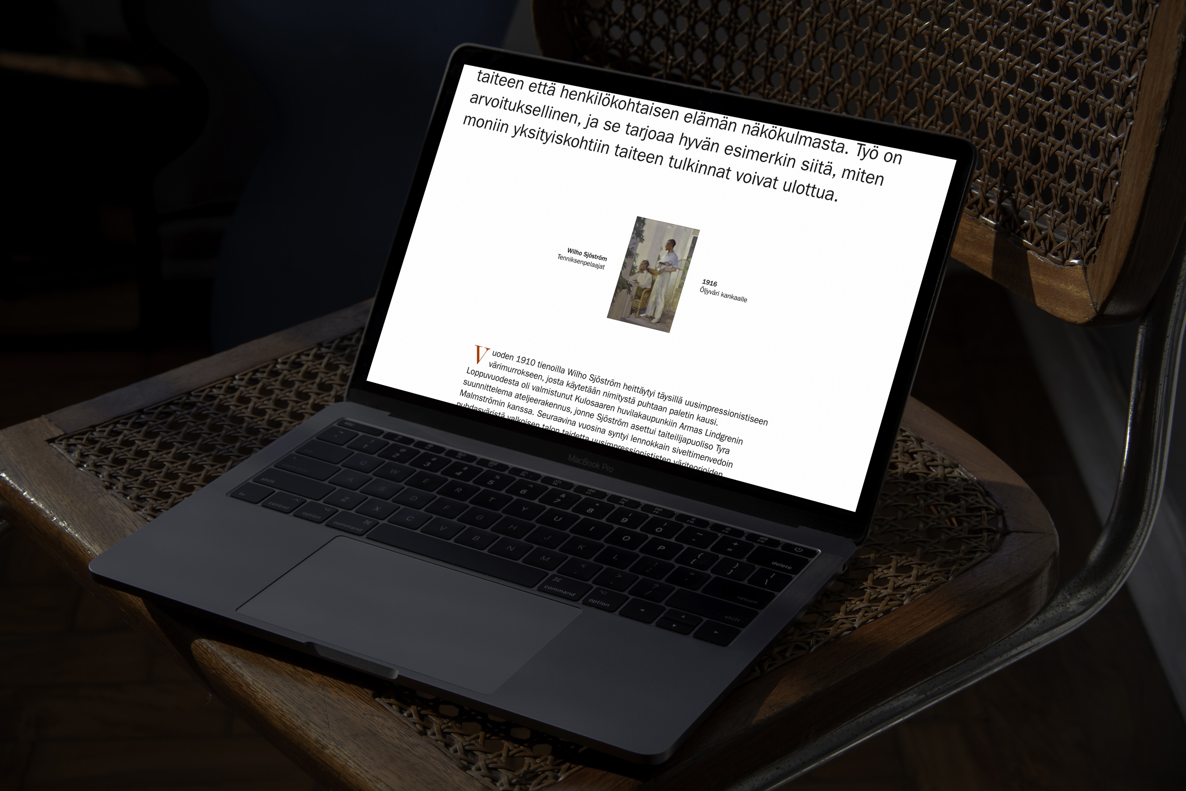
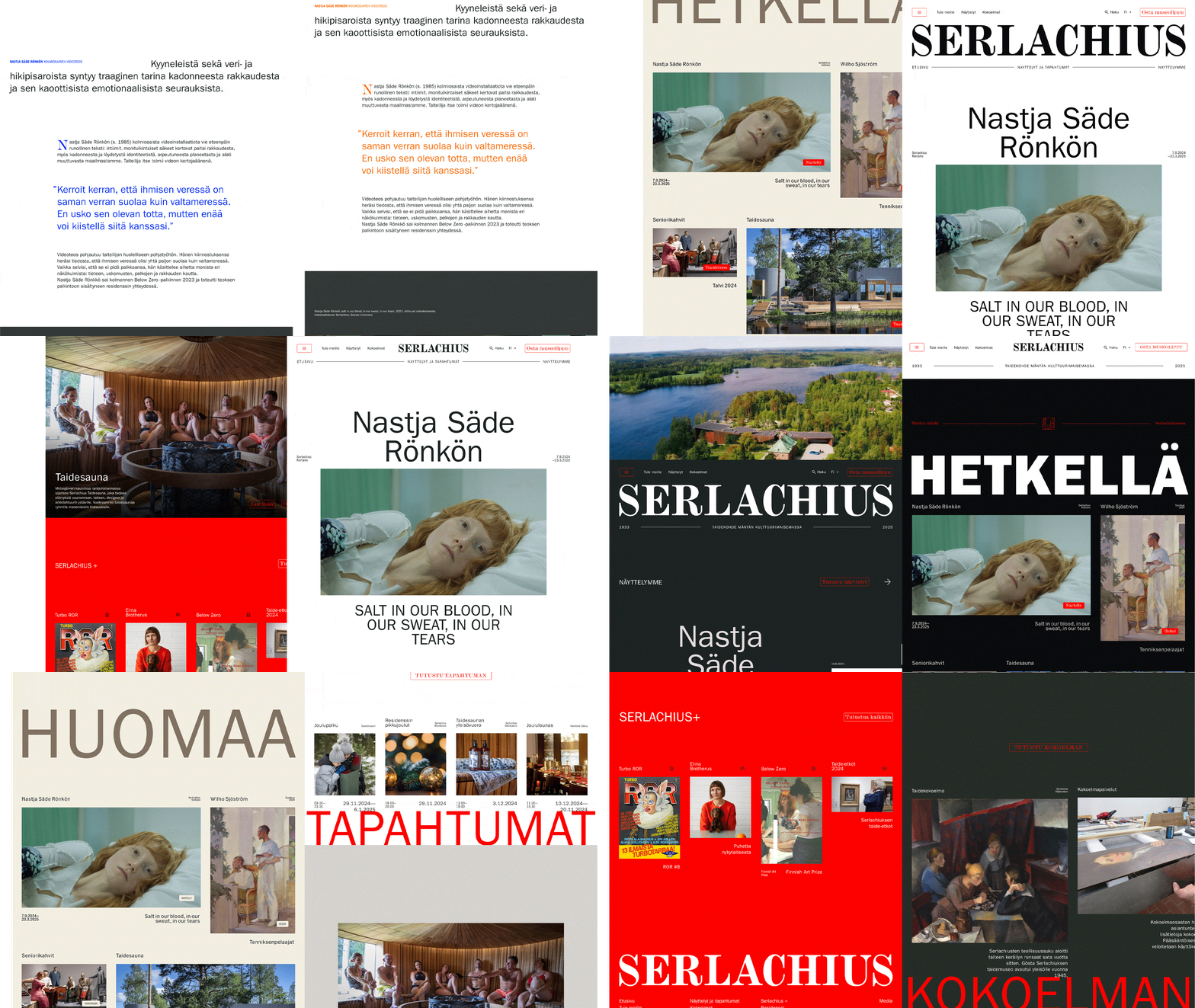
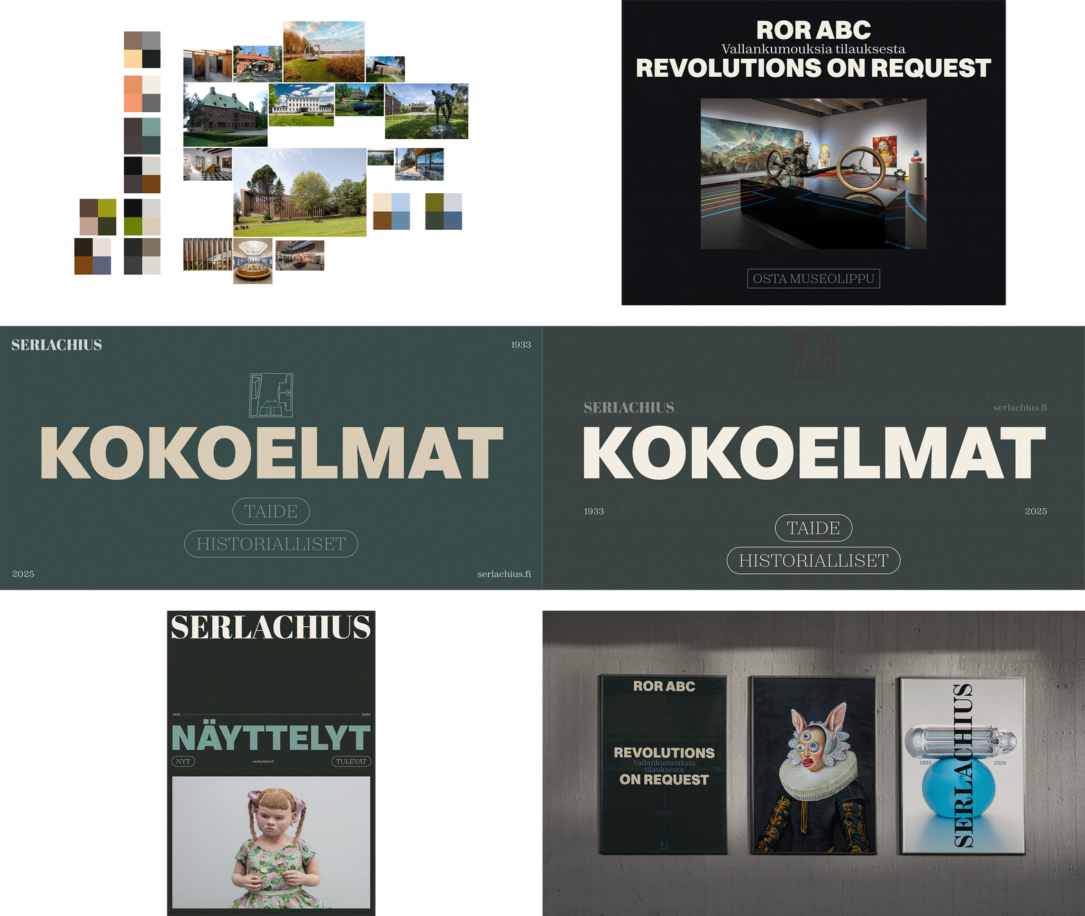
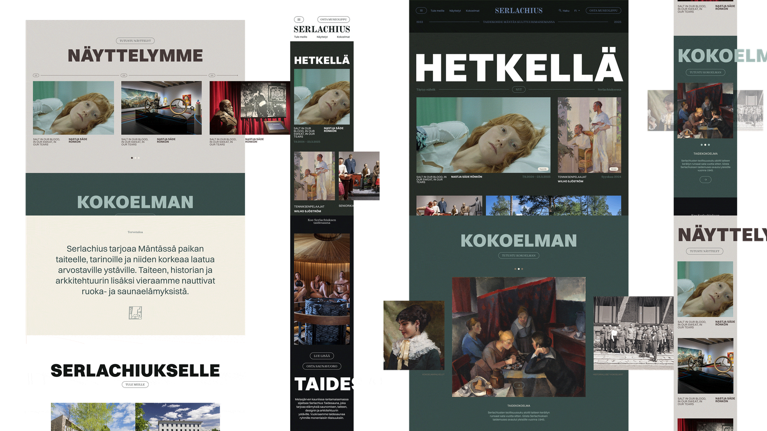
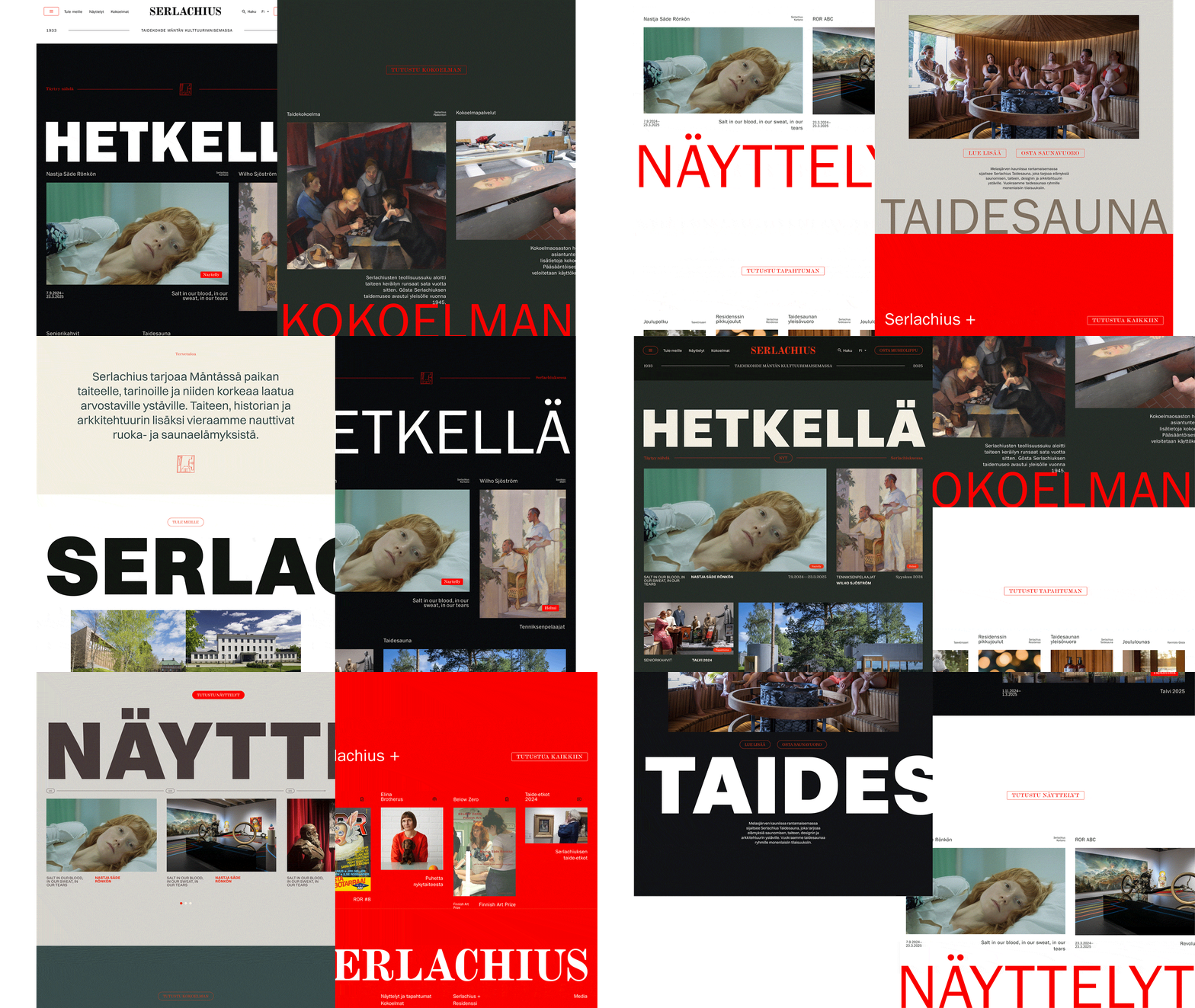
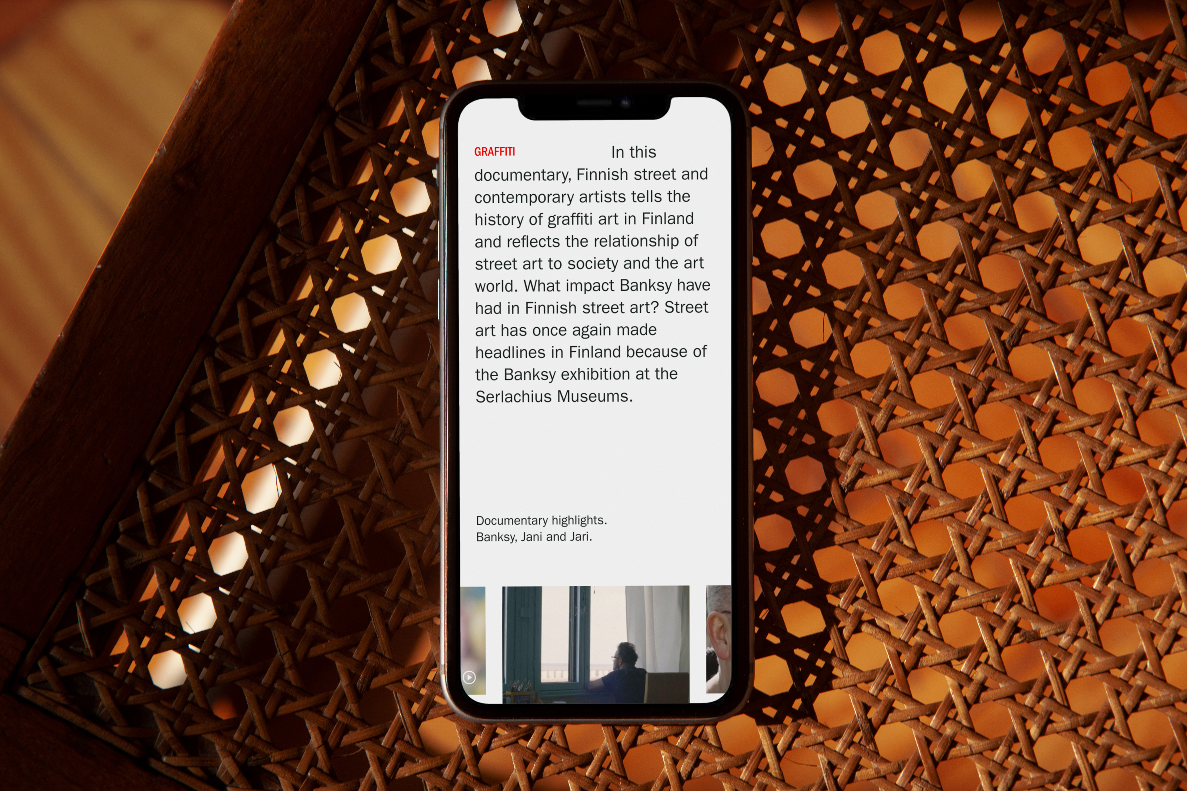
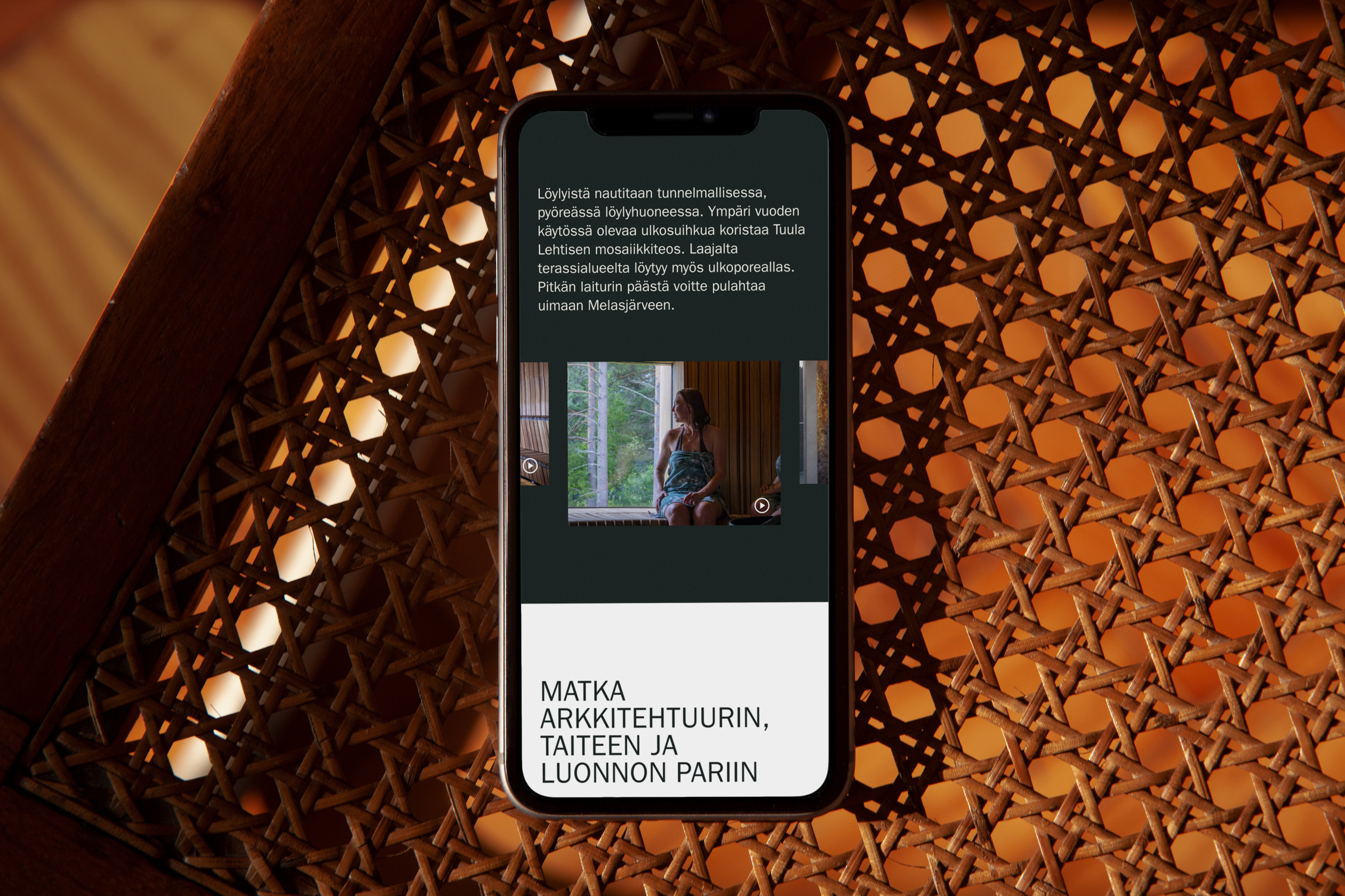
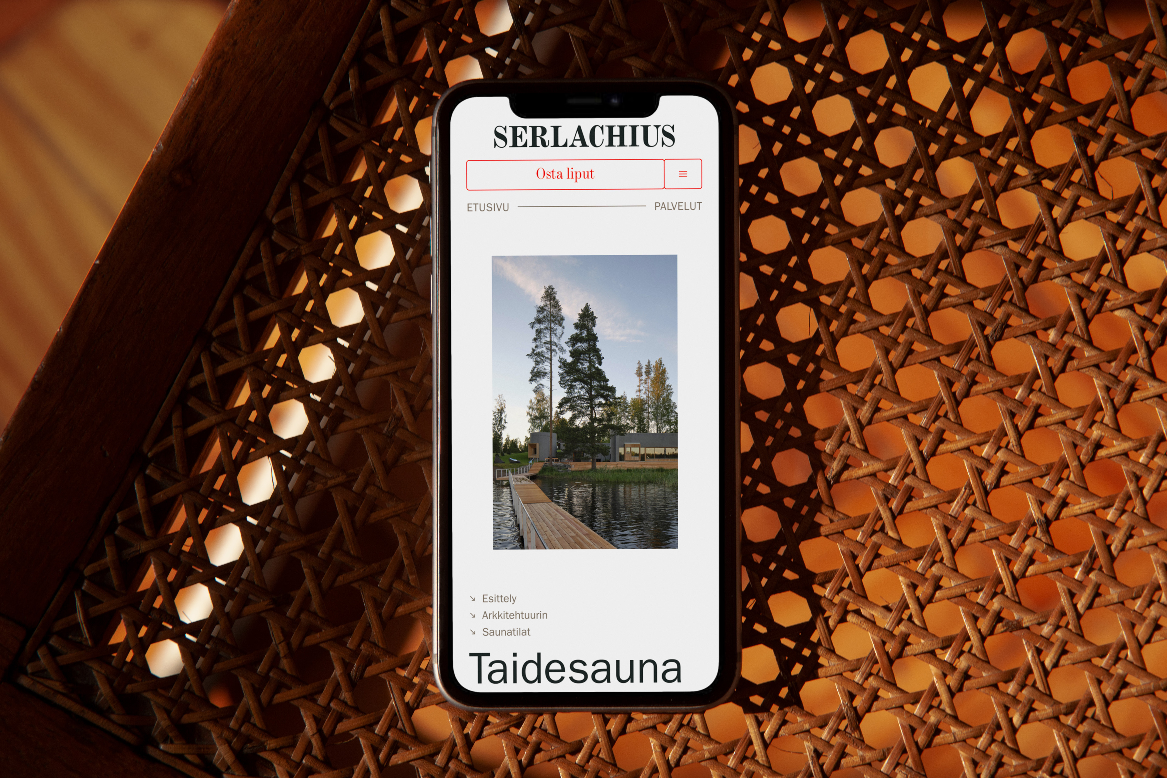
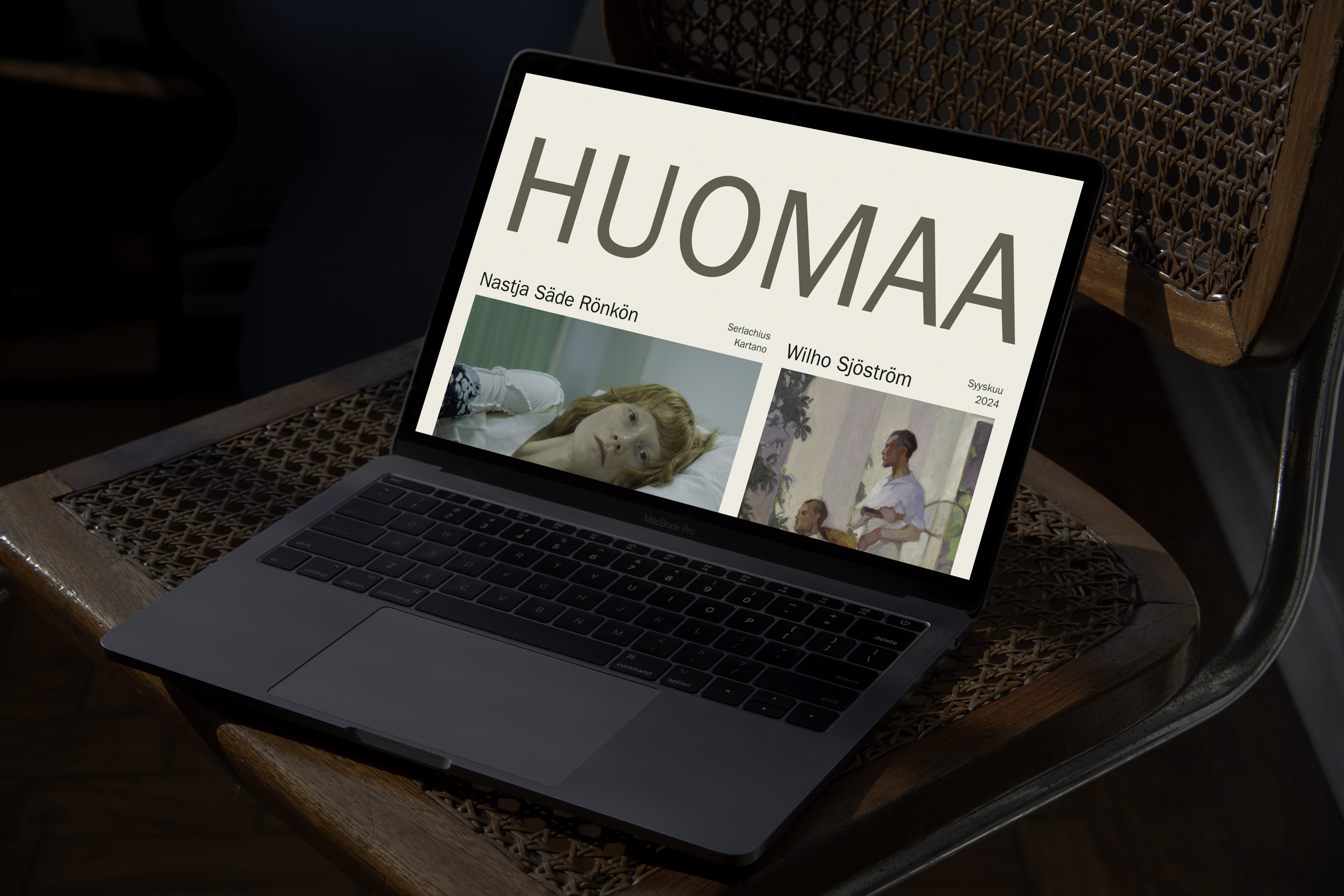
Serlachius had a thin corporate identity, and a destination needs more than that. So the UI design evolved it into an expressive digital experience. The concept comes from the tension of the place itself. Serlachius is a place of contrast and vastness. Old and new architecture live in harmony, and classic and modern art sit side by side. Nature and buildings blend into each other. Through its art, Serlachius is also a place of opinion and debate.
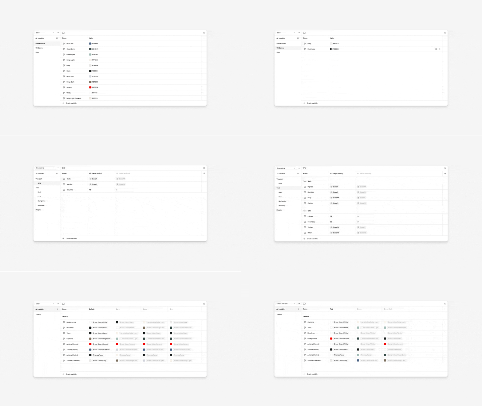
That duality became a system for the whole site. The typography pairs tradition with the modern. The colours come from the destination itself, its buildings and the nature around them, and bring deep contrast. The layouts leave tension and space between elements. The result is a website that is a destination in its own right: the digital form of Serlachius' purpose, identity and sense of belonging.
Serlachius key facts
- Client
- Gösta Serlachius Fine Arts Foundation
- Location
- Mänttä, Finland
- Expertise
- Digital transformation
- Disciplines
- Digital strategy, content strategy, information architecture, UX and UI design
- My role
- Digital strategist, lead UX and UI designer
- Timeline
- 2024–2025
- Agency
- Werklig
- Development
- Sofokus
- Live
- serlachius.fi